Wallet
The project scope included the initial design and subsequent redesign of the wallet page for G-loot. The wallet was expanded to support additional currencies and allows users to easily navigate to related pages for using and purchasing new currencies.
Research & analysis / UX
2021 / 2022
G-Loot, later rebranded as Stryda, was a Stockholm-based esports company specializing in stats tracking, player identity, and competitions. It permanently ceased operations in 2023.
The problem :
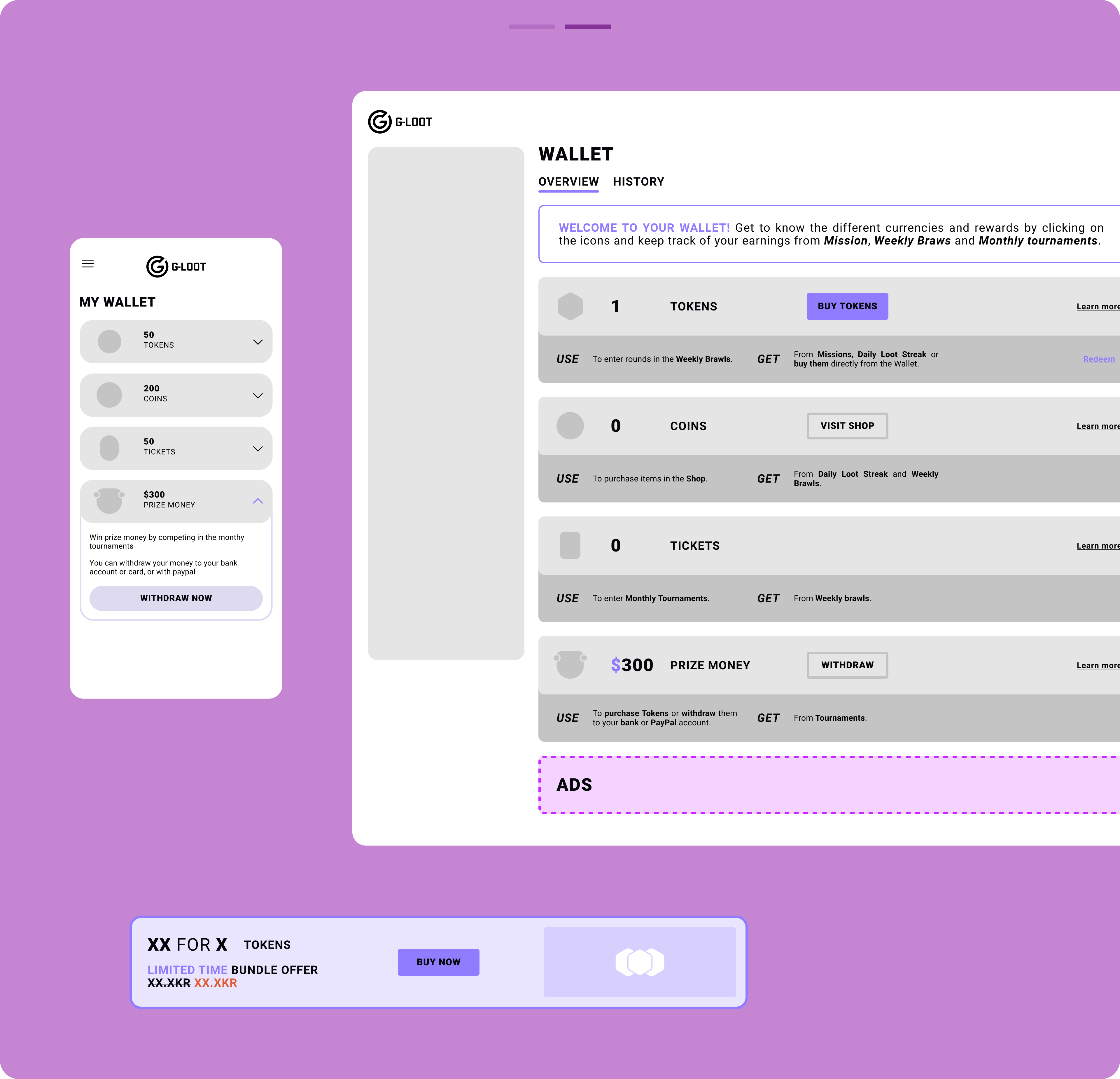
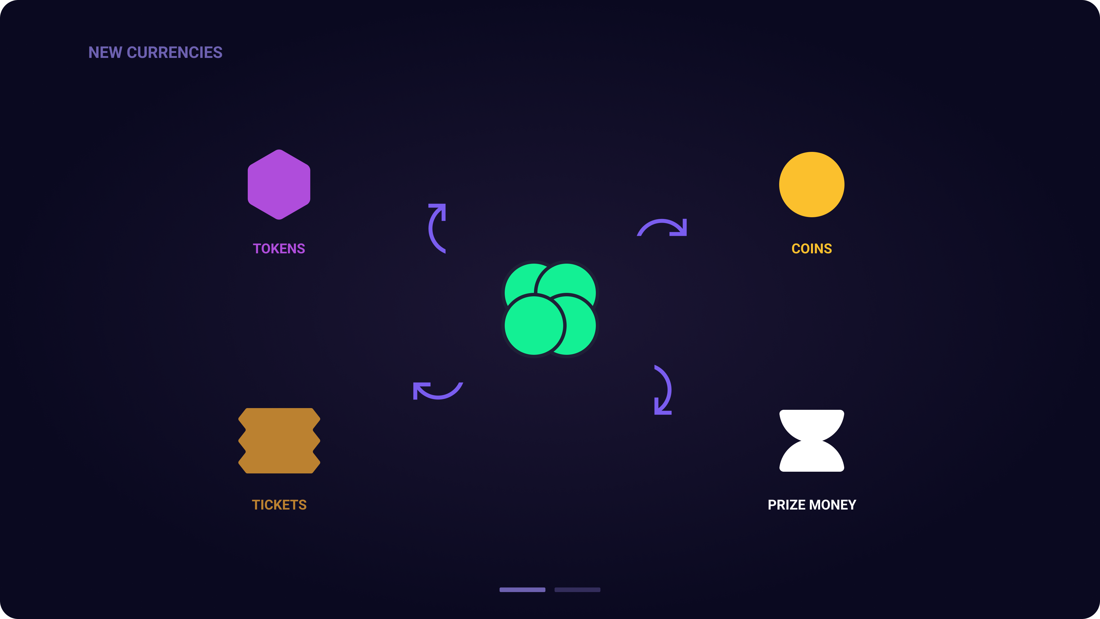
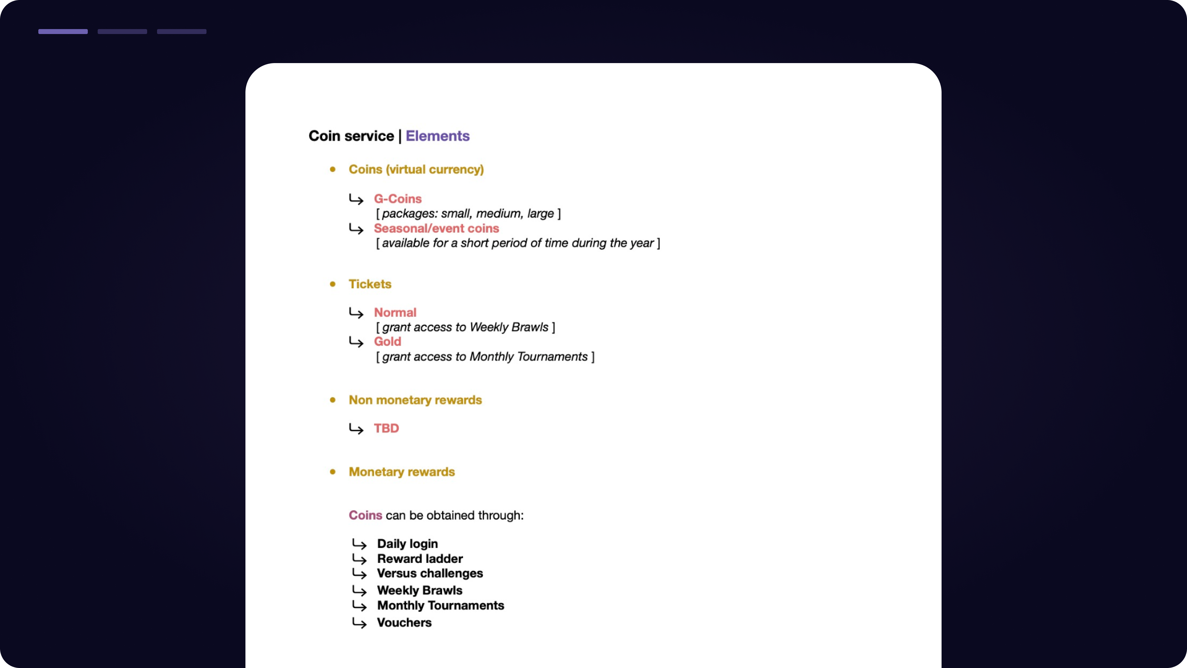
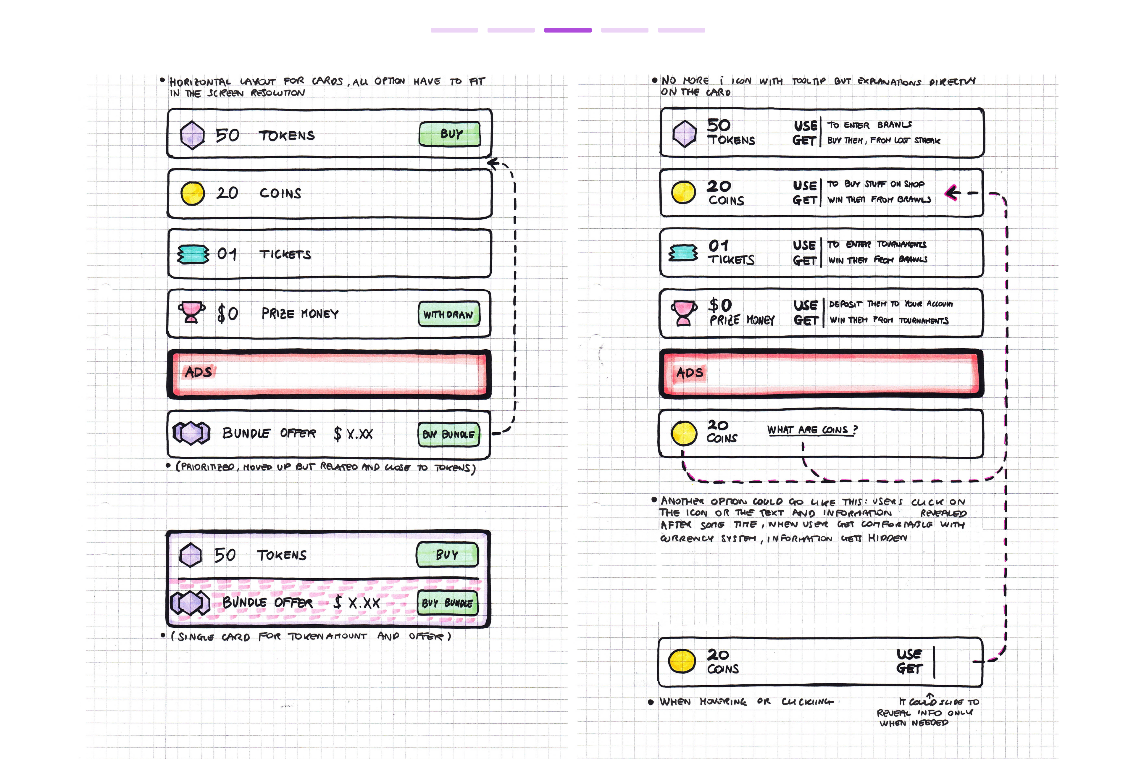
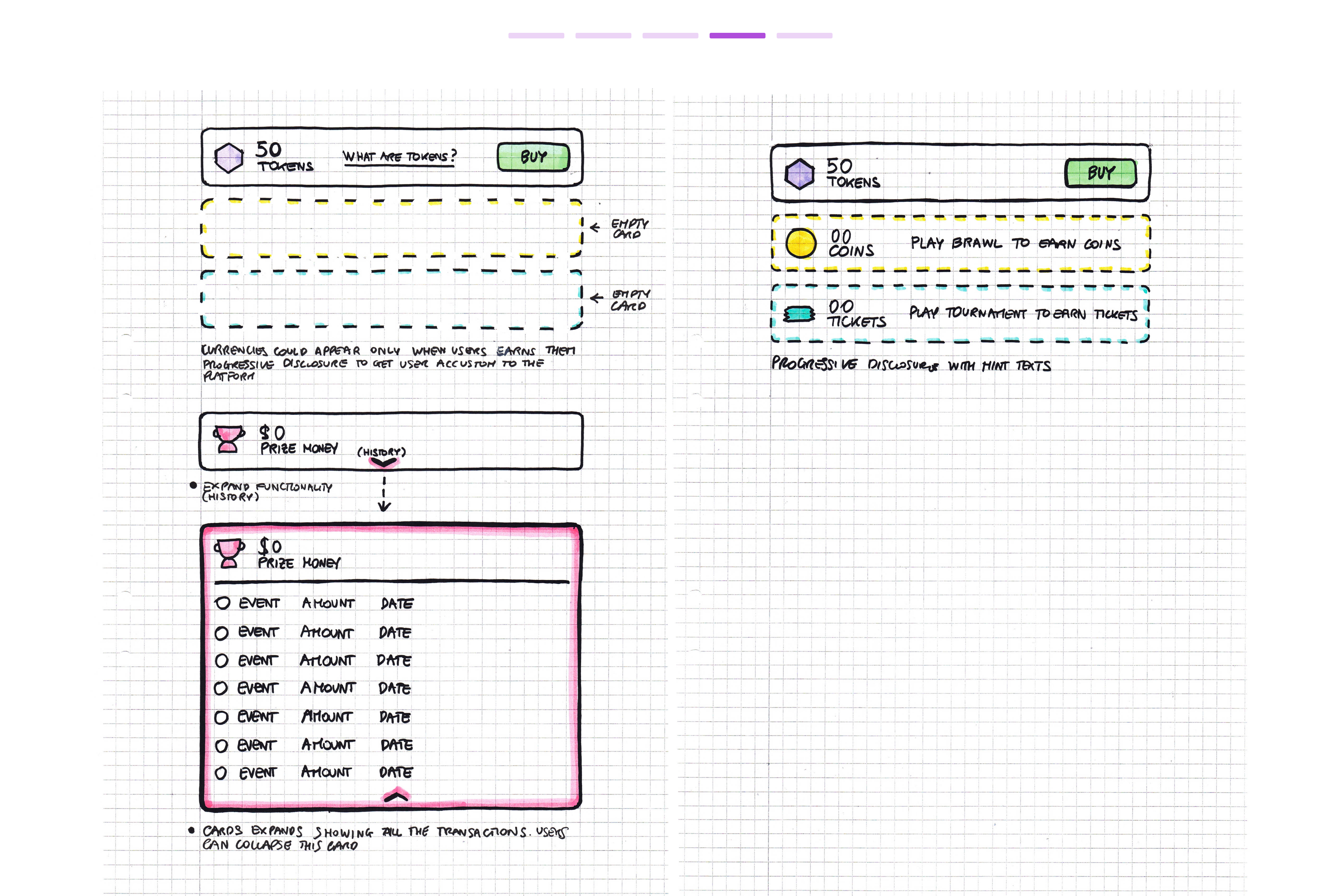
Four new currencies were introduced, each linked to new activities on the platform. It was crucial to establish a new page structure that could accommodate all of them while clearly explaining the core loop associated with the currencies.
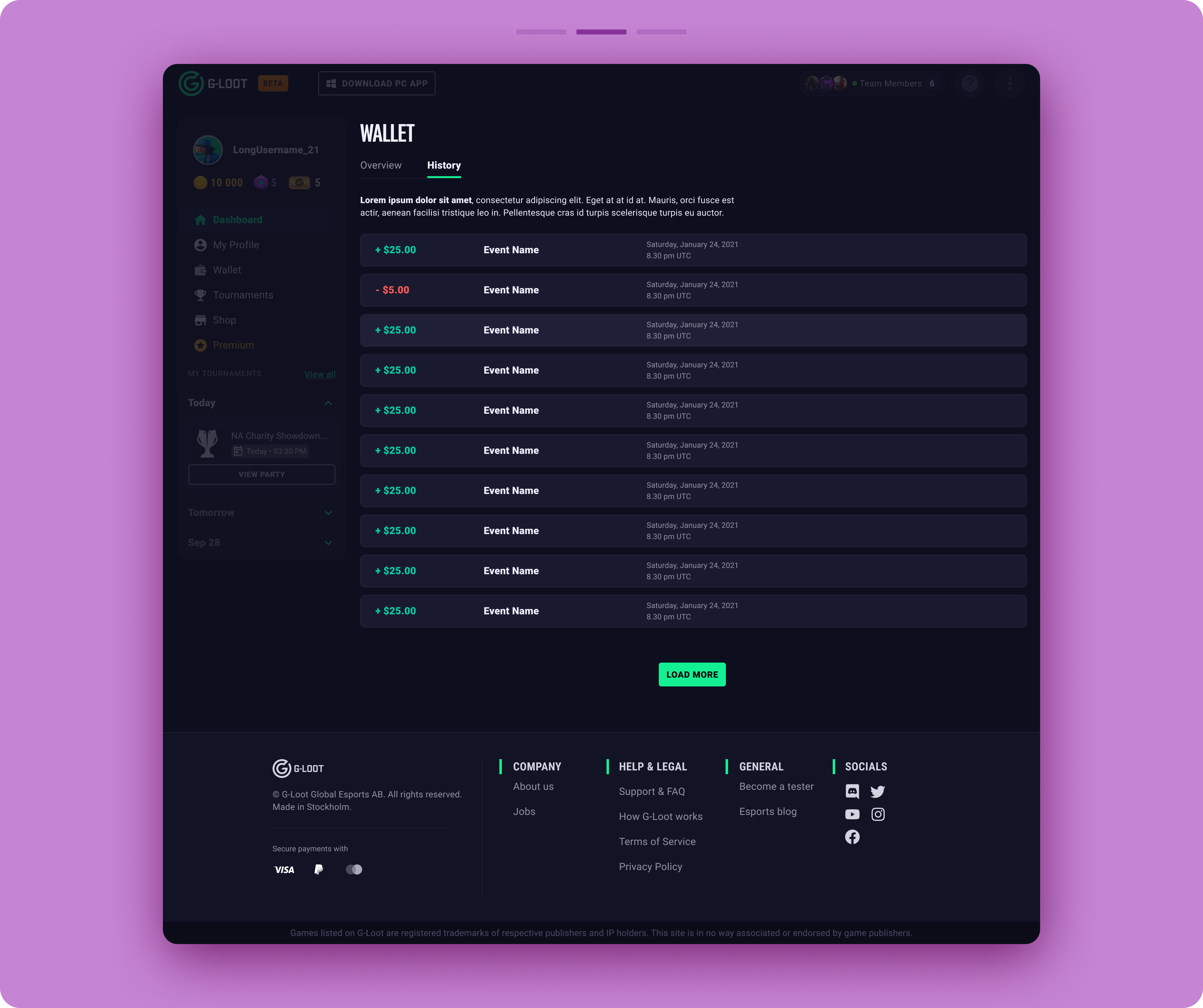
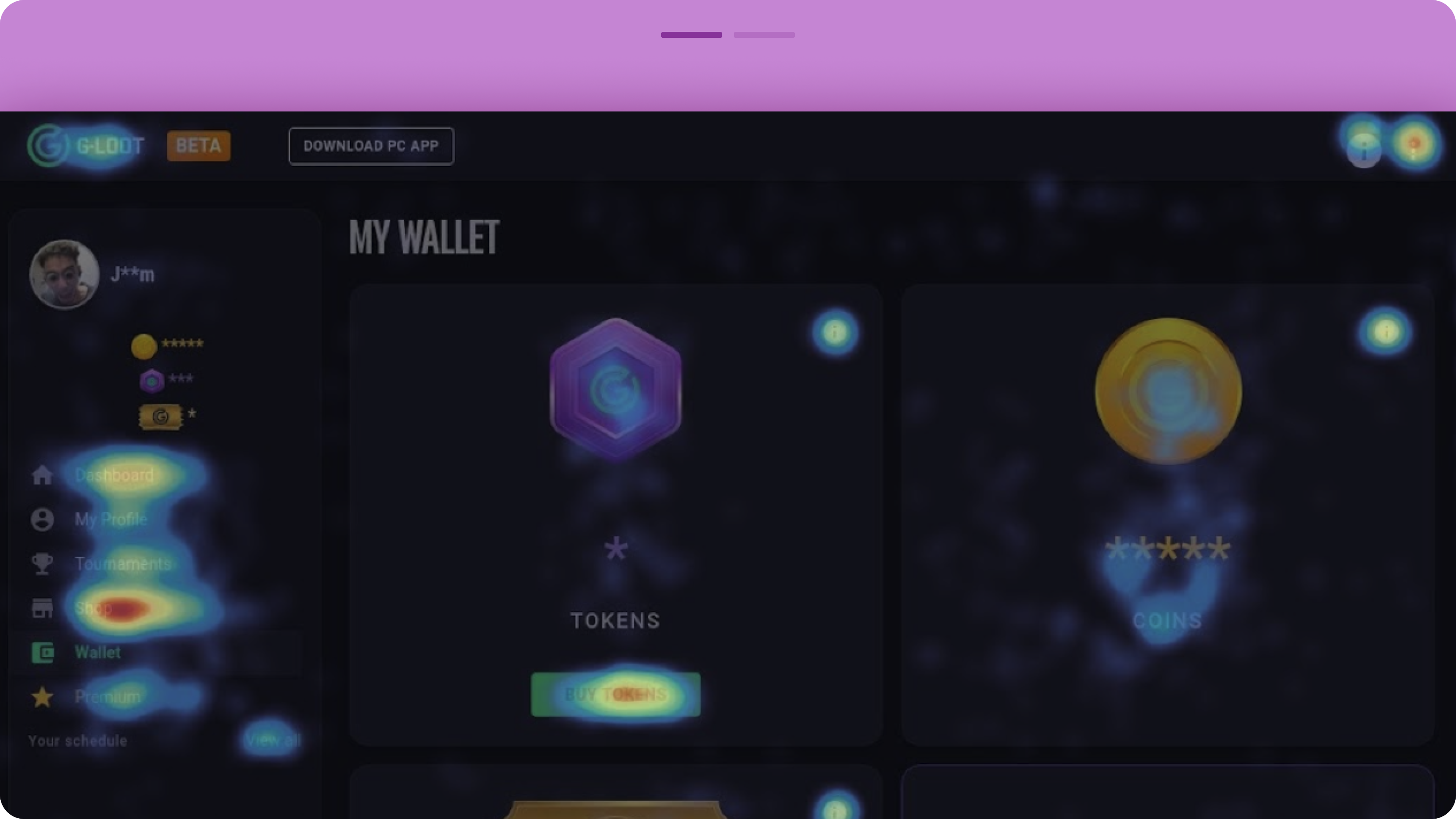
Research revealed that the previous wallet card layout was ineffective in conveying information about the different currencies and how to use them. Key details were hidden inside tooltips, and users often overlooked the info icon in the top-right corner of each currency card. Instead, they mistakenly clicked on the currency icon, expecting more information.
Additionally, the height of the cards required users to scroll to view all currencies, causing those at the bottom to be frequently overlooked, especially on smaller screens, which were the most commonly used devices.
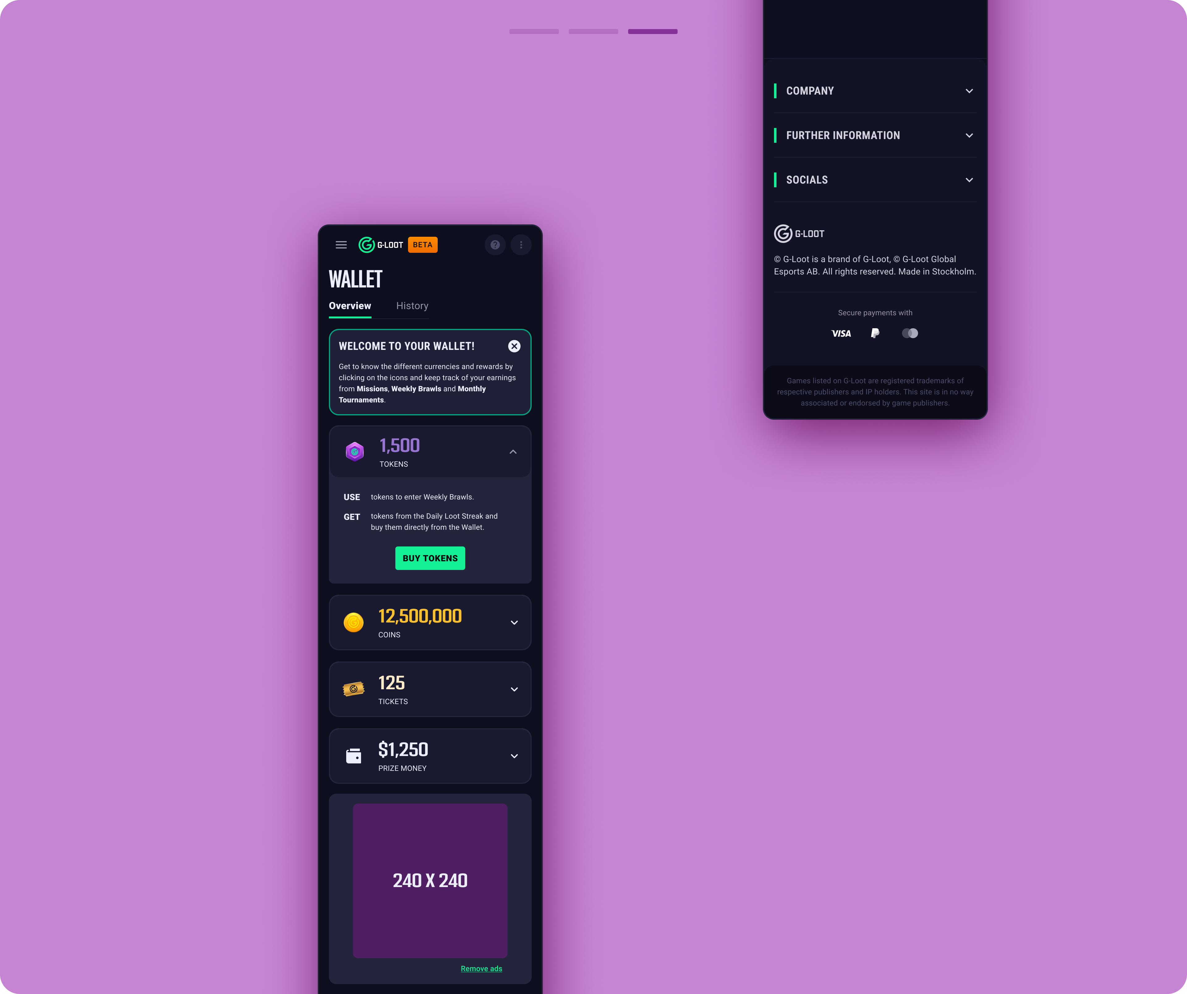
- Tokens: Used to enter Brawls (a type of competition).
-
Coins: Used to make purchases in the shop and earned by winning Brawls and other types of competitions.
-
Tickets: Used to participate in monthly tournaments and earned by winning weekly Brawls.
-
Prize Money: Real money that users can withdraw, obtained from tournament winnings.
Research revealed that the previous wallet card layout was ineffective in conveying information about the different currencies and how to use them. Key details were hidden inside tooltips, and users often overlooked the info icon in the top-right corner of each currency card. Instead, they mistakenly clicked on the currency icon, expecting more information.
Additionally, the height of the cards required users to scroll to view all currencies, causing those at the bottom to be frequently overlooked, especially on smaller screens, which were the most commonly used devices.
Browse the gallery to view the final design
The solution:
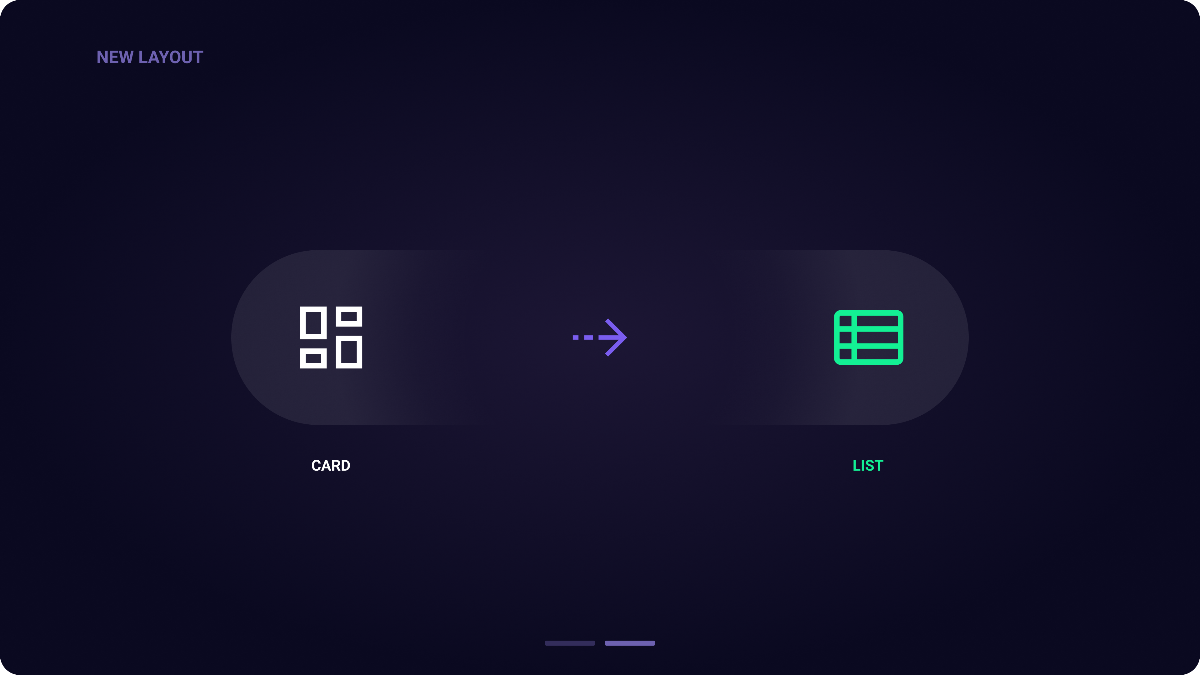
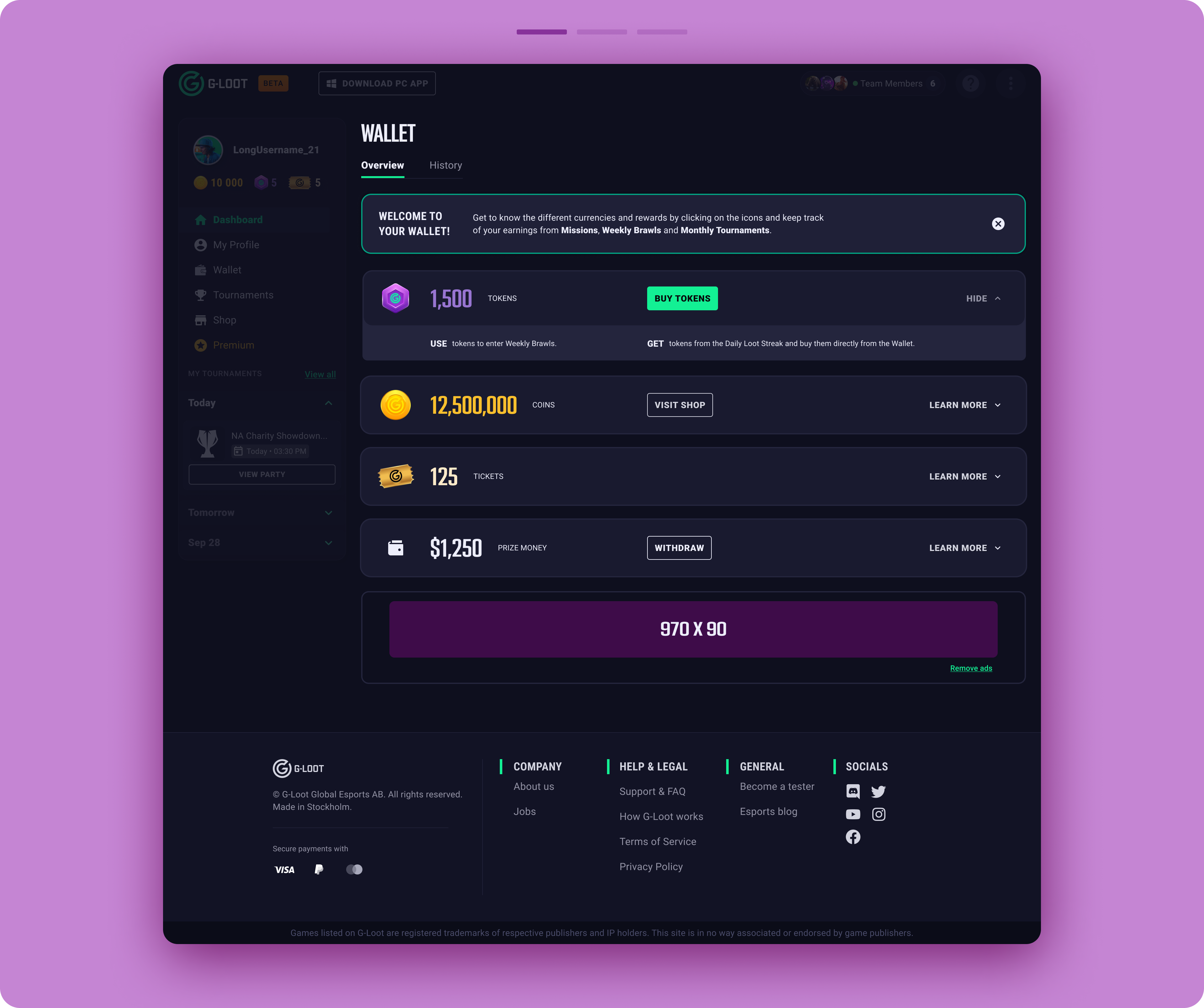
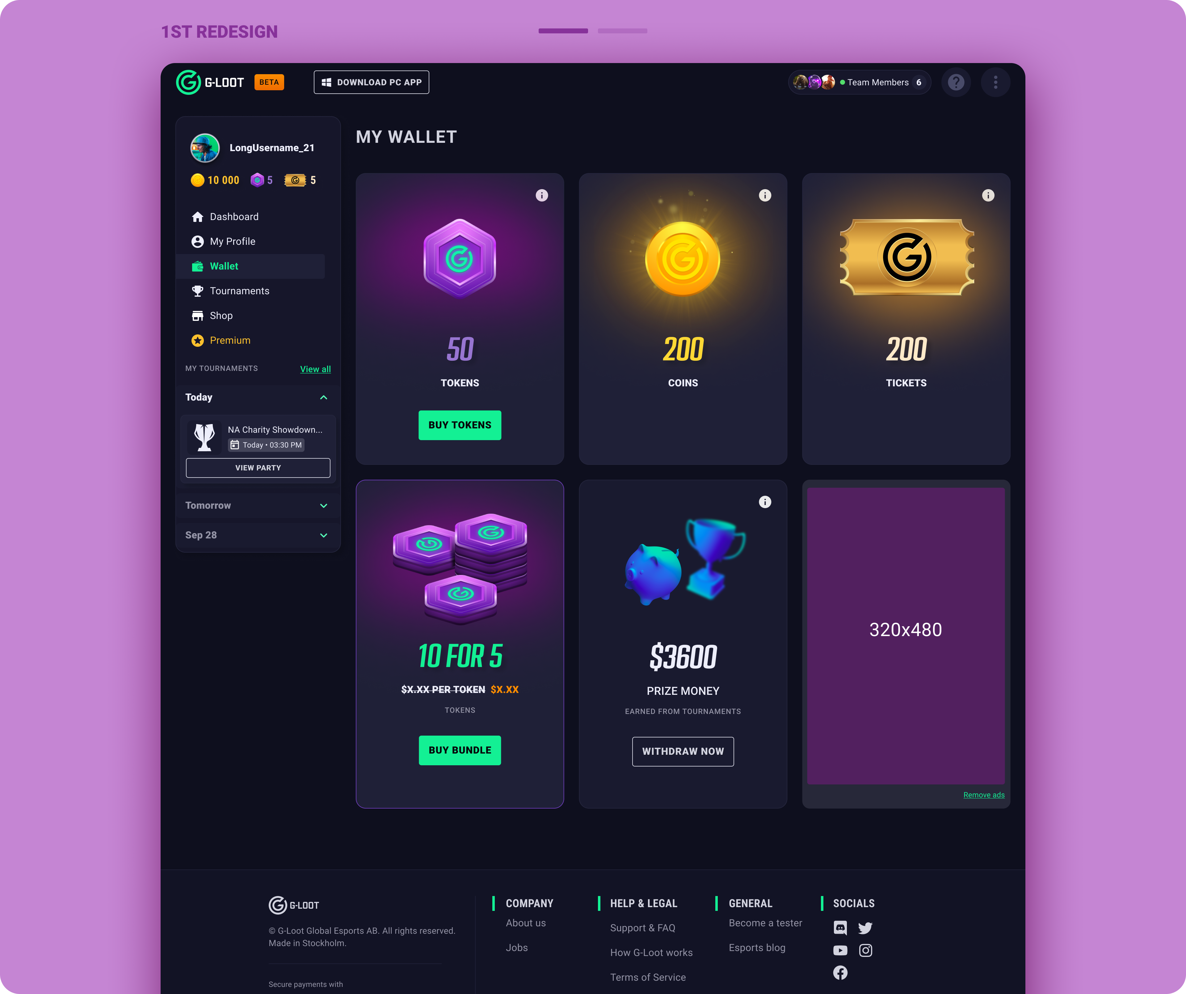
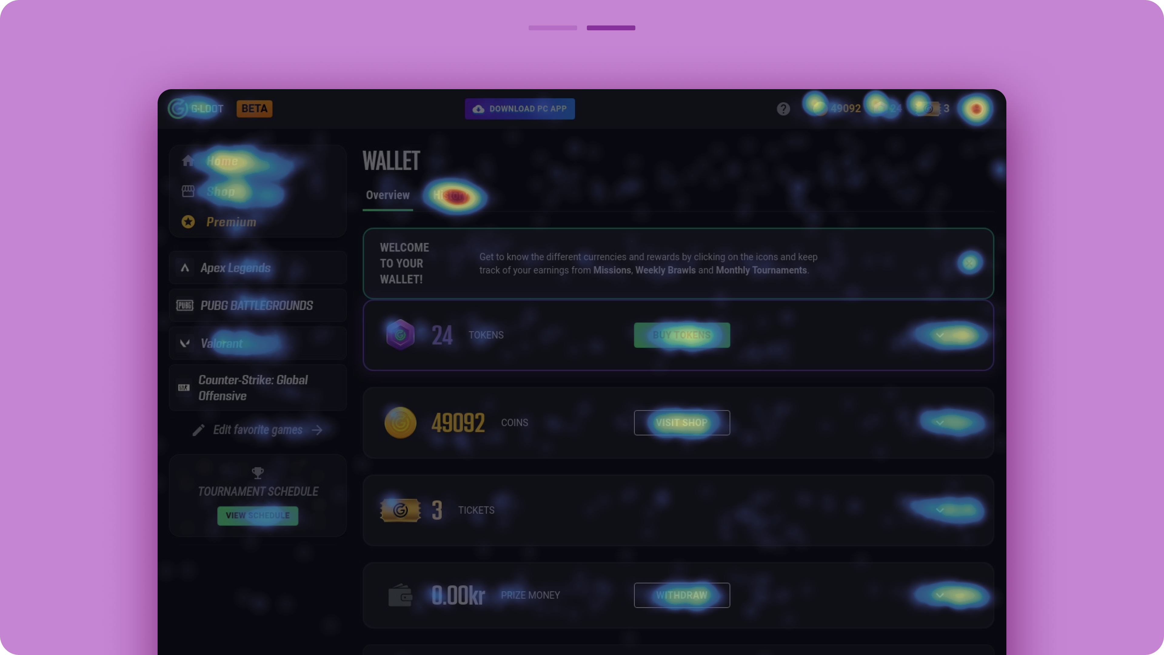
The currencies are now stacked in a horizontal layout, reducing the height of each currency card. This structure ensures that the cards remain visible across different screen sizes. The redesigned page welcomes new users with an introductory message, which can be dismissed afterward.
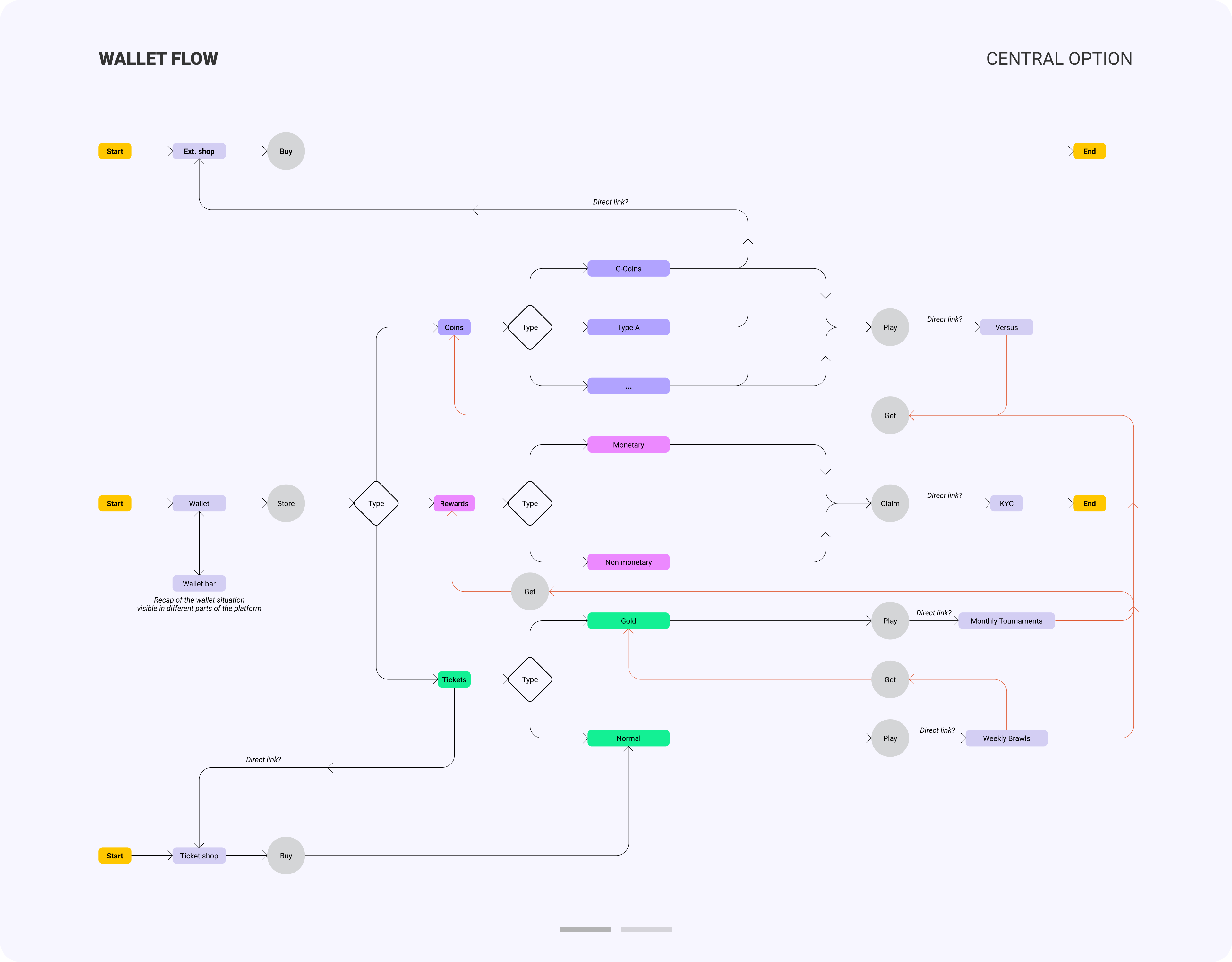
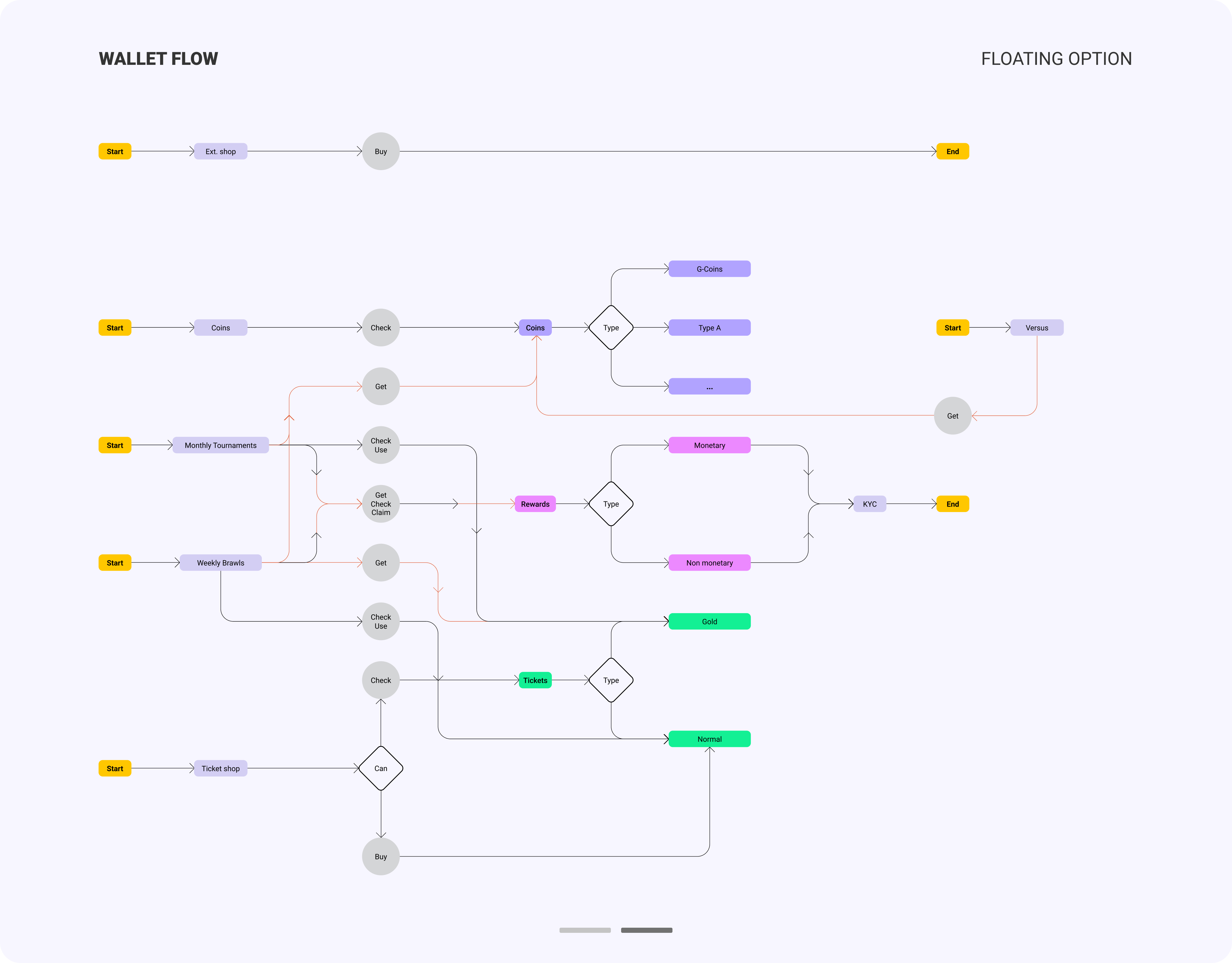
Additional information is embedded within specific dropdowns. Currency details are structured using a 'use' and 'get' approach, clearly explaining what each currency is and how users can earn and spend them.
Redesign strategy


The redesign reduced misclicks and helped users focus on key elements that provided valuable information about the currencies. Usability tests confirmed that the improvements made it easier for users to understand the platform's complex core loop and newly released features. The wallet became more than just a storage space, it evolved into a hub for user guidance.
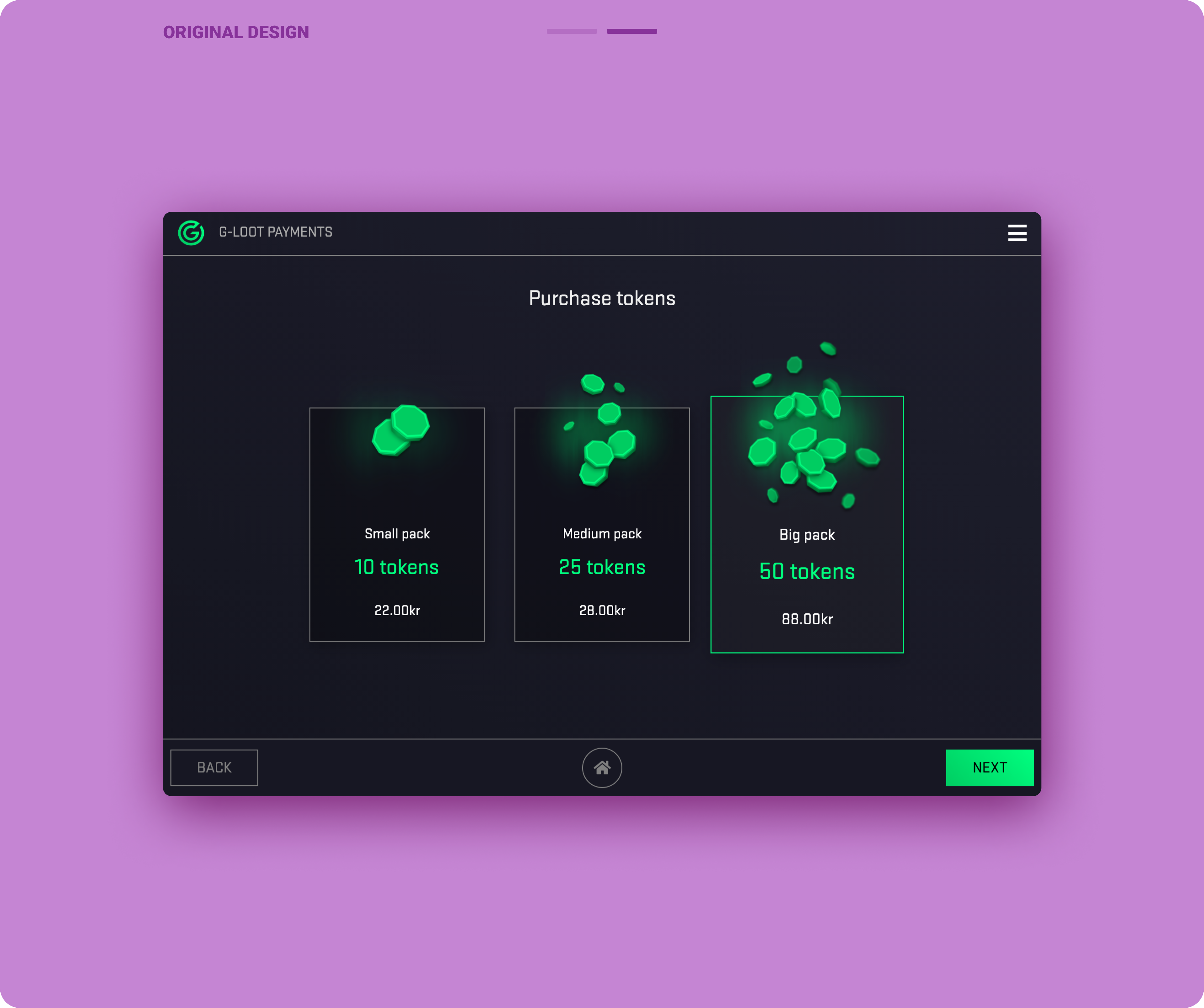
Previous designs
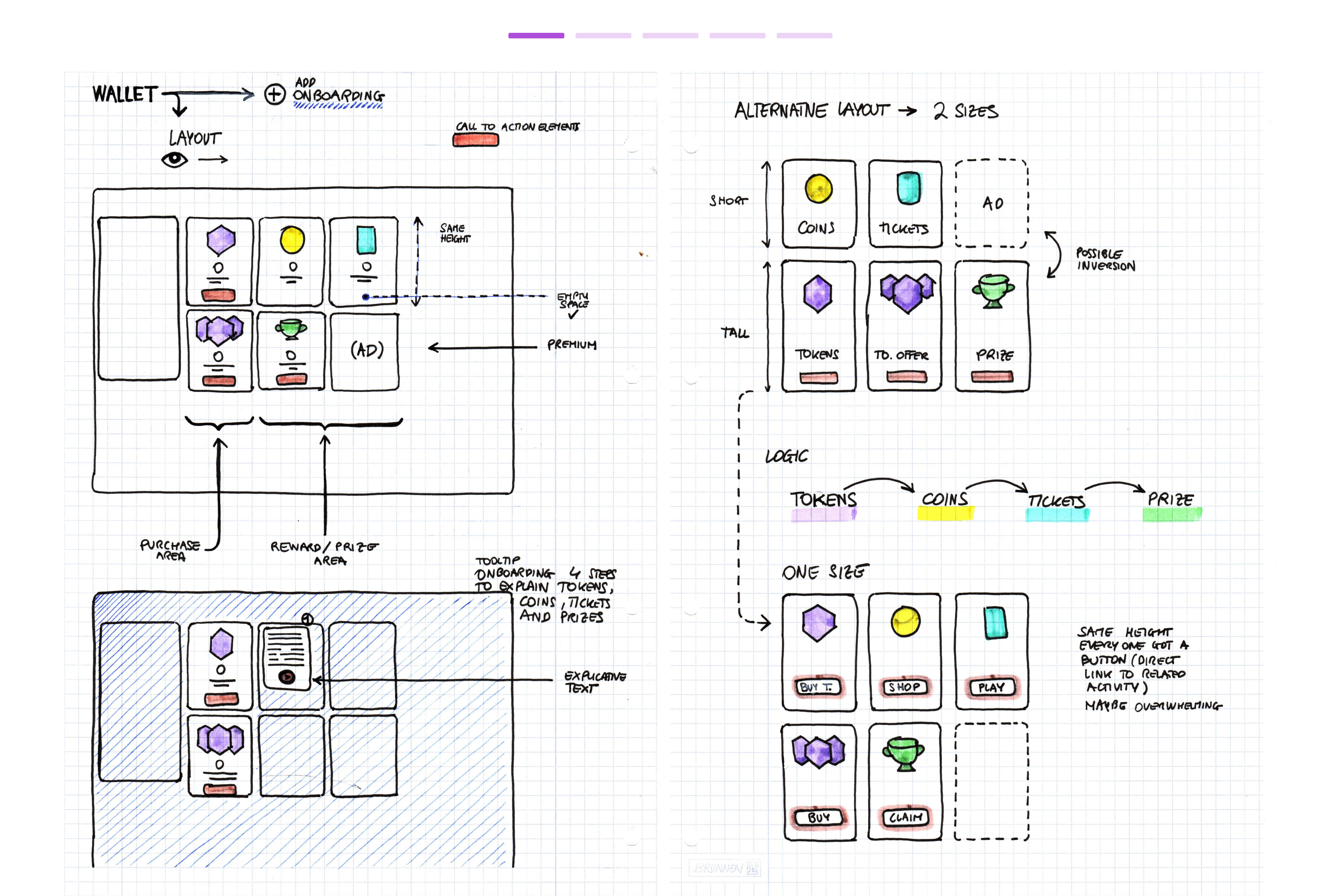
Development sketches


Heatmap comparison
Browse the gallery to view wireframe samples