Sandbox
This project aimed to redesign the main Sandbox interface and improve the user experience of sub-editors like the Level Explorer and Asset Browser. CryEngine Sandbox is a suite of tools that enables real-time creation, editing, and in-game preview of all aspects of a game.
Research & analysis / UX / UI / Prototype
2020 / 2021
Crytek is a Frankfurt-based video game developer and publisher known for creating first-person shooters (FPS) and game development technology.
CryEngine is Crytek’s proprietary game engine, used to develop their own games and licensed to other studios.
New design


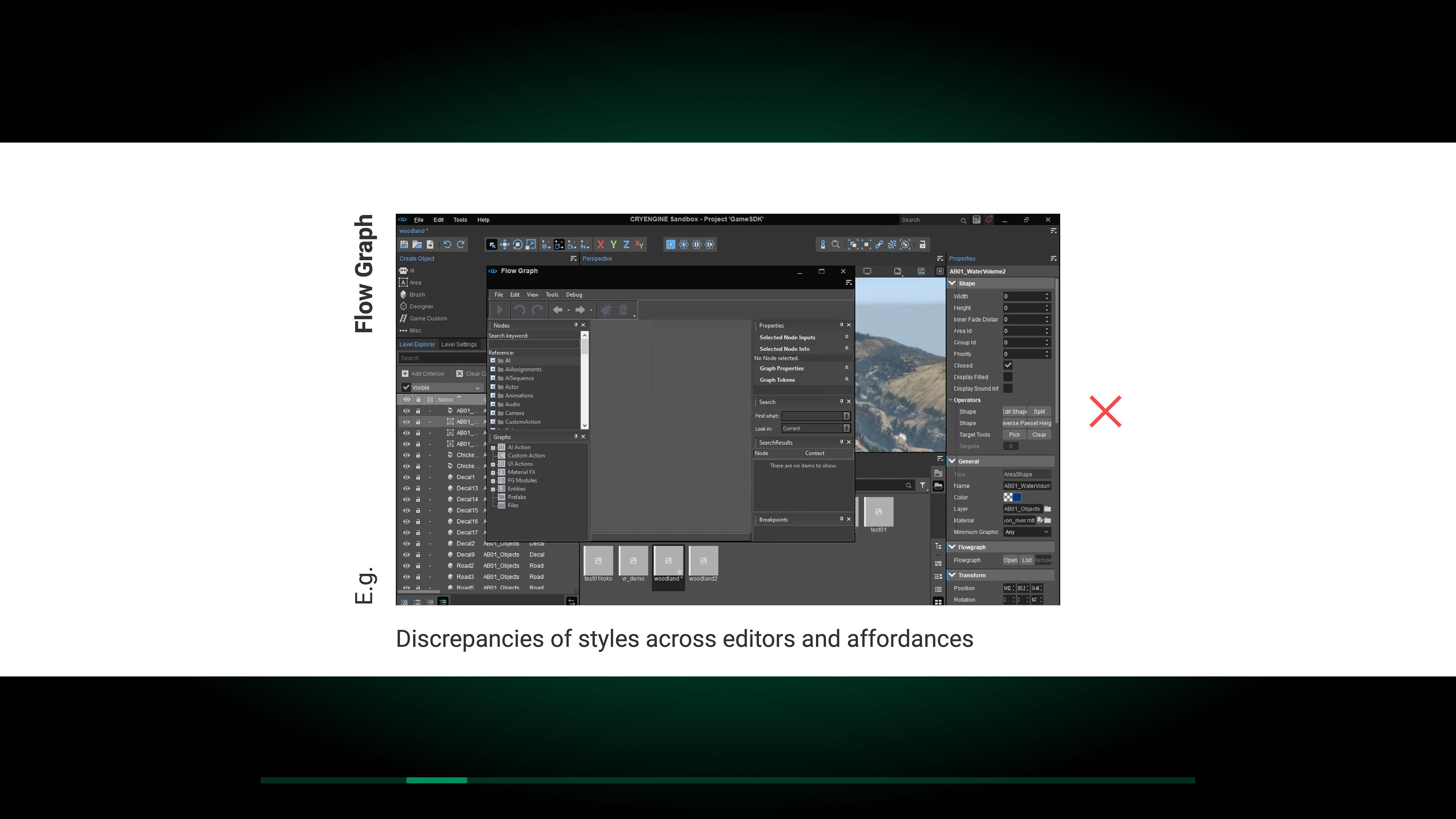
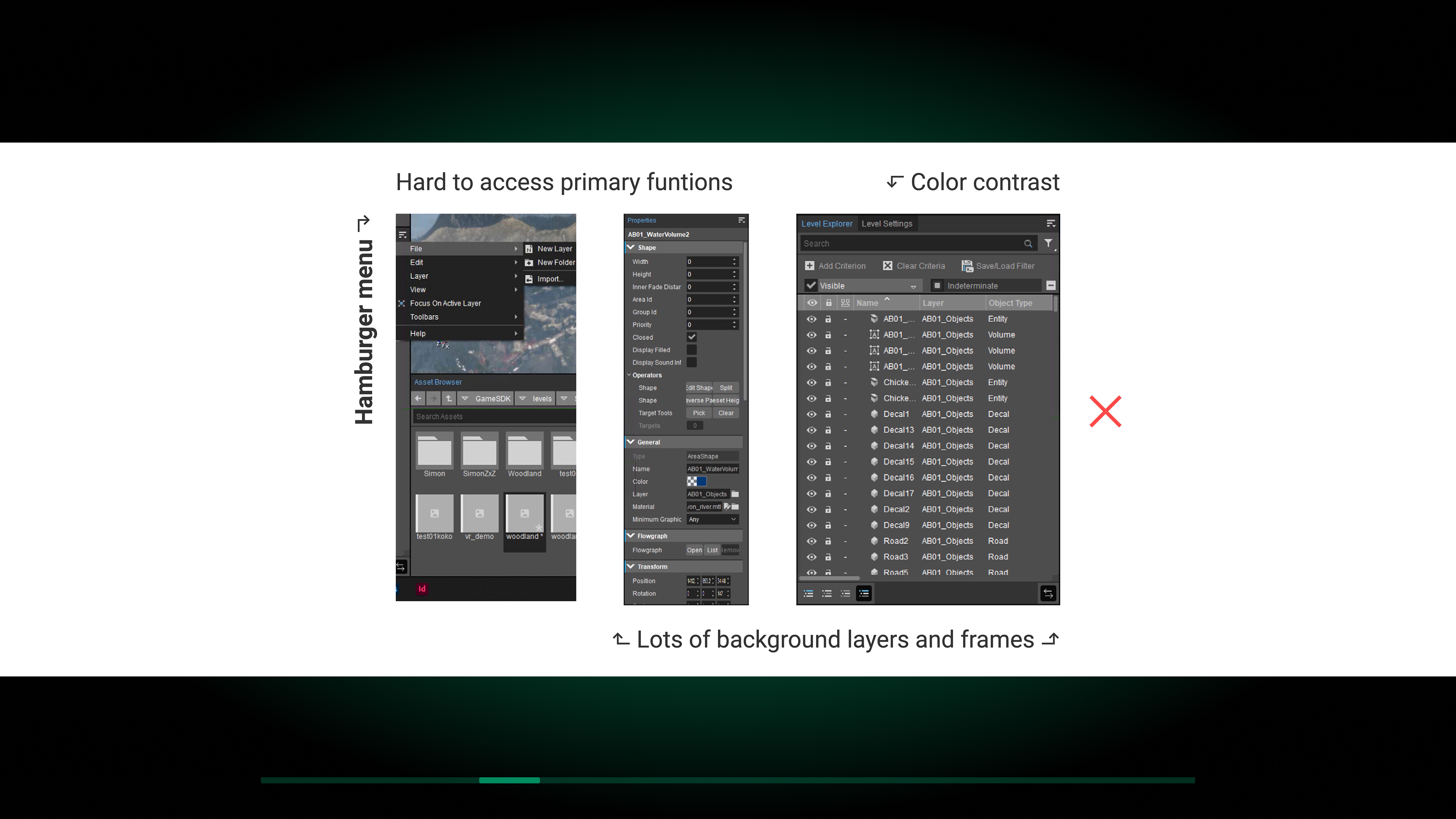
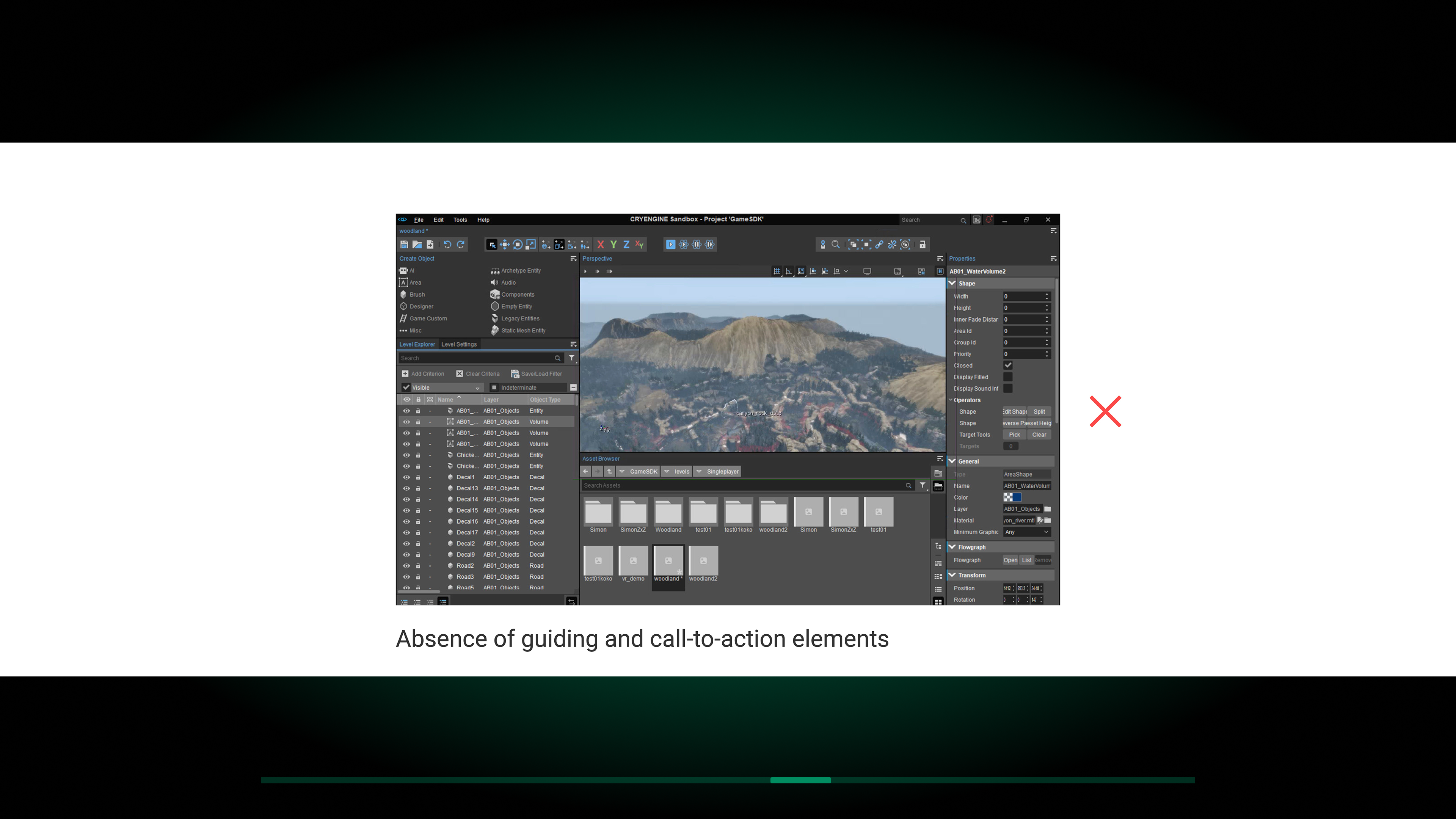
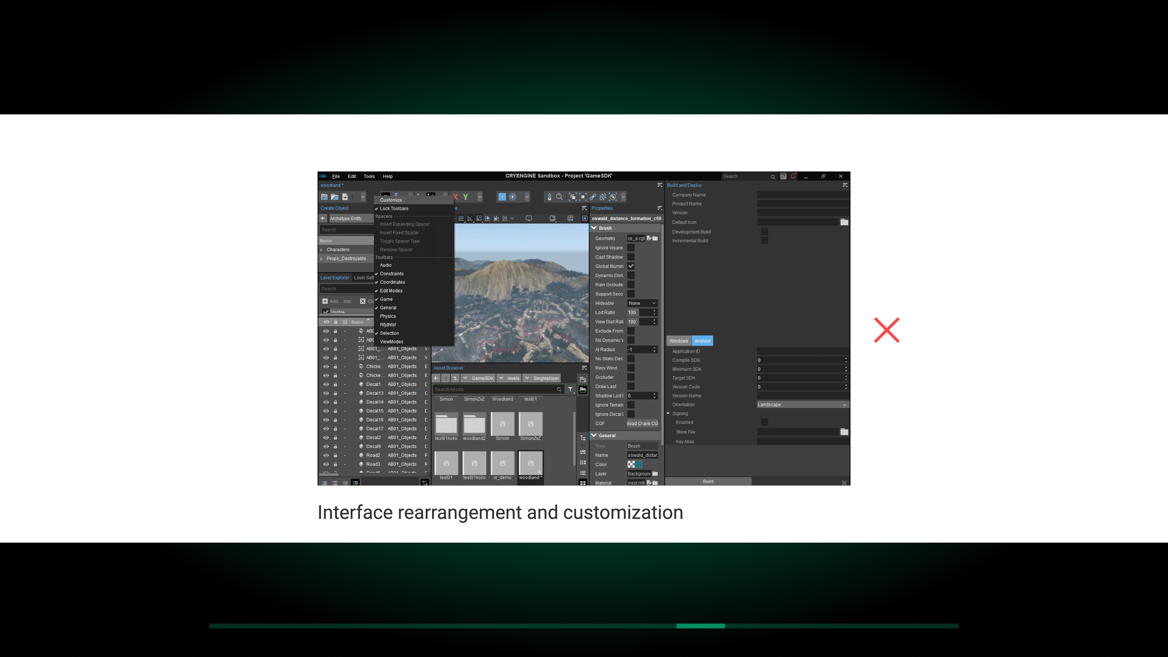
The problem :
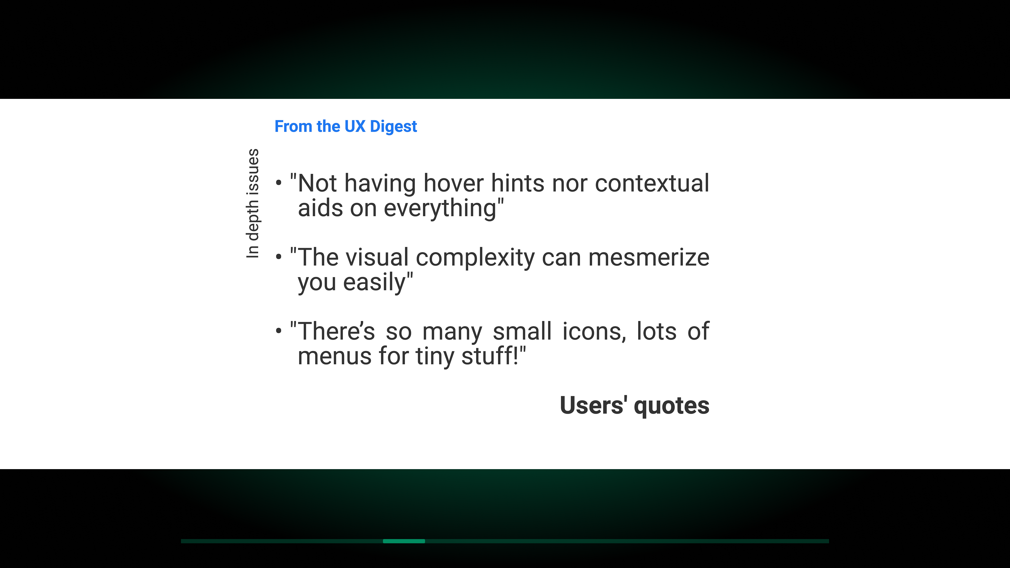
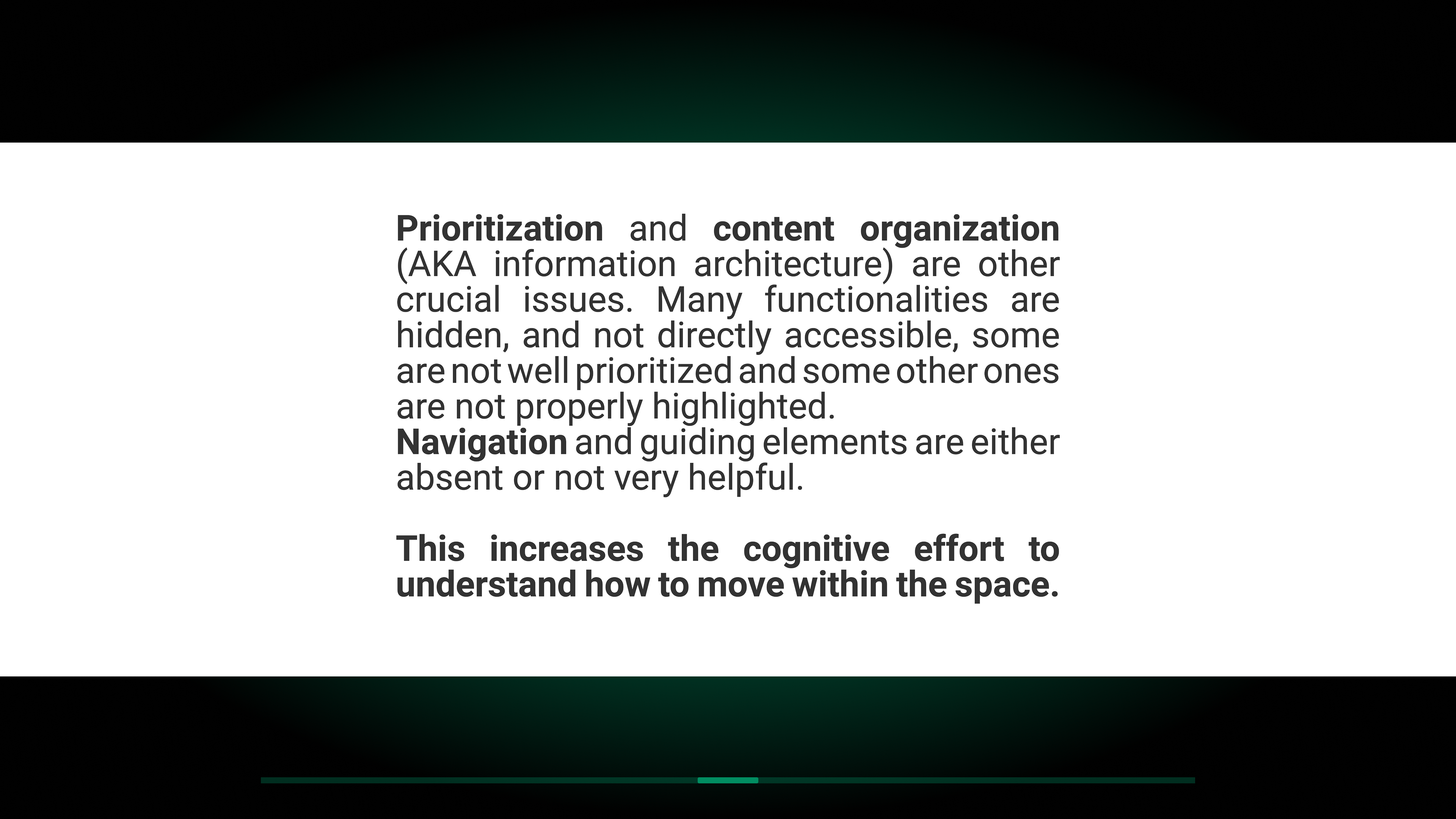
As highlighted by the research, Sandbox had several issues, including an overly complex and nested information architecture, unintuitive editor workflows, and a design system with multiple accessibility problems. The software’s interface significantly impacted the learning curve, making it difficult for new users to become comfortable without external onboarding or guidance from experienced users.
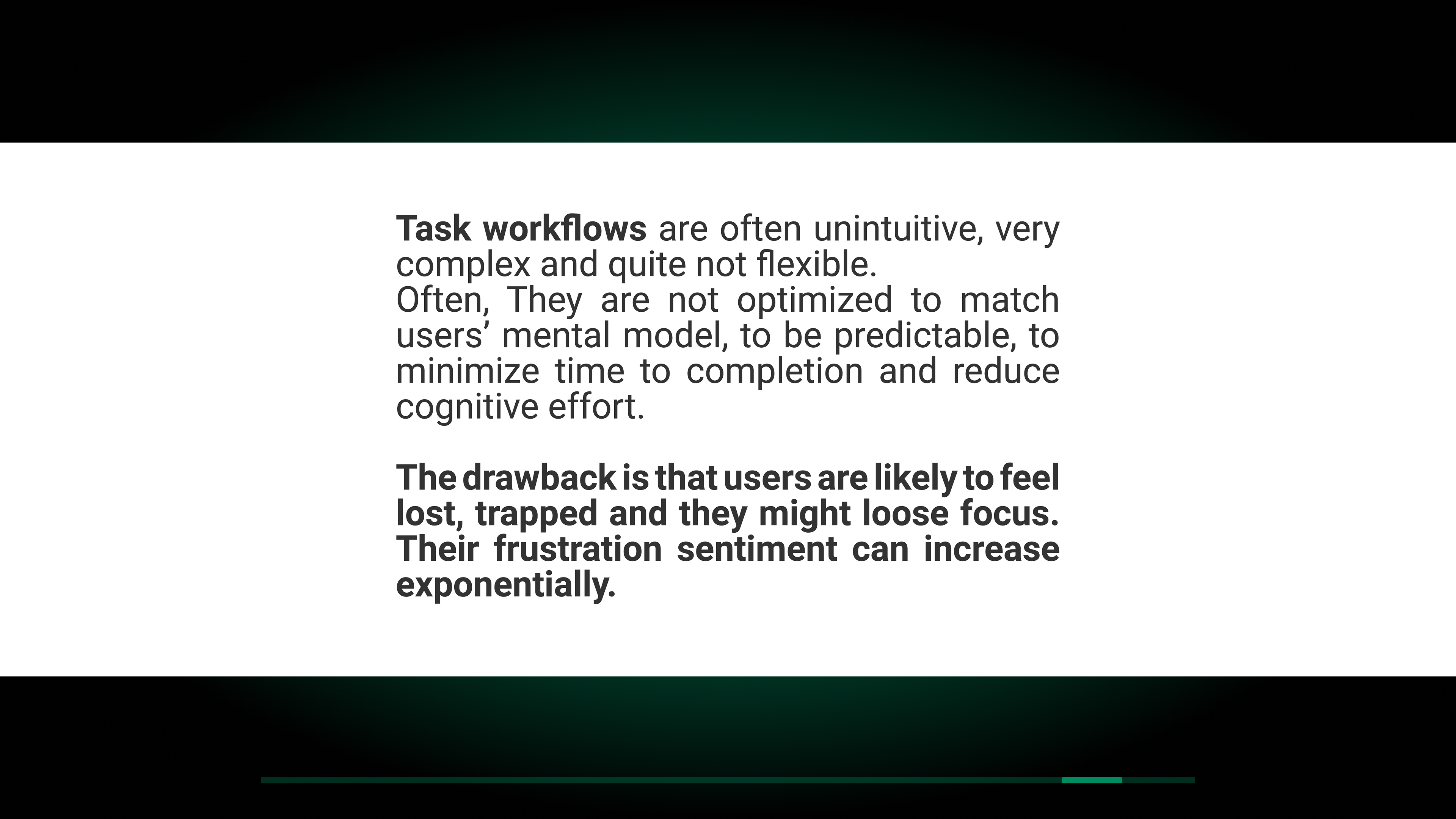
The software’s approach was heavily feature-oriented, allowing excessive user customisation to the point where the interface, actions, and toolbars prioritised flexibility over a goal-oriented workflow. This hindered the onboarding process and the execution of core tasks within the different editors.
The software’s approach was heavily feature-oriented, allowing excessive user customisation to the point where the interface, actions, and toolbars prioritised flexibility over a goal-oriented workflow. This hindered the onboarding process and the execution of core tasks within the different editors.
Browse the gallery to explore the research findings, in collaboration with Lead Researcher Alex Card


The interface redesign was driven by several key improvements:
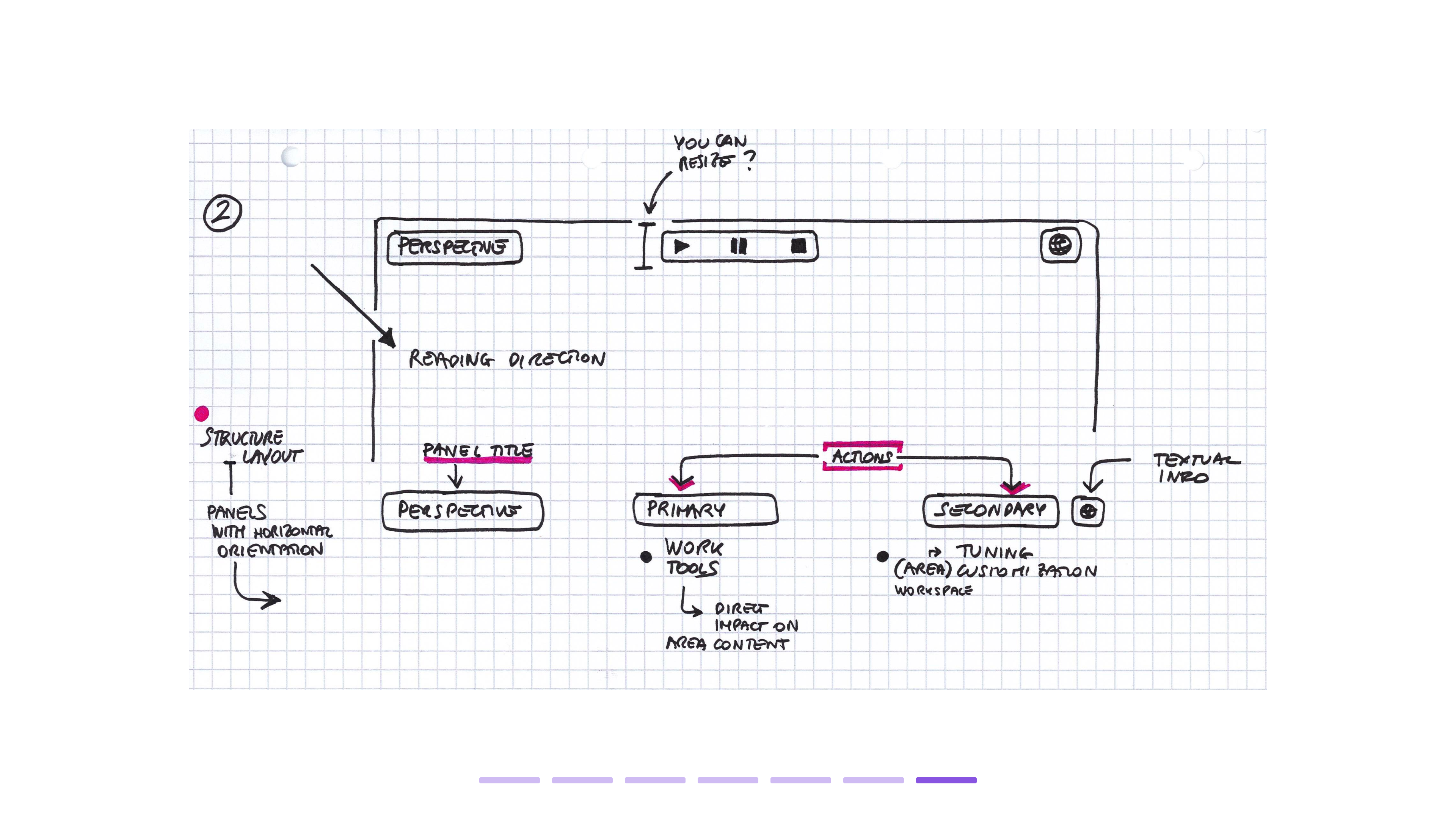
- Reorganised information architecture: Elements were reprioritised between primary and secondary areas for a more intuitive structure.
-
Enhanced user guidance: The learning curve for new users was reduced by making affordances more accessible and structured while limiting excessive interface customisation.
-
Optimised panel content: Unnecessary hierarchy levels were removed to maximise the content displayed within panels.
-
Streamlined workflows: Sub-editors were redesigned with a more intuitive and direct approach to simplify key workflows.
- Improved accessibility: Better colour contrast, fewer background layers, and semi-transparent overlays in the perspective view were introduced for a clearer and more user-friendly experience.
Browse the zoomed-in map


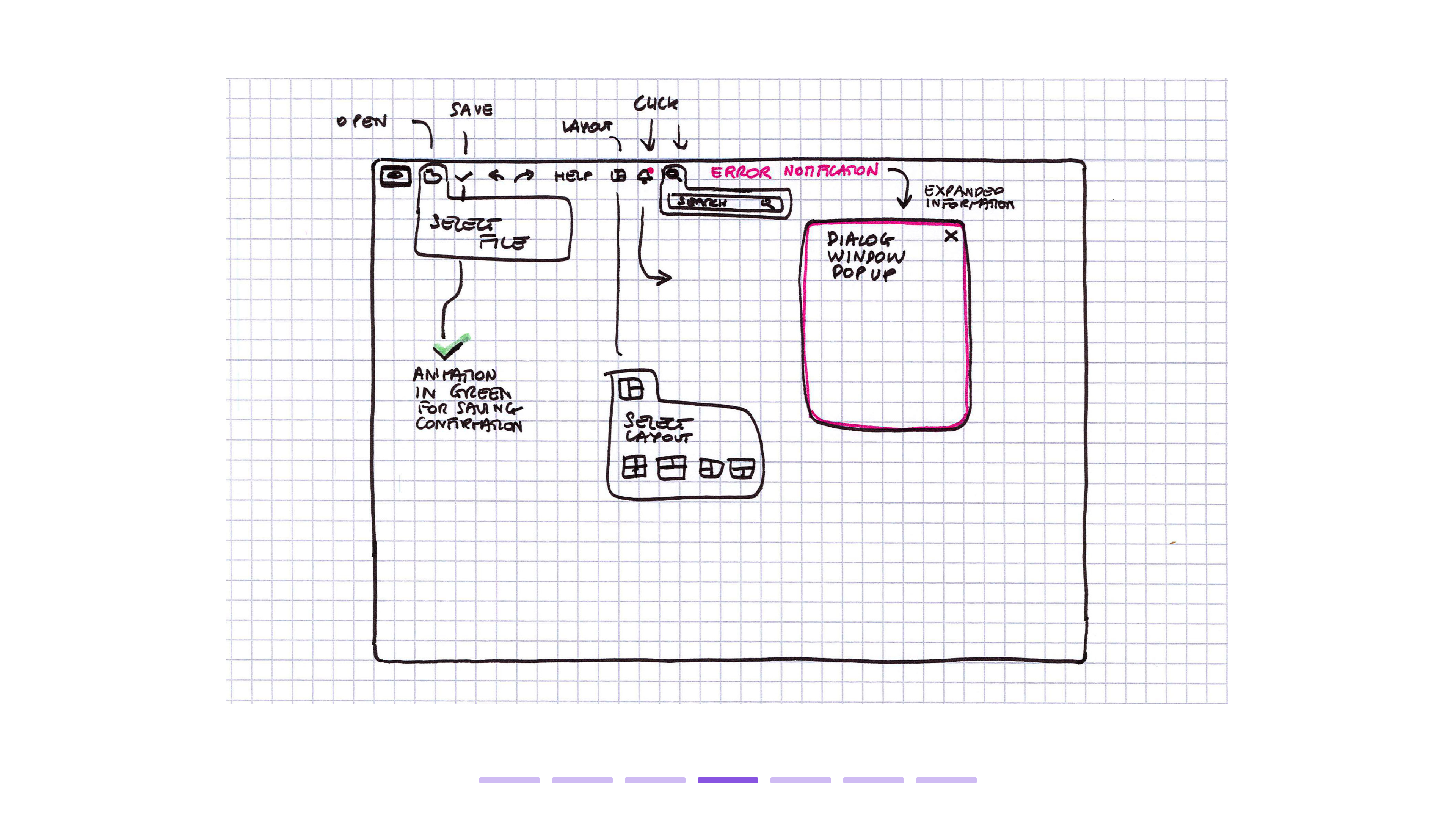
New interactions and animations were developed to provide additional guidance and make the interface more intuitive and engaging.
Main menu
Warning messages
Saving confirmation and notifications
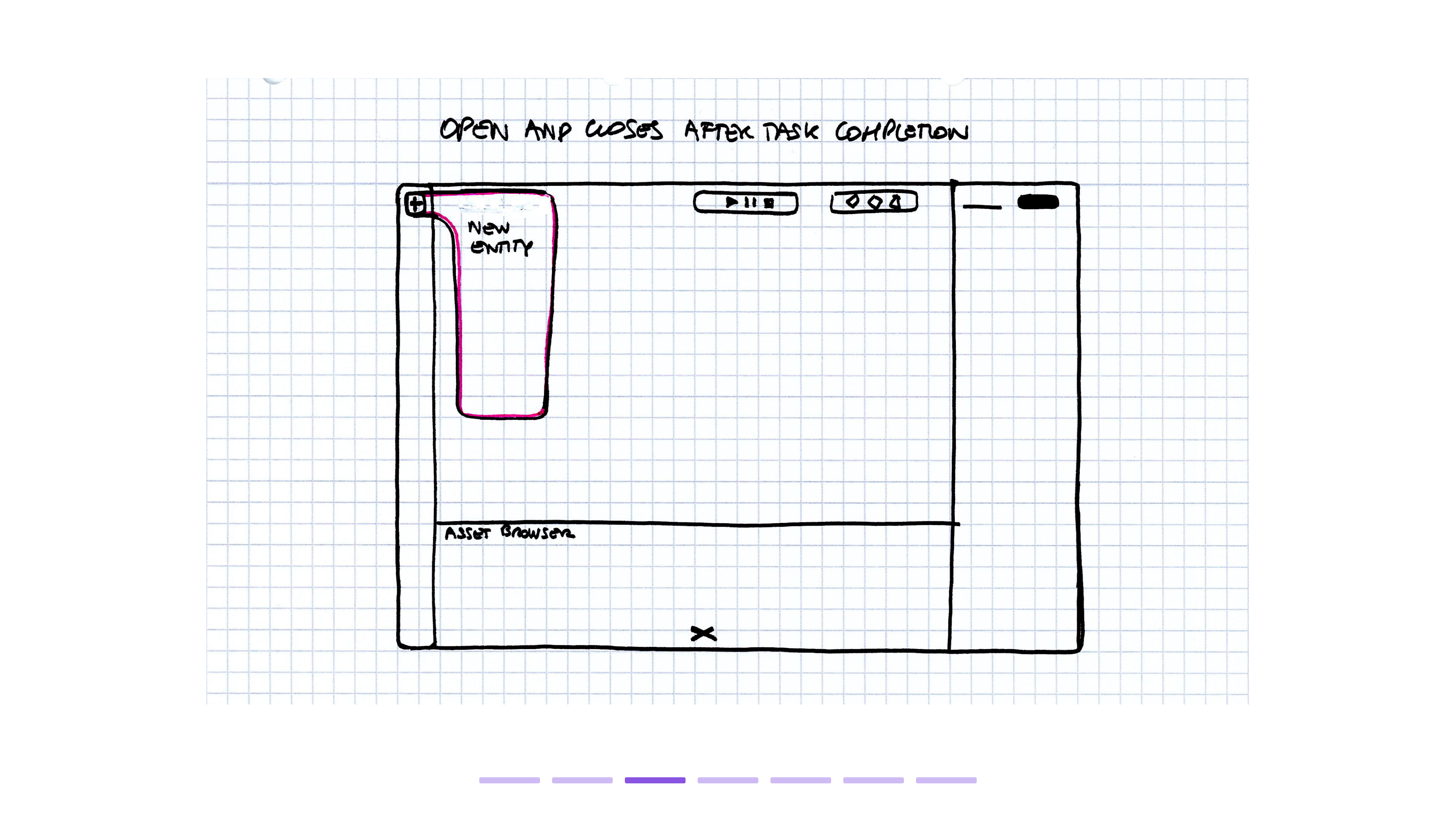
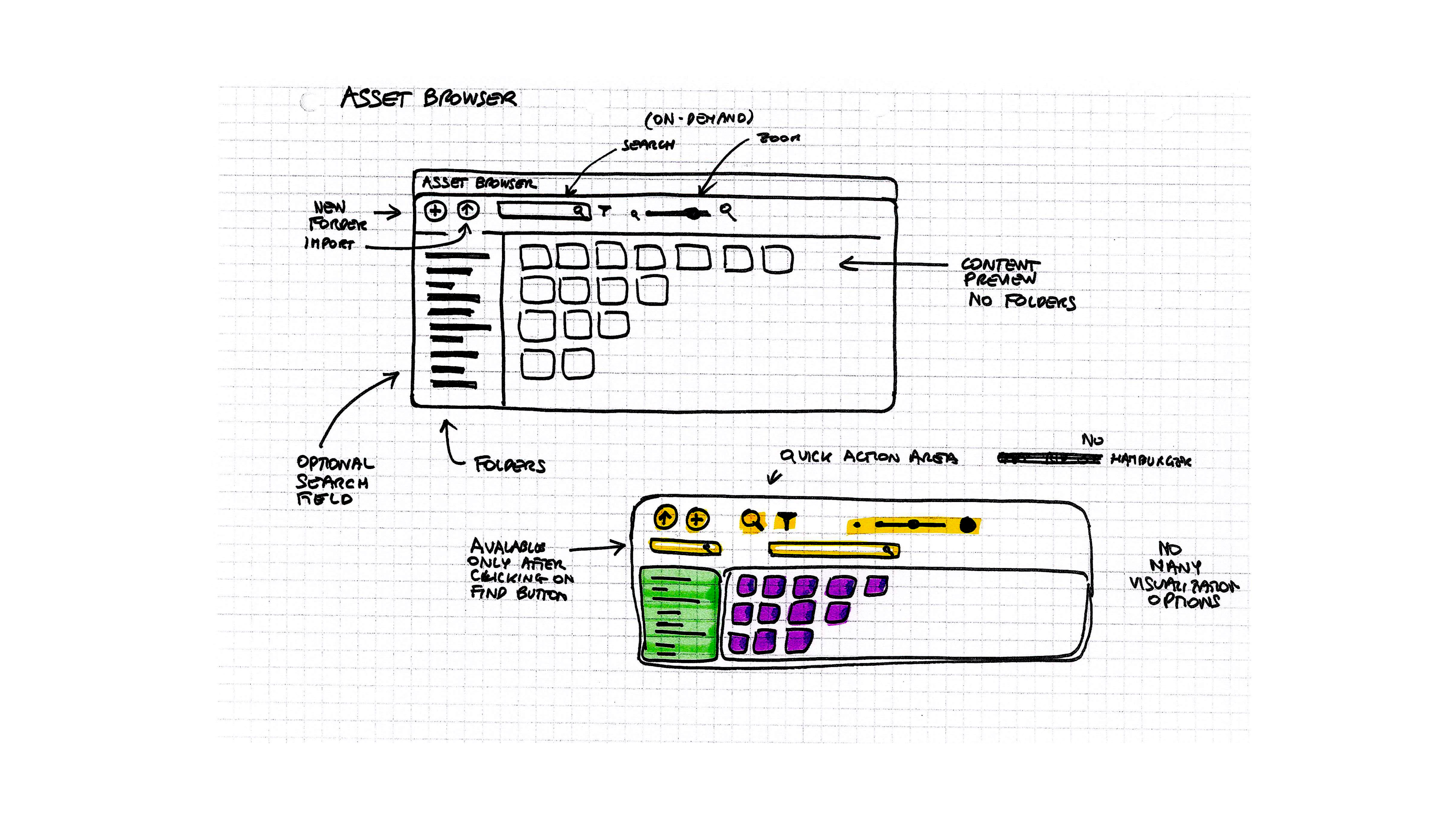
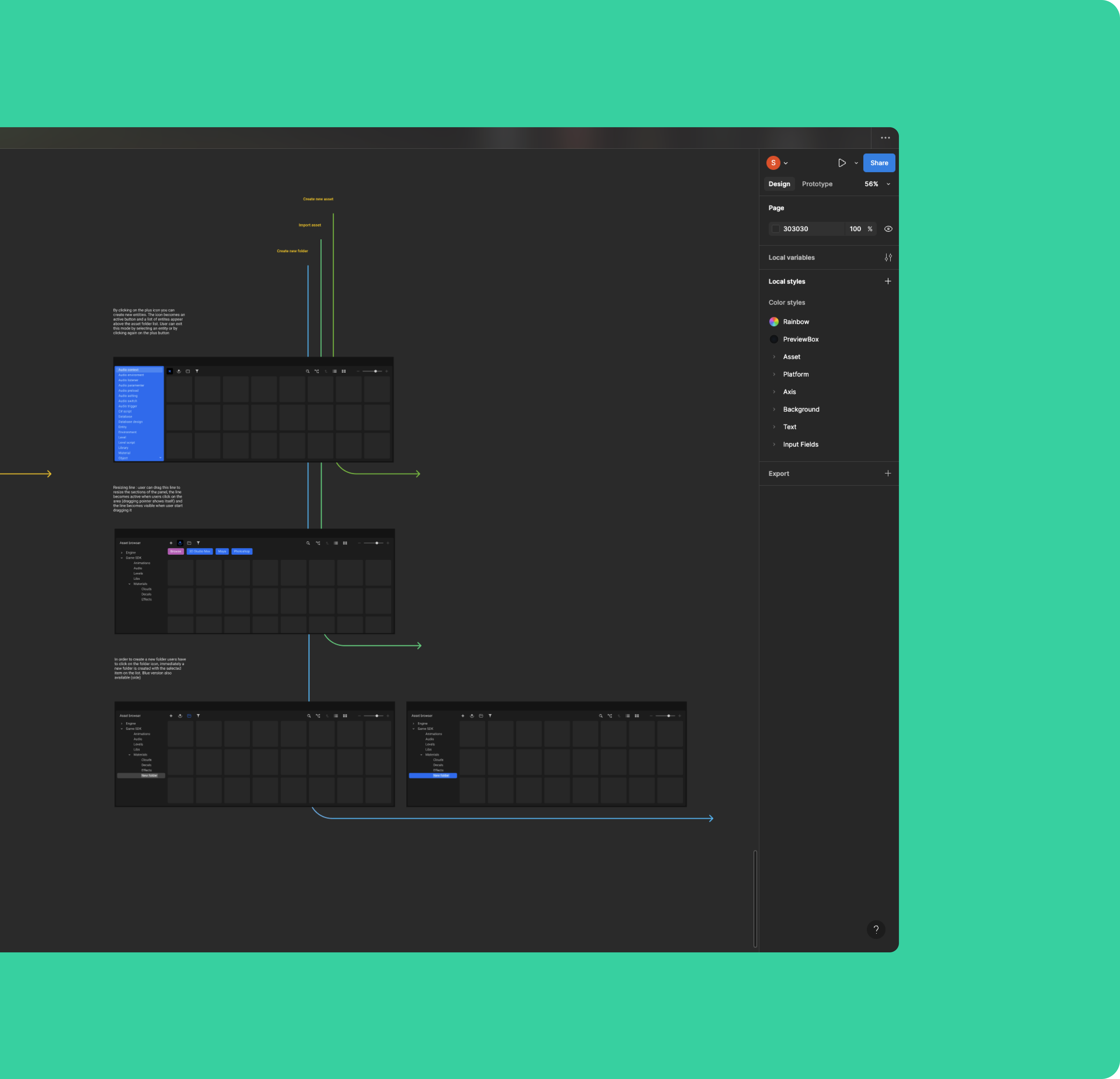
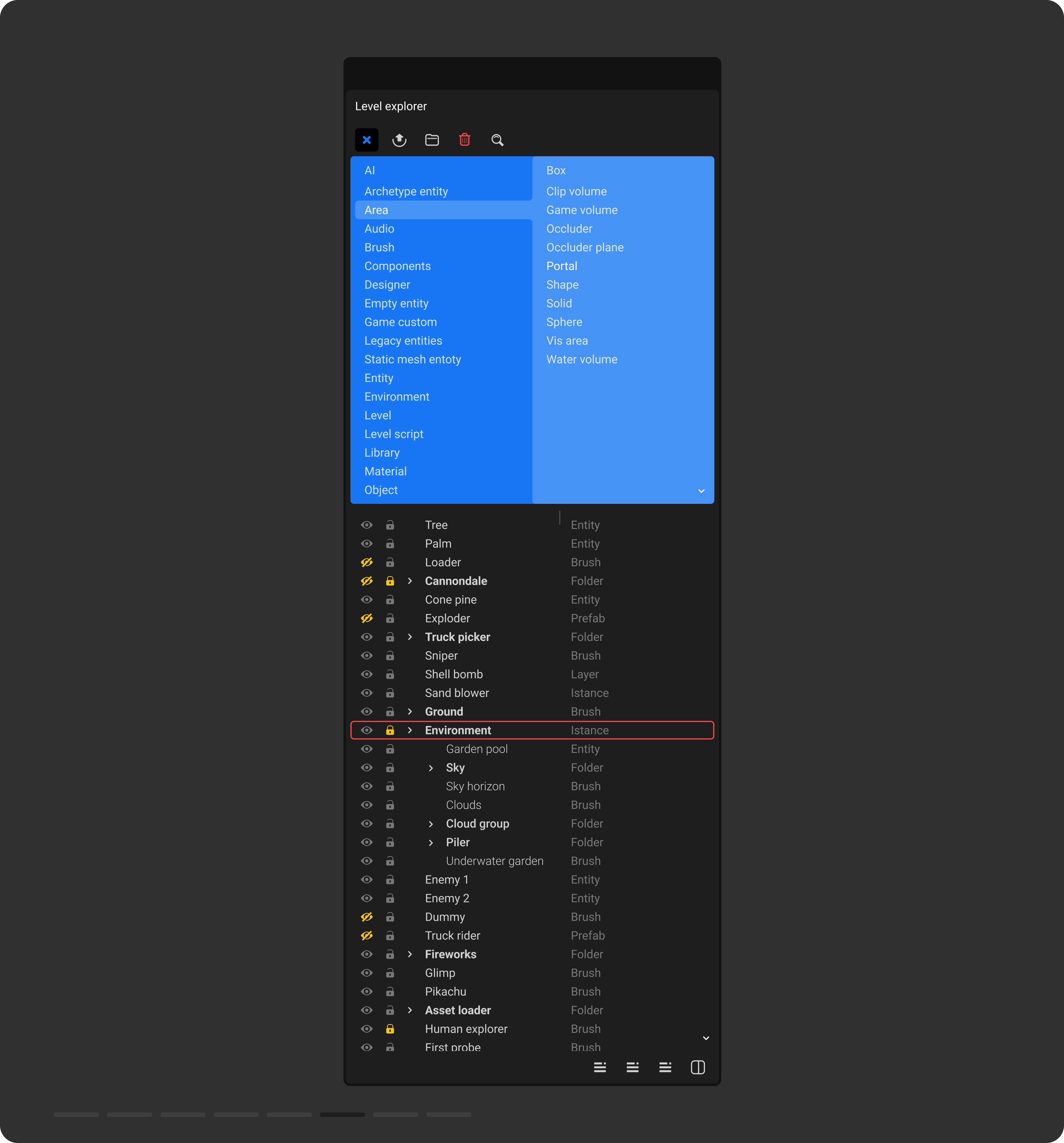
The information architecture for both the asset browser and the Level Explorer was redesigned to improve navigation through large asset databases, making it easier to add assets to projects.
A prominent plus button was added to open the core menus and new double-column menu was introduced, along with a toolbar featuring essential actions for importing, managing, and organising assets.
A new filtering functionality allows users to search for specific assets more efficiently.
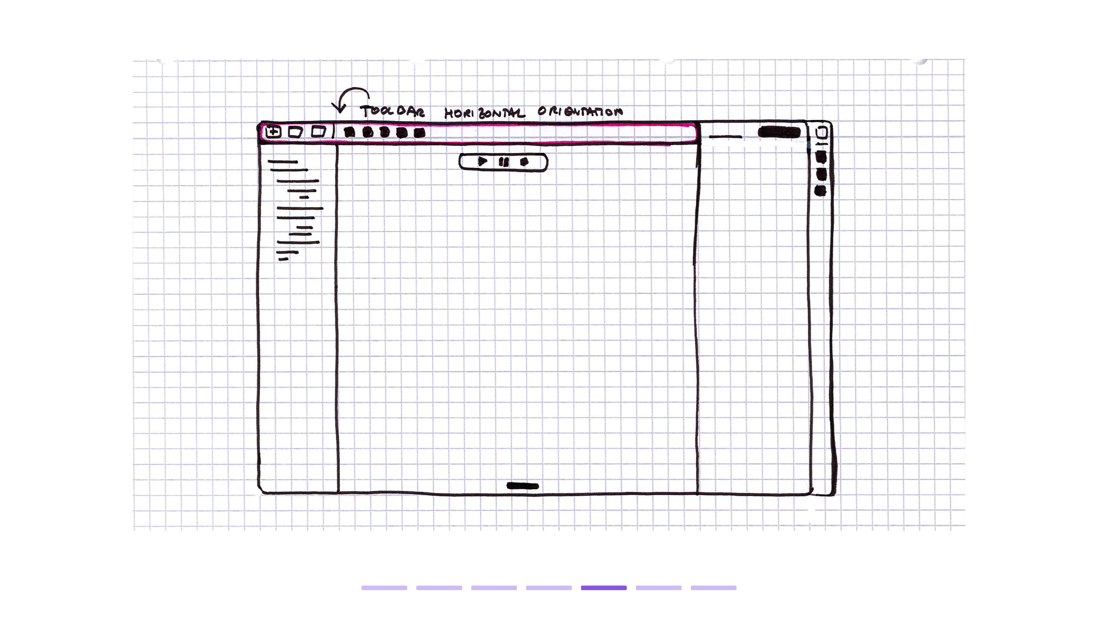
Given the high volume of assets used in game development and the common multi-screen setups of many users, where one screen is often dedicated to a specific editor, the Level Explorer now supports multiple database columns. This enhancement provides a better overview of all active elements without excessive scrolling or the need to open multiple overlapping Level Explorer windows.
A prominent plus button was added to open the core menus and new double-column menu was introduced, along with a toolbar featuring essential actions for importing, managing, and organising assets.
A new filtering functionality allows users to search for specific assets more efficiently.
Given the high volume of assets used in game development and the common multi-screen setups of many users, where one screen is often dedicated to a specific editor, the Level Explorer now supports multiple database columns. This enhancement provides a better overview of all active elements without excessive scrolling or the need to open multiple overlapping Level Explorer windows.
Browse the gallery to explore the new Asset Browser flow


Browse the gallery to view the new Level Explorer design


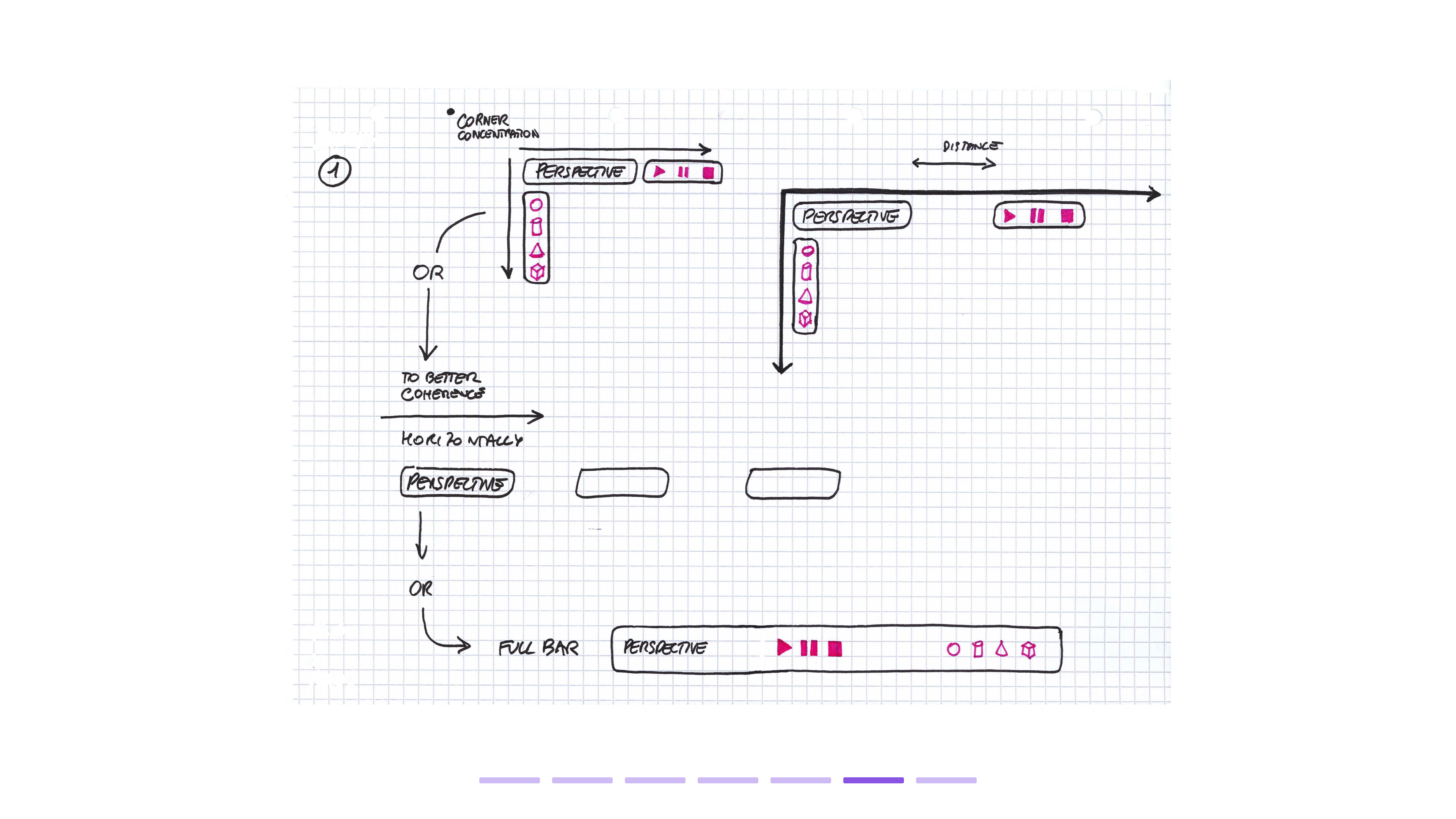
Development sketches