Payments
The project involved the redesign of the payment portal, with a special focus on the mobile experience. The goal was to streamline the purchase process and investigate the high rate of cart abandonment.
Research & analysis / UX / UI / Prototype
2022
G-Loot, later rebranded as Stryda, was a Stockholm-based esports company specializing in stats tracking, player identity, and competitions. It permanently ceased operations in 2023.
New design
The problem :
The research highlighted significant issues with dropout and cart abandonment. Further investigation revealed that these problems stemmed from the transition of the platform from a gambling company to a freemium esports model. Users were attempting to cheat or enter expired or fake credit card information to pay for subscriptions and coins, the main currency used on the platform. The two primary issues were card denials and multiple registered cards.

Other usability problems were identified, such as ineffective error messages, lack of field confirmations, and no option to go back if a transaction failed. Additionally, users were unable to edit their payment methods. There were also backend issues that caused the process to stall in some cases.
Watch the Add Payment flow
The solution :
Although the primary issue of cart abandonment was largely due to the transitional period, where users had to adjust to the core change in the platform’s business model, improvements were suggested for the other issues.
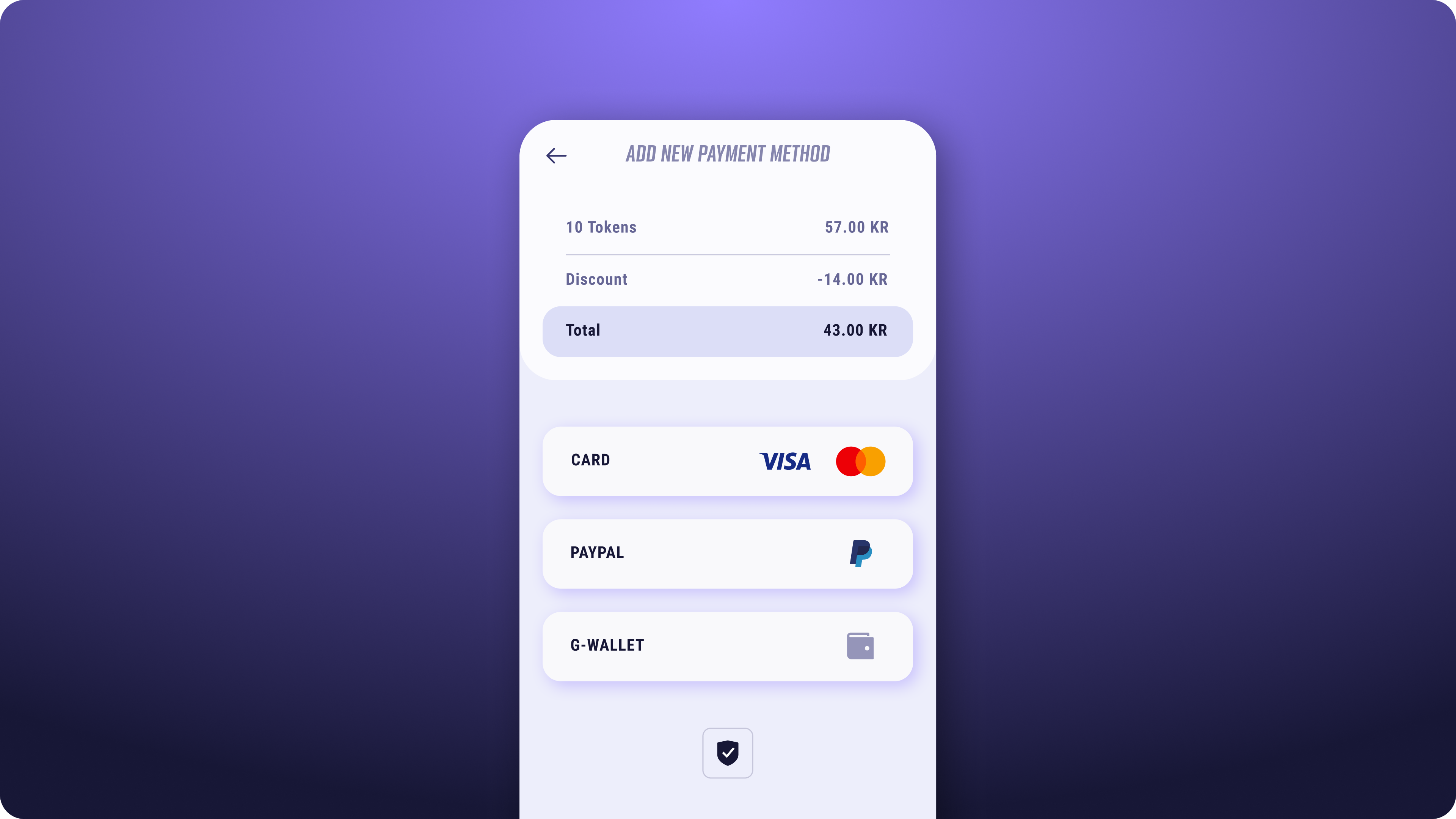
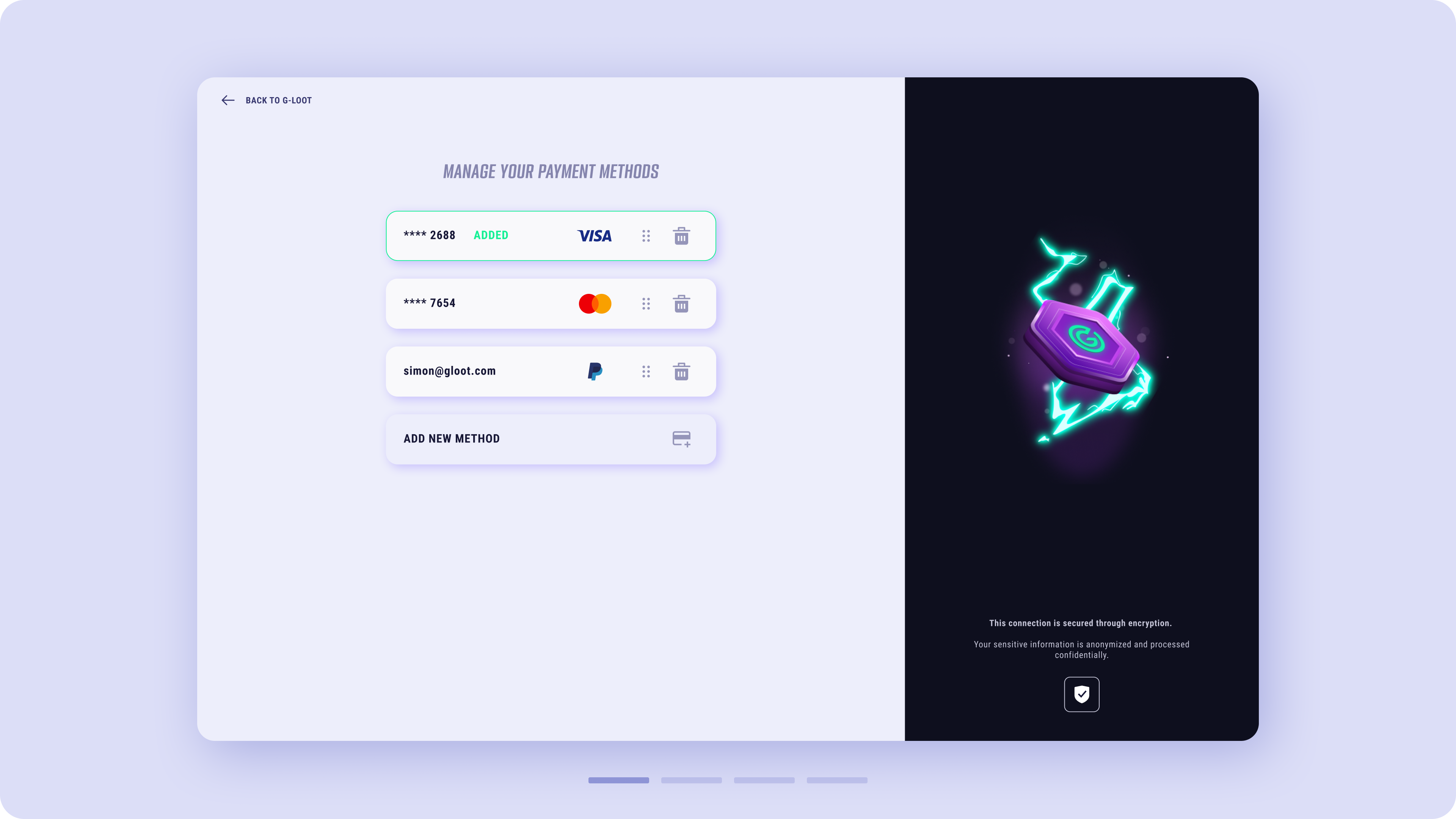
A new payment edit functionality was introduced, limiting the number of payment methods to a maximum of three. Error messages were improved to provide clearer guidance.
Previous research showed that a light mode design provided users with a greater sense of security and reassurance when making payments. As a result, a light theme, in contrast to the G-Loot platform’s dark theme, was adopted for the payment portal.
Desktop interface

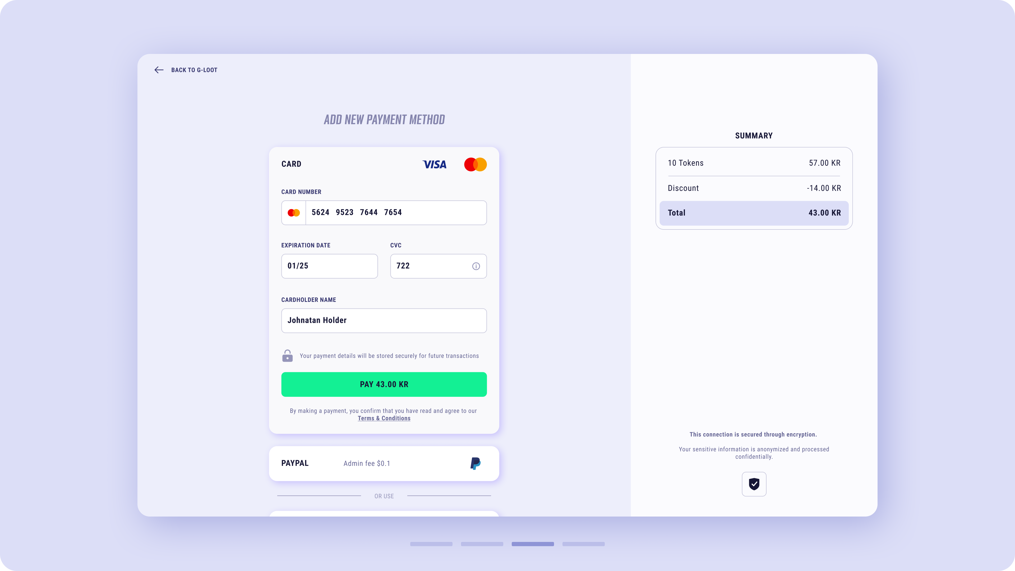
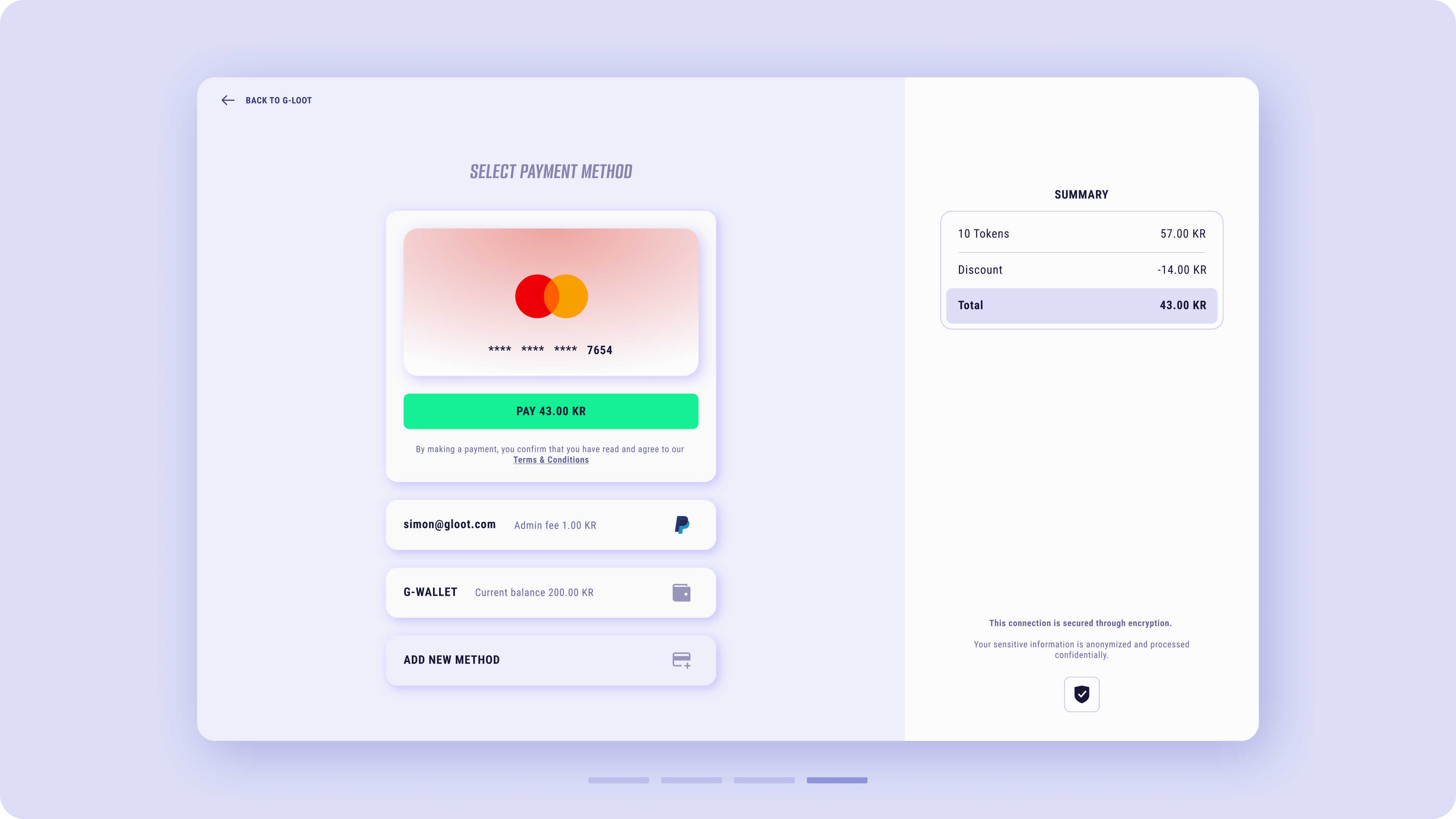
Additional trust-building elements, such as a shield icon, were introduced. New strategies and animations for the mobile version were developed to prioritise task areas while ensuring the purchase amount remains visible at every stage of the process.
Watch the Select Payment flow