Filtering Functionality
Designing a scalable filtering experience for complex healthcare analytics.
Filtering is one of the most critical interactions within Encare’s analytics platform. It allows clinicians to explore compliance and outcome data across hospitals, patient populations, procedures and protocols. The filtering system expanded significantly, introducing new dimensions and increasingly complex user scenarios. The challenge was to redesign the experience so users could build sophisticated queries without increasing cognitive load.
Product Design / UX Research / Information Architecture / Prototyping / User testing
2024
Encare is a HealthTech company based in Stockholm, specializing in the development of cloud-based solutions to enhance surgical care.
Previous filtering ecosystem
The challenge:
The existing filtering experience had grown organically over time. As additional analytical capabilities were introduced, users faced several challenges:
- Understanding which filters were available
- Remembering previously applied selections
- Navigating large sets of filtering options
- Building advanced queries efficiently
- Maintaining context while exploring data
Rather than adding more controls, the objective was to rethink how users interacted with filters altogether.
Understanding the problem:
Through discussions with clinicians, product stakeholders and internal teams, several recurring issues emerged:
- Cognitive overload: The number of available filters made the interface increasingly difficult to scan and understand.
-
Poor discoverability: Users often knew the data they wanted to analyse but struggled to locate the appropriate filtering options.
-
Inconsistent behaviour: Similar filters behaved differently depending on context, creating uncertainty and reducing user confidence.
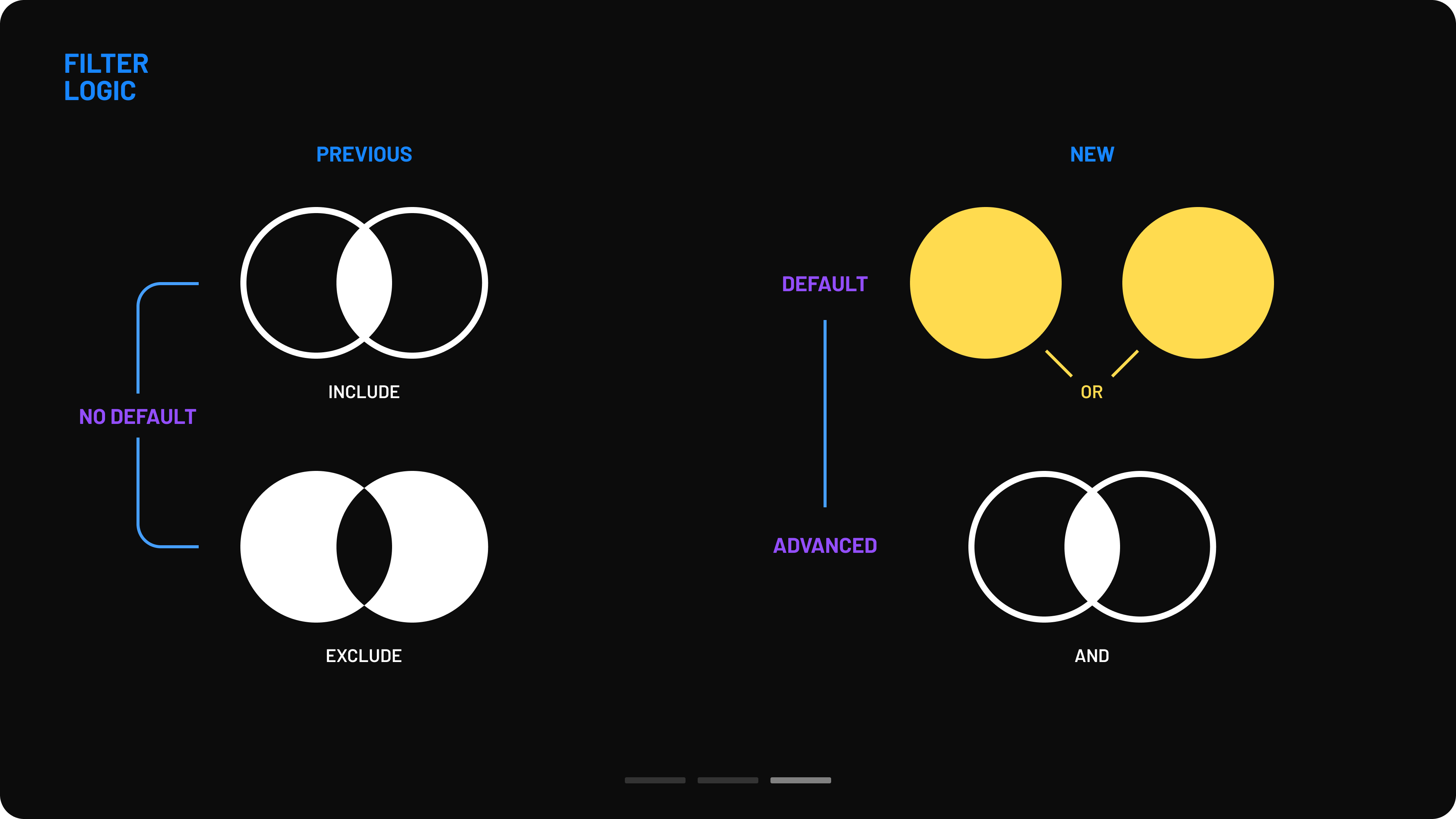
- Ineffective filtering logic: The logic behind filter combinations was leading user into invalid data results
- Limited scalability: The existing solution worked for current requirements but would become increasingly difficult to extend as the product continued to grow.
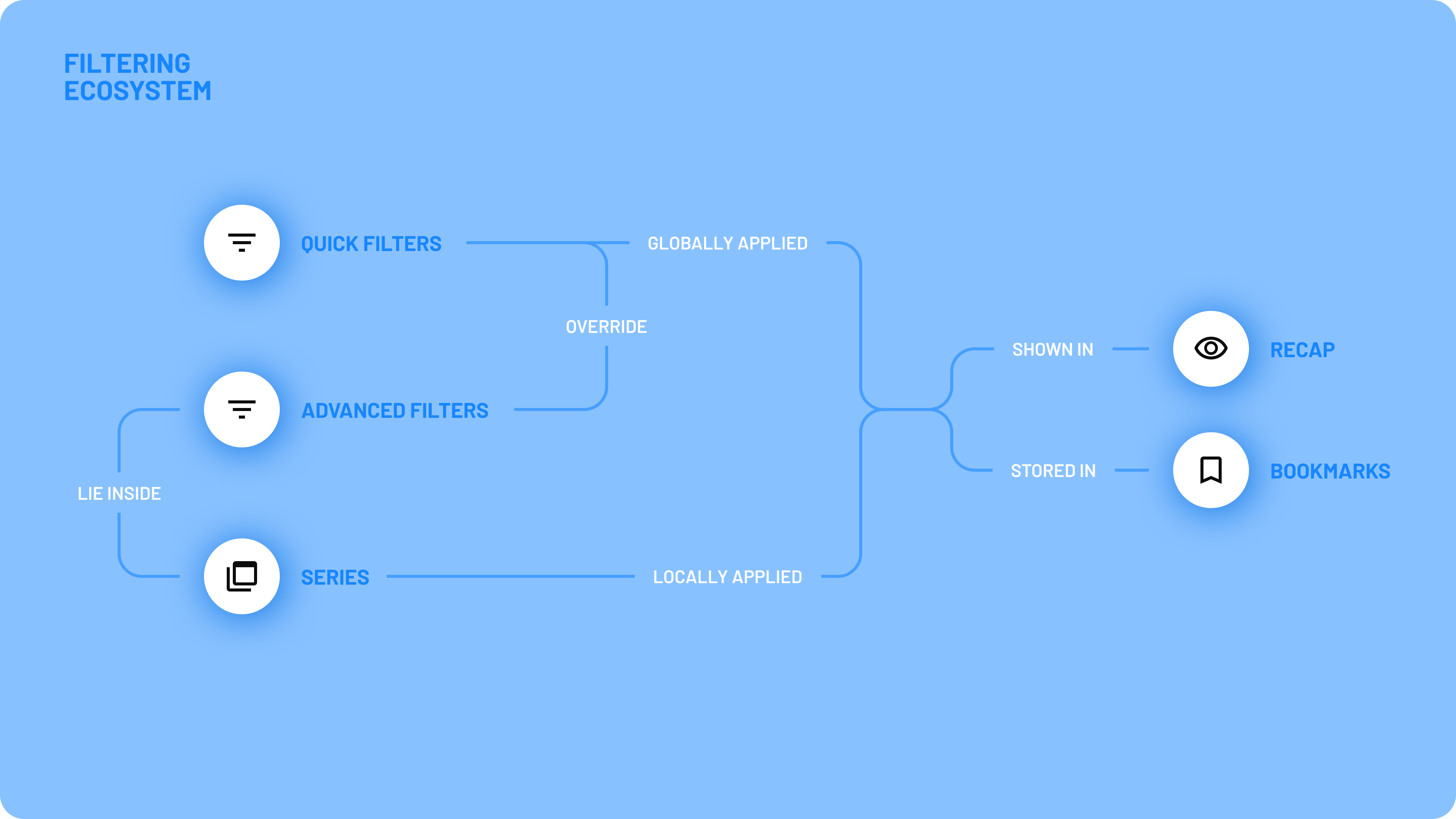
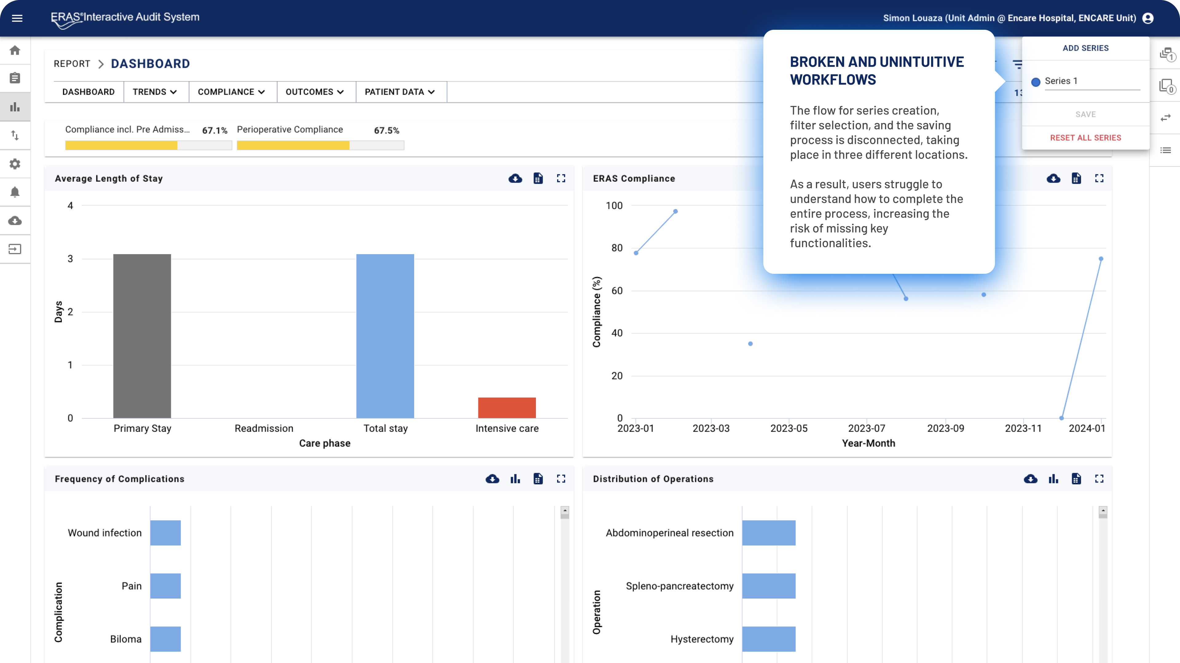
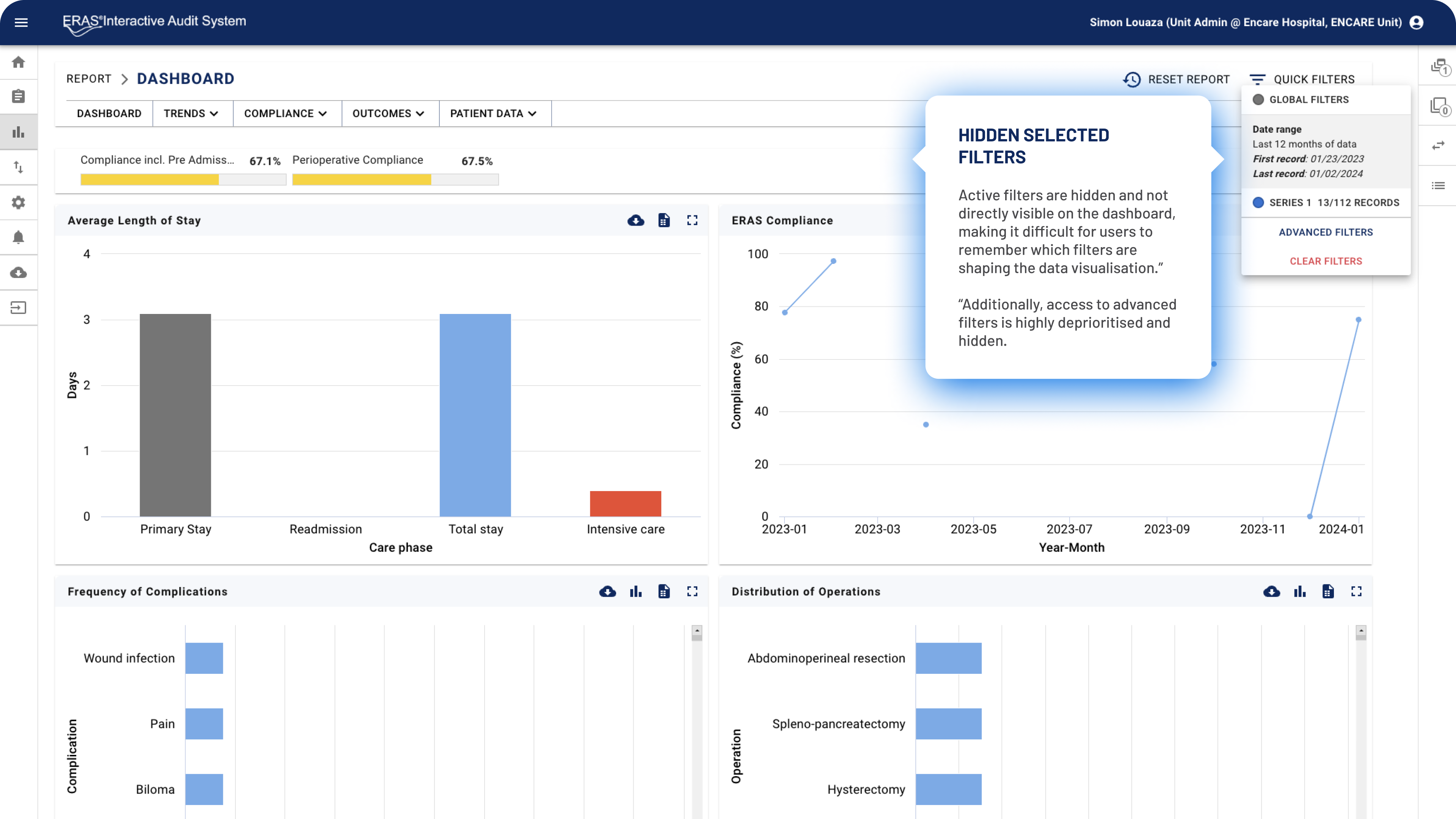
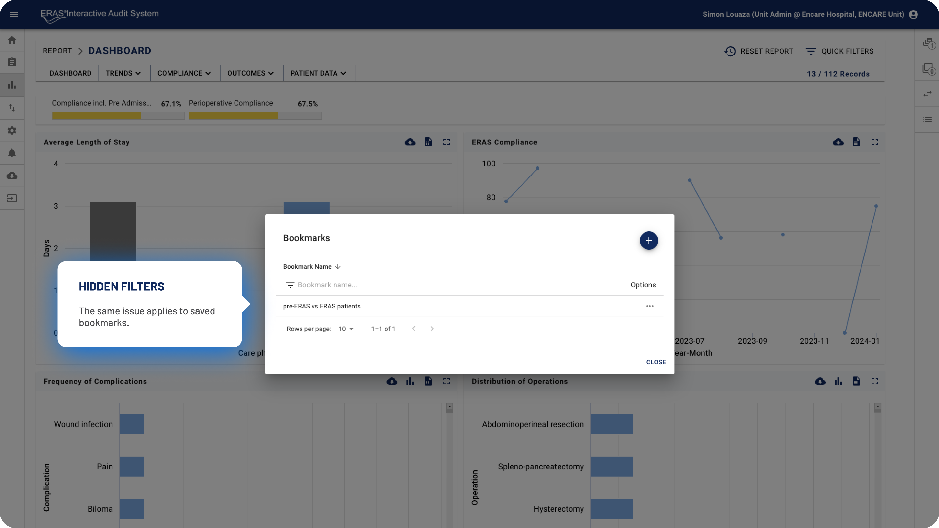
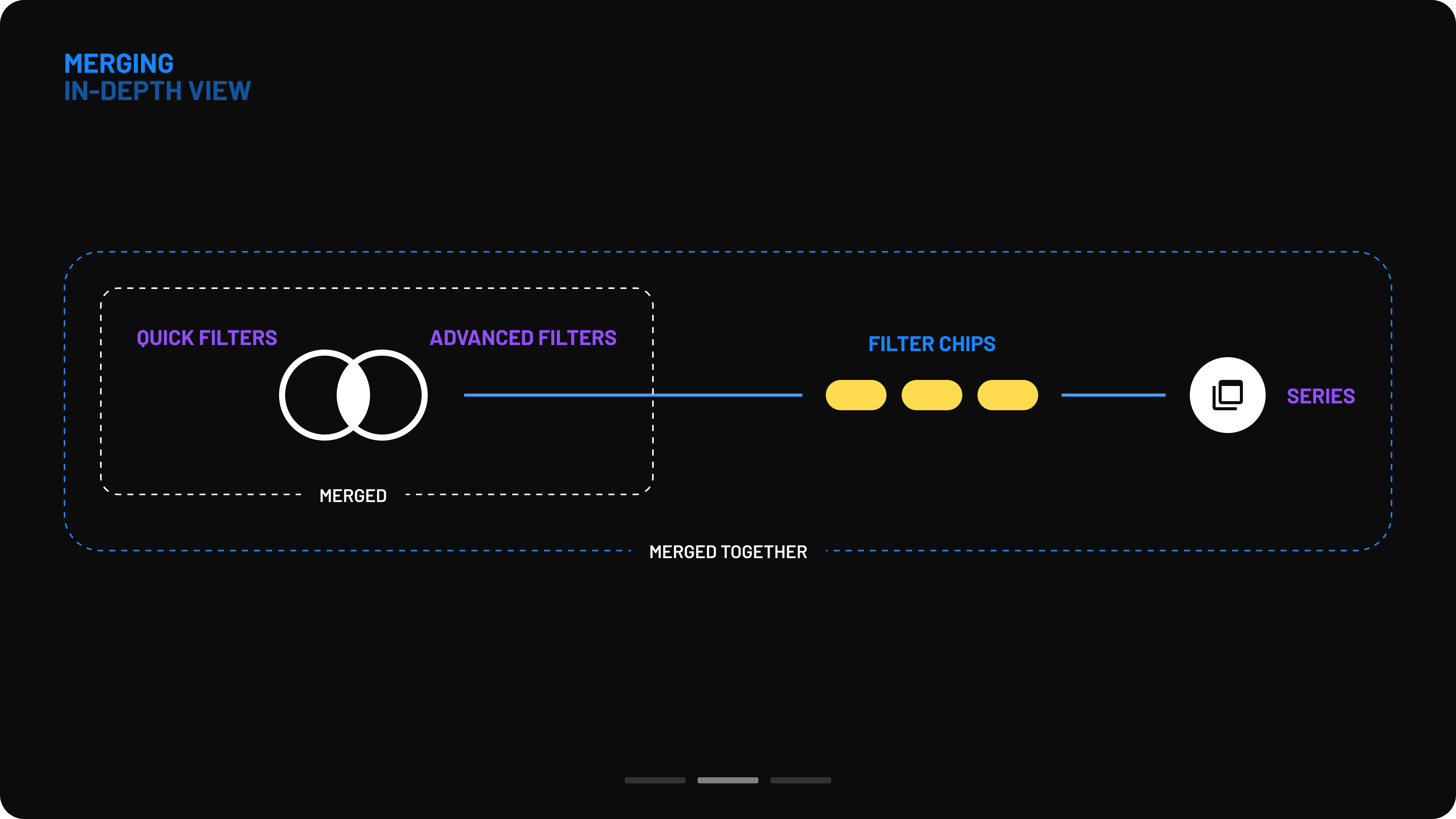
The previous filtering ecosystem consisted of multiple components that were part of a shared flow but scattered across different areas of the interface. This made it extremely difficult for users to locate all elements, understand their connections, and effectively use the filtering functionality.
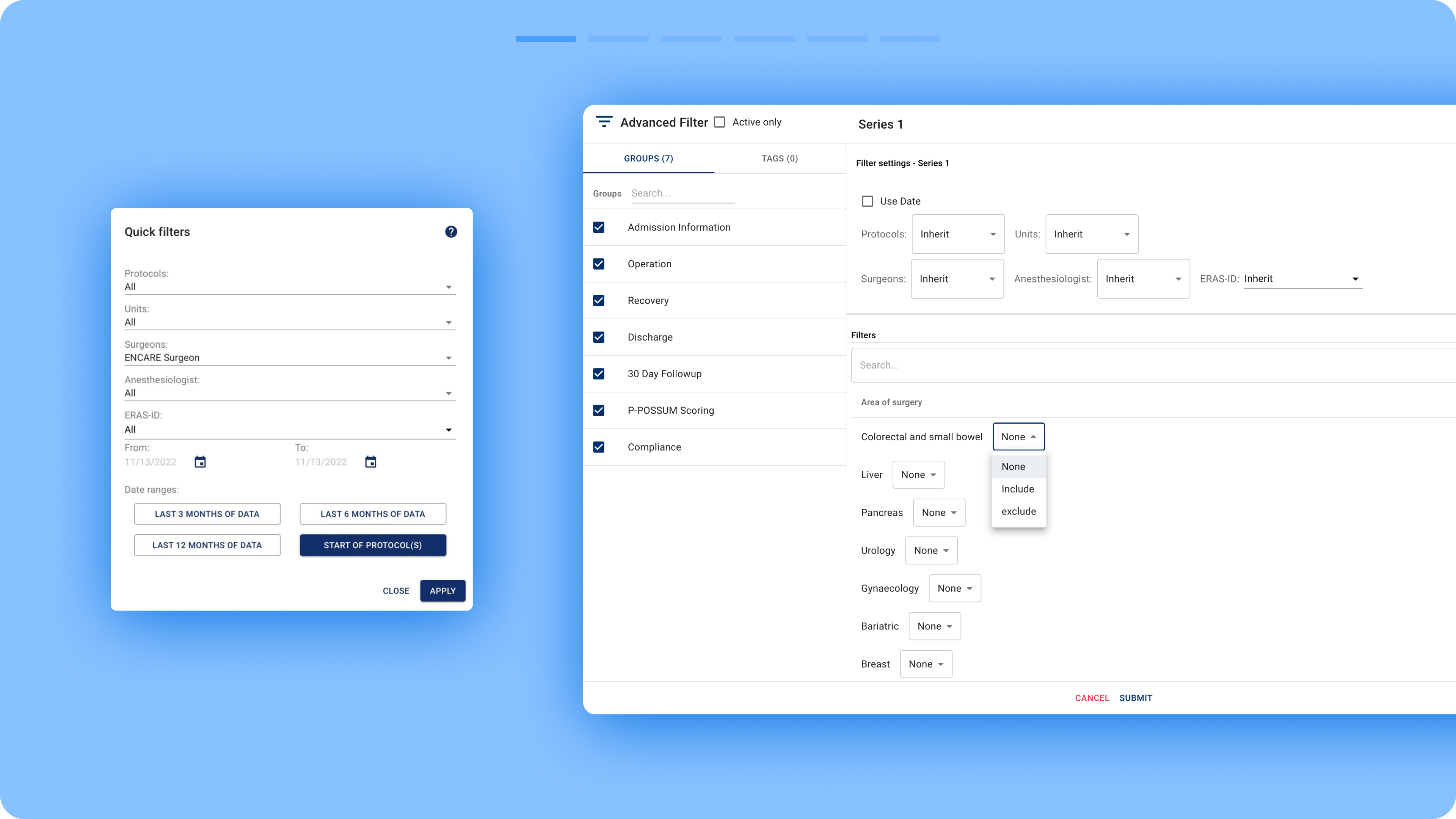
- Quick Filters: Misleadingly named, as they were simply ordinary filters placed in a modal. They were intended to highlight the most commonly used filters.
- Advanced Filters: A comprehensive list of filters categorized by the different phases of the surgical cycle, from admission to discharge and follow-up.
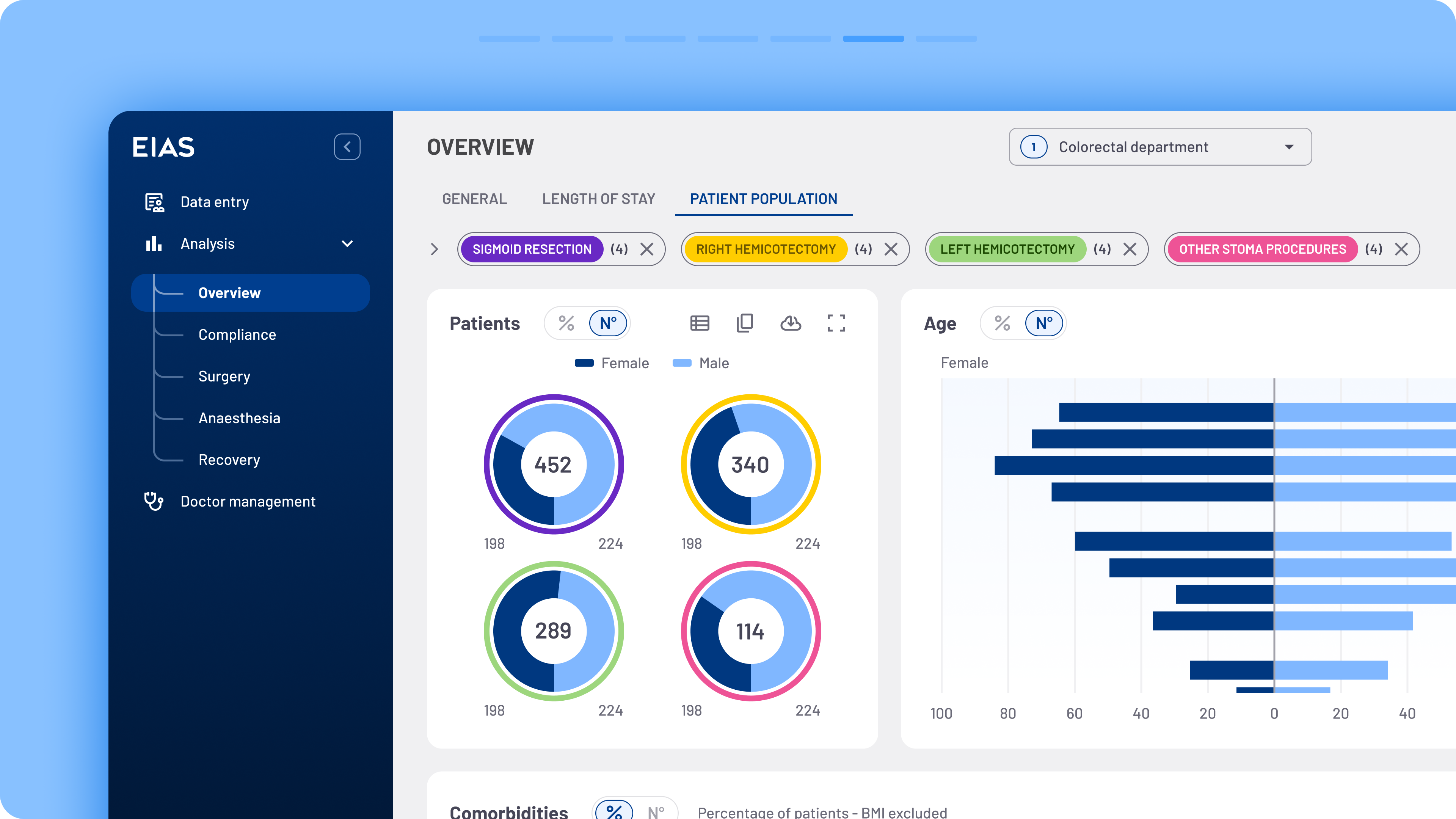
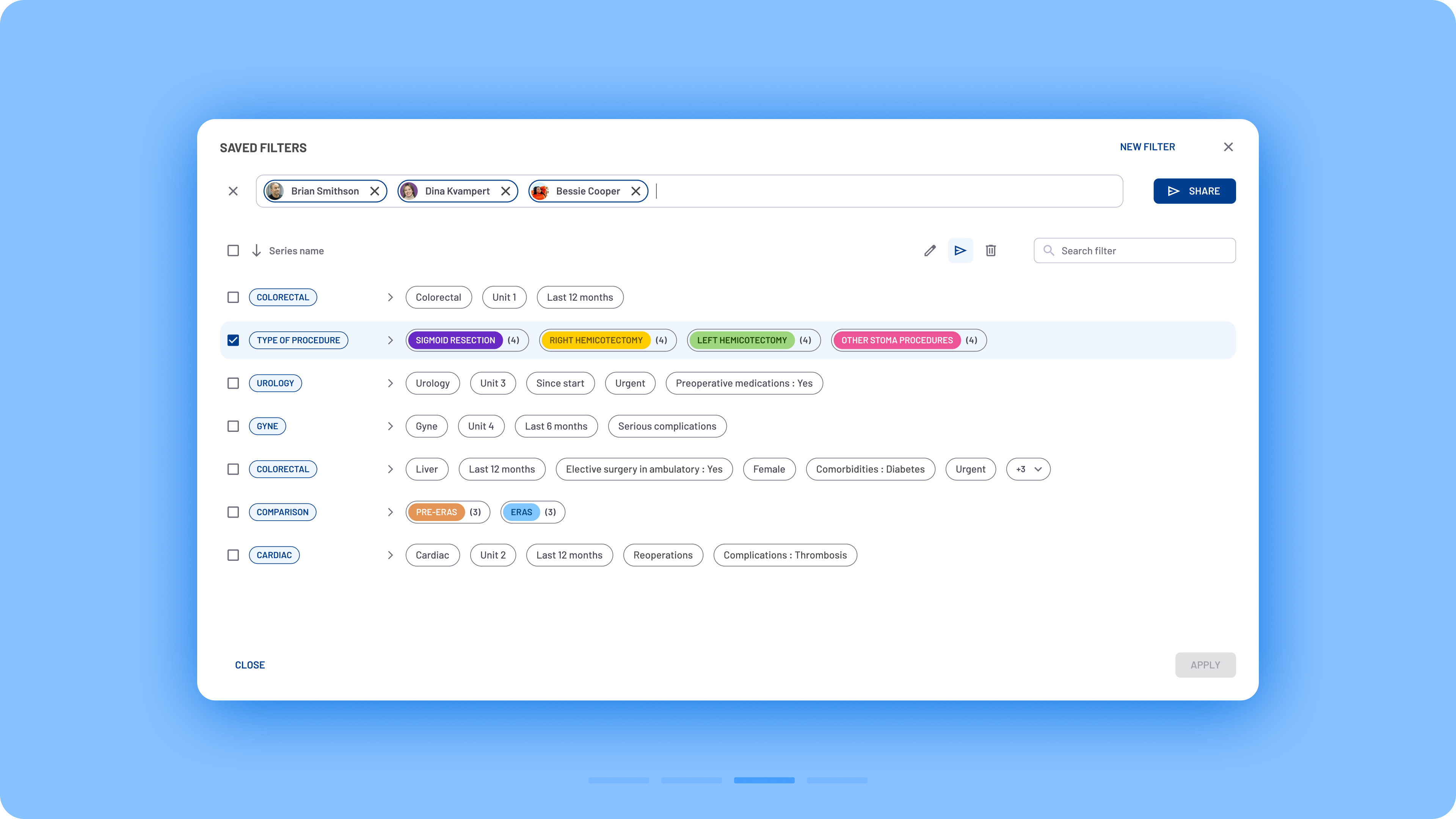
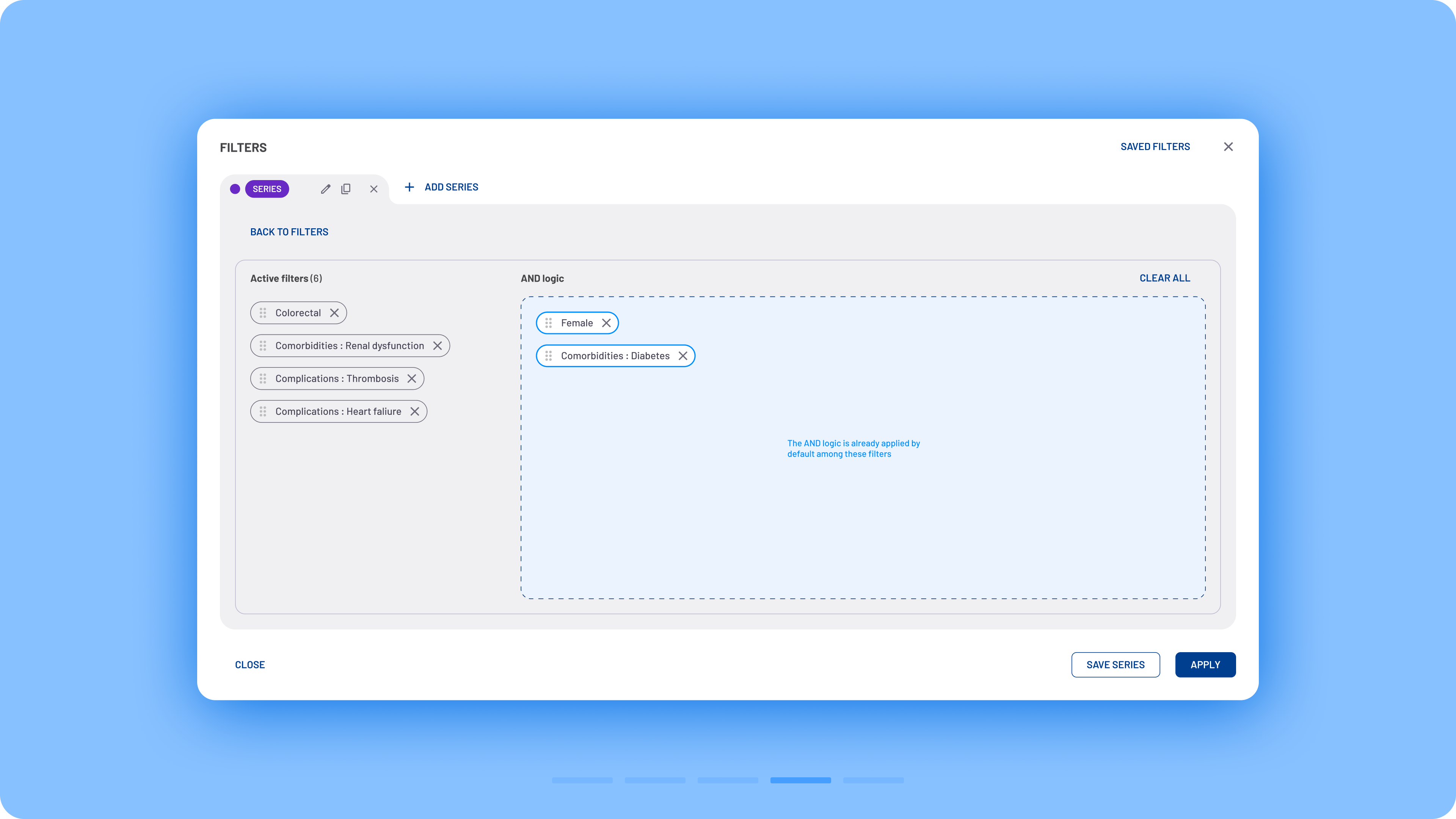
- Series: A feature that allows users to create control groups and compare different sets of filters. Users can create up to eight series.
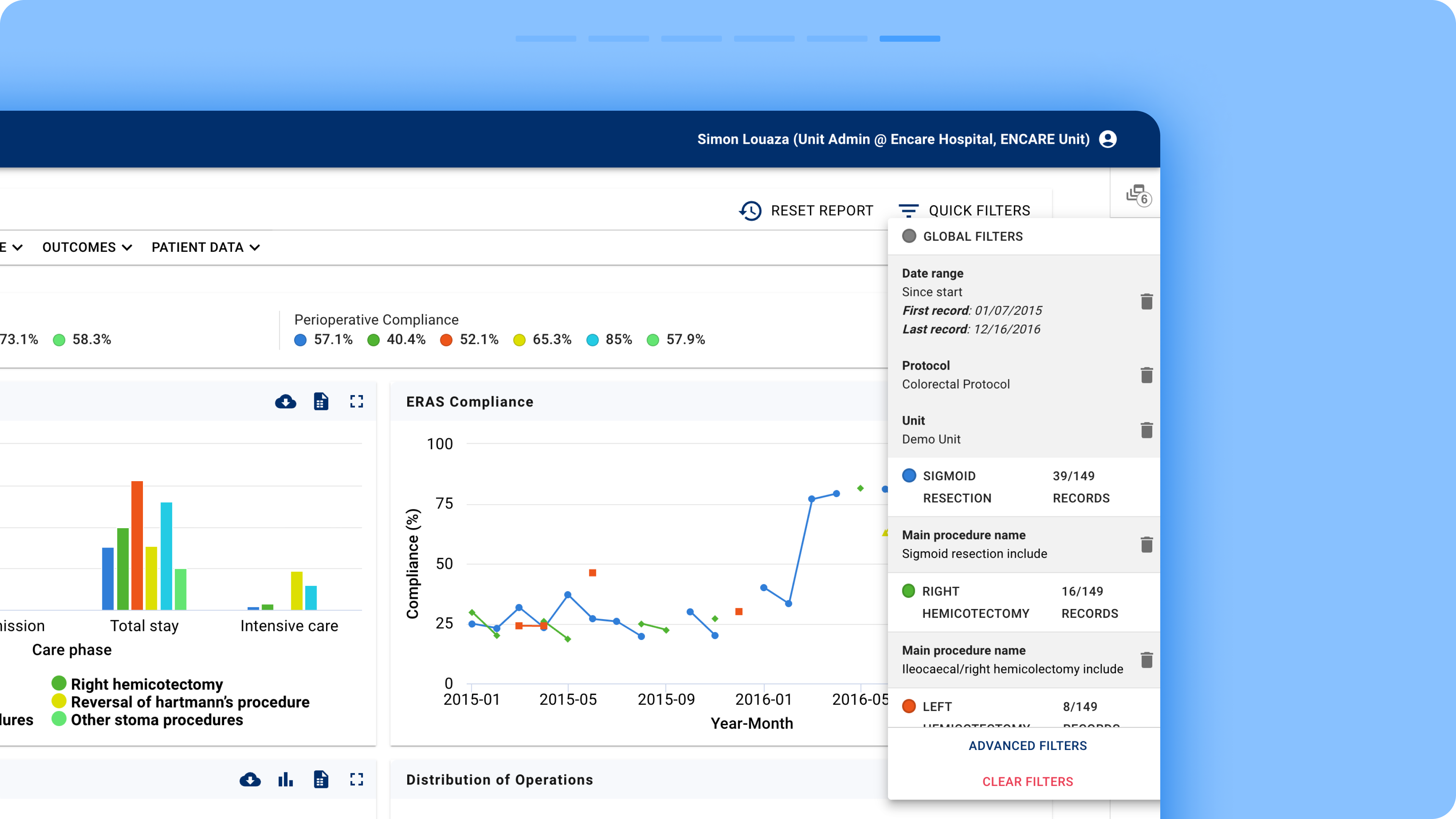
- Filter Recap: A hidden popup, accessible via an item in the right bar menu, summarizing active filters.
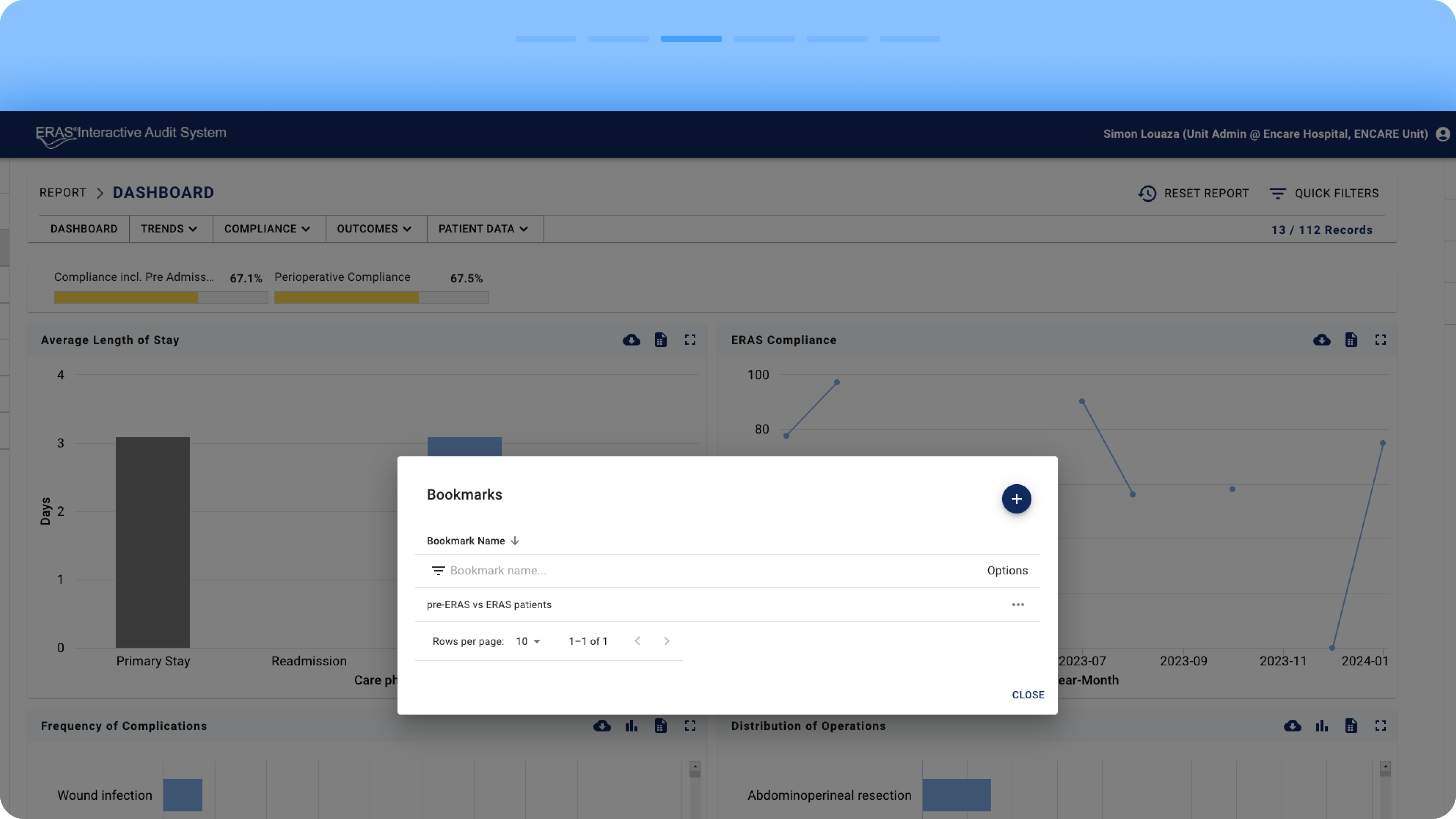
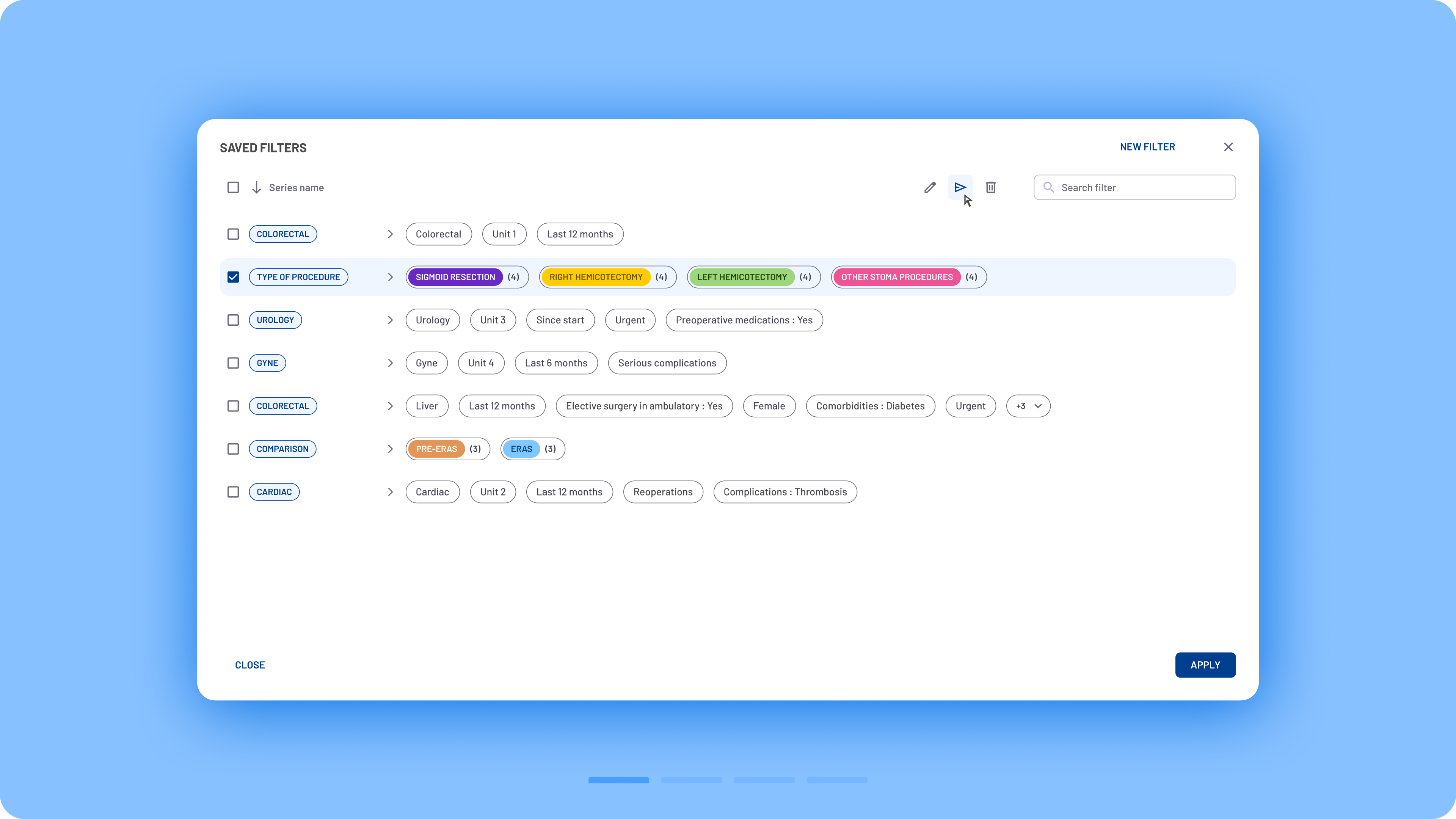
- Bookmarks: A space for saving sets of active filters.
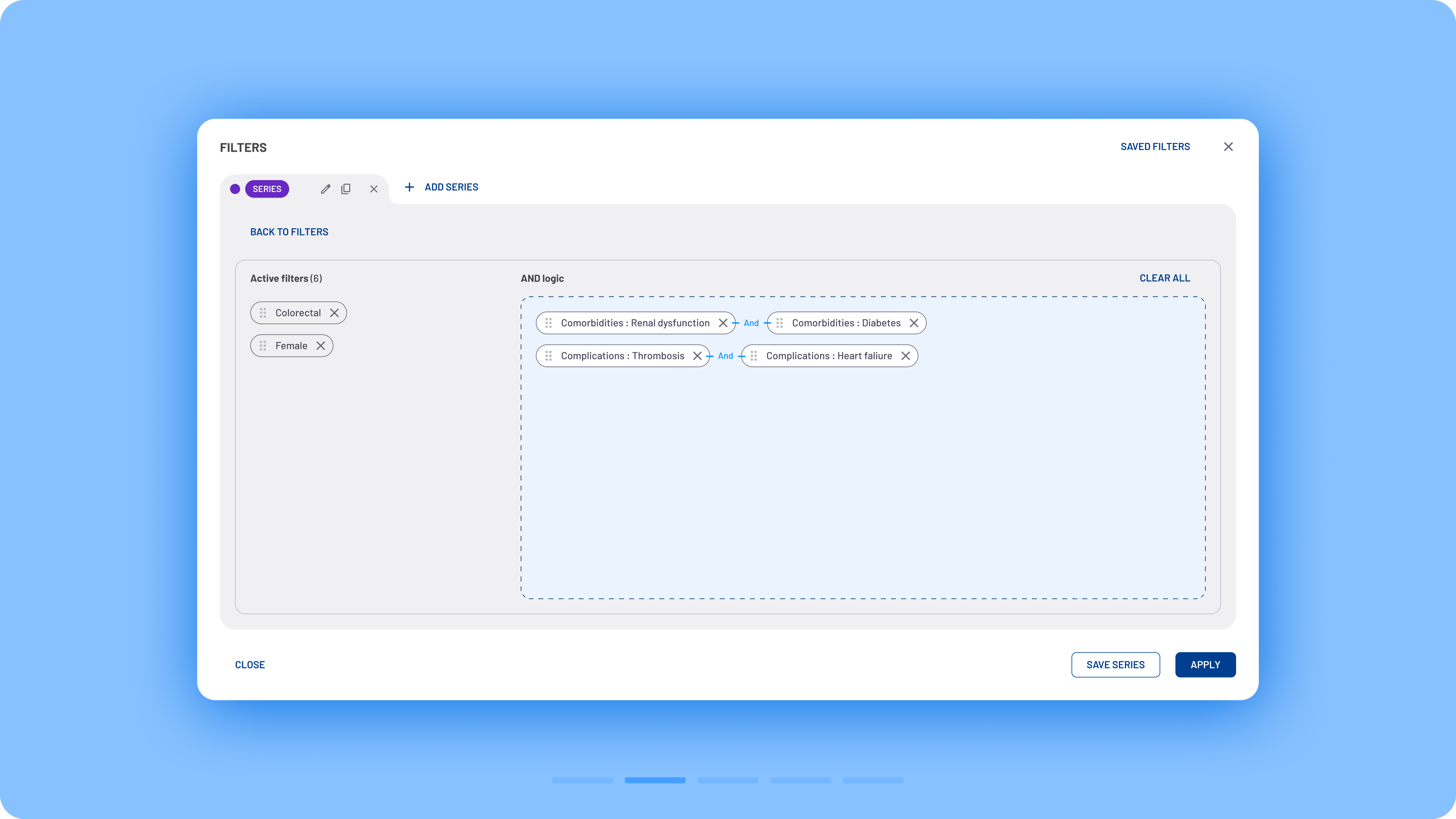
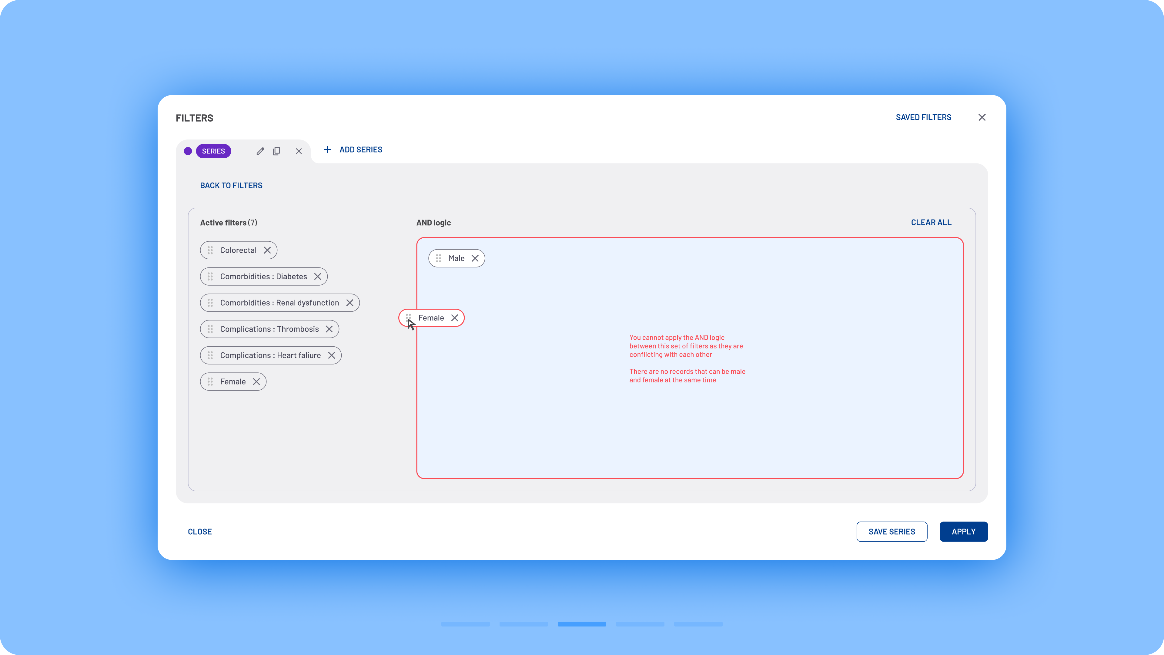
Moreover, filters applied an AND logic by default, frequently resulting in no valid data (e.g. selecting both “female” and “male” would yield no results, as no patient can be both). A more intuitive OR logic, which better aligns with users’ mental models, would have improved usability.
Design goals:
The redesign focused on creating a filtering system that could scale with the product while remaining intuitive for everyday users. The main objectives were:
- Simplify complex filtering workflows
- Improve discoverability
- Reduce cognitive load
- Create consistent interaction patterns
- Support future expansion without redesigning the experience again
Browse the gallery to explore the research findings


Redesigned workflow
Explore the new filtering functionality

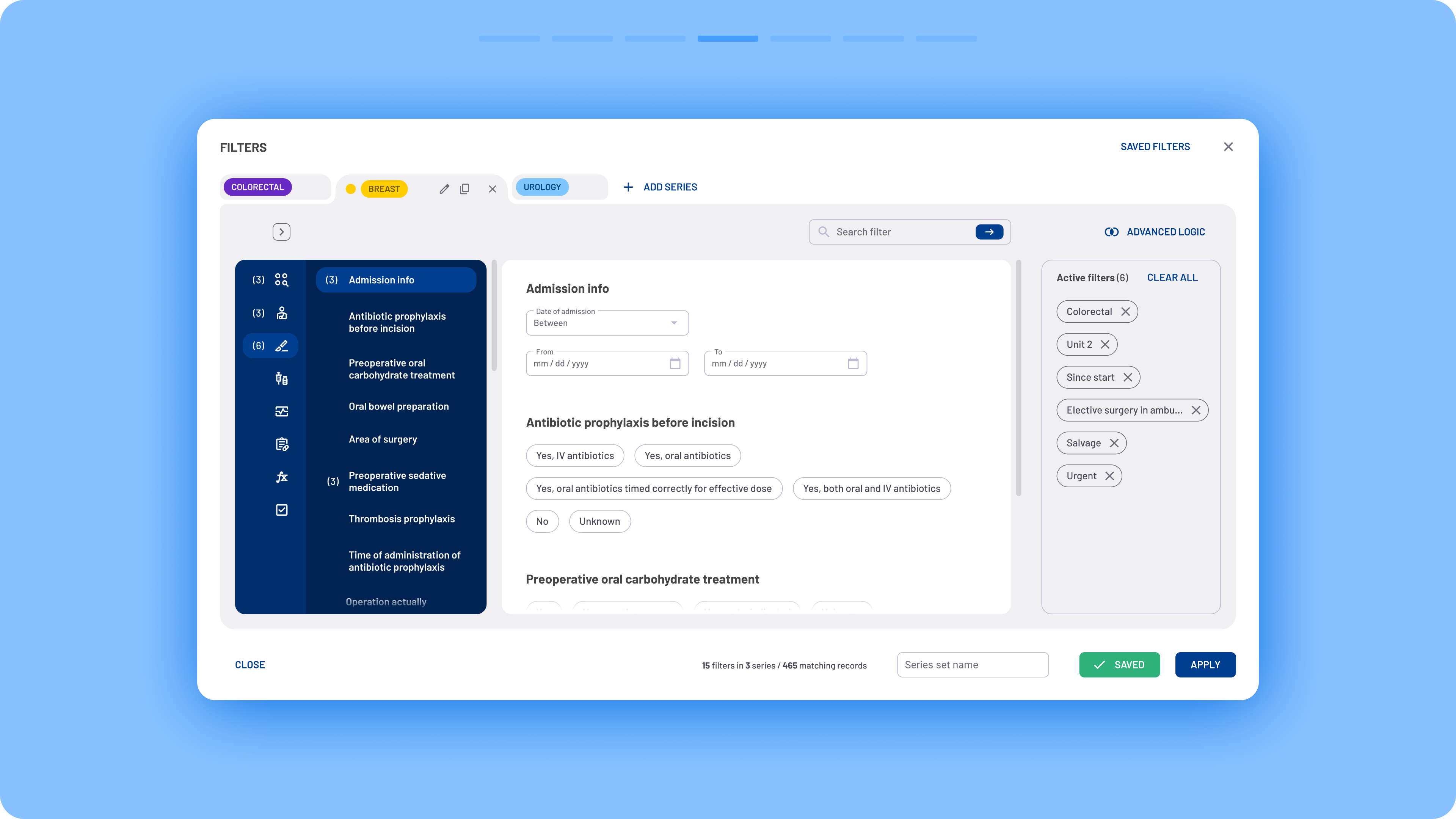

The Solution:
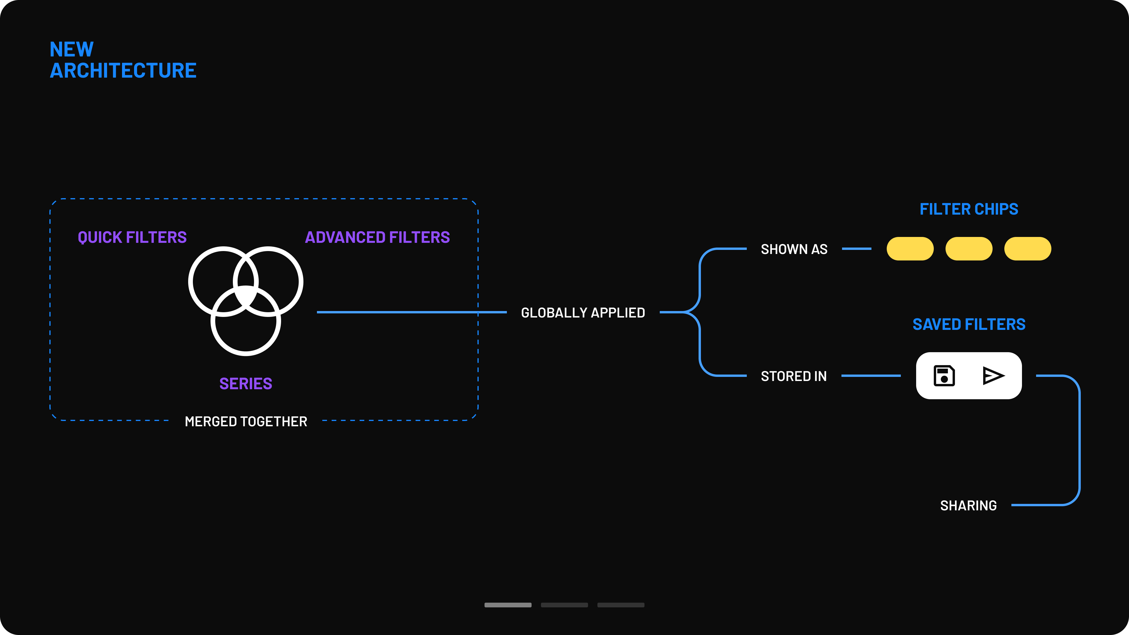
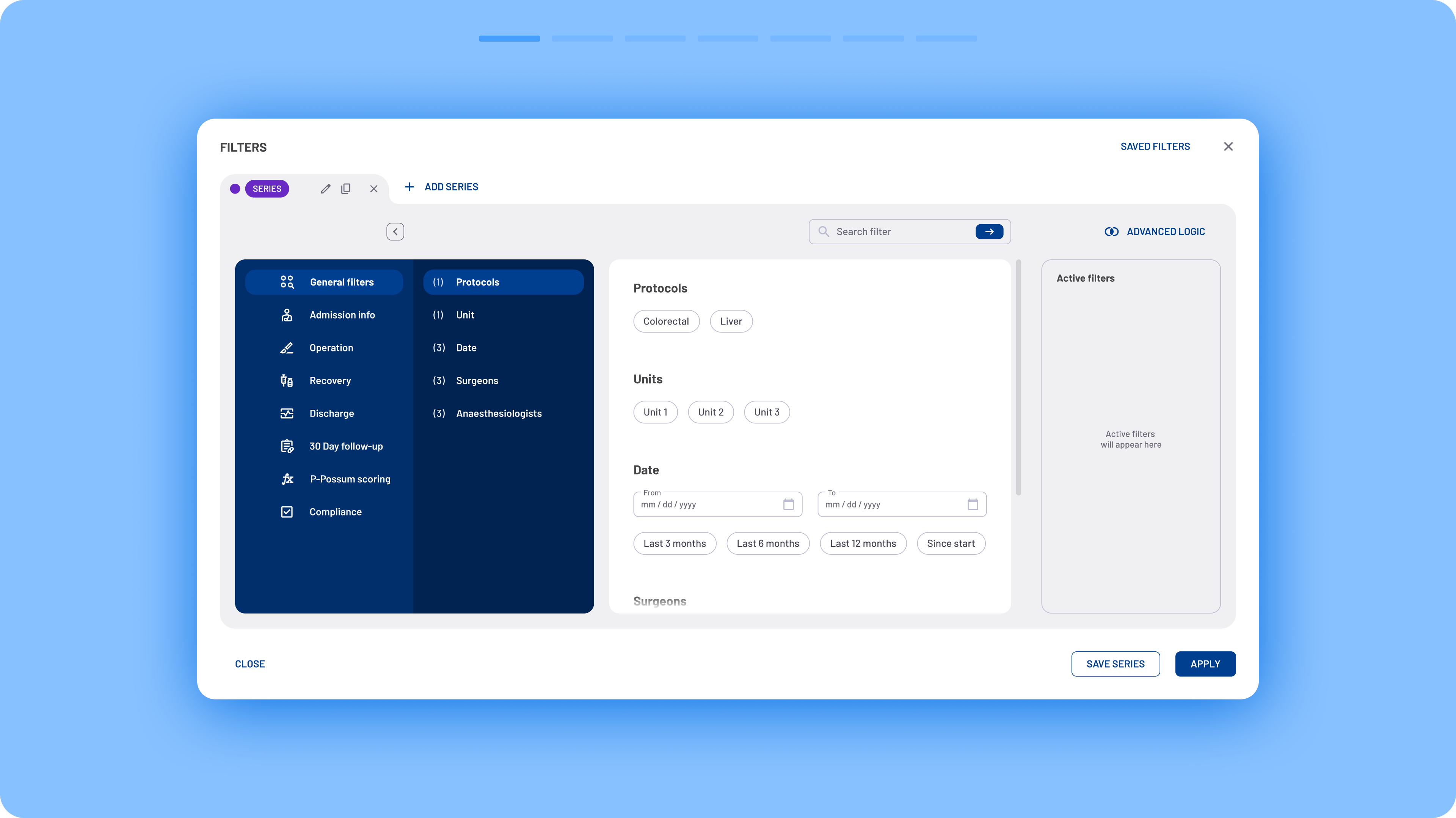
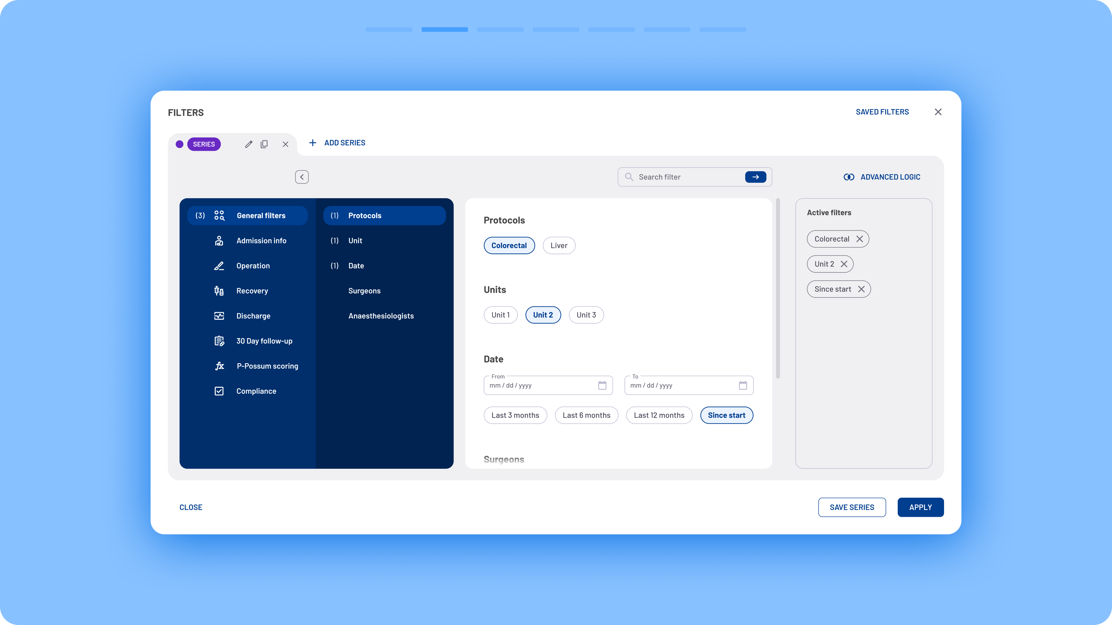
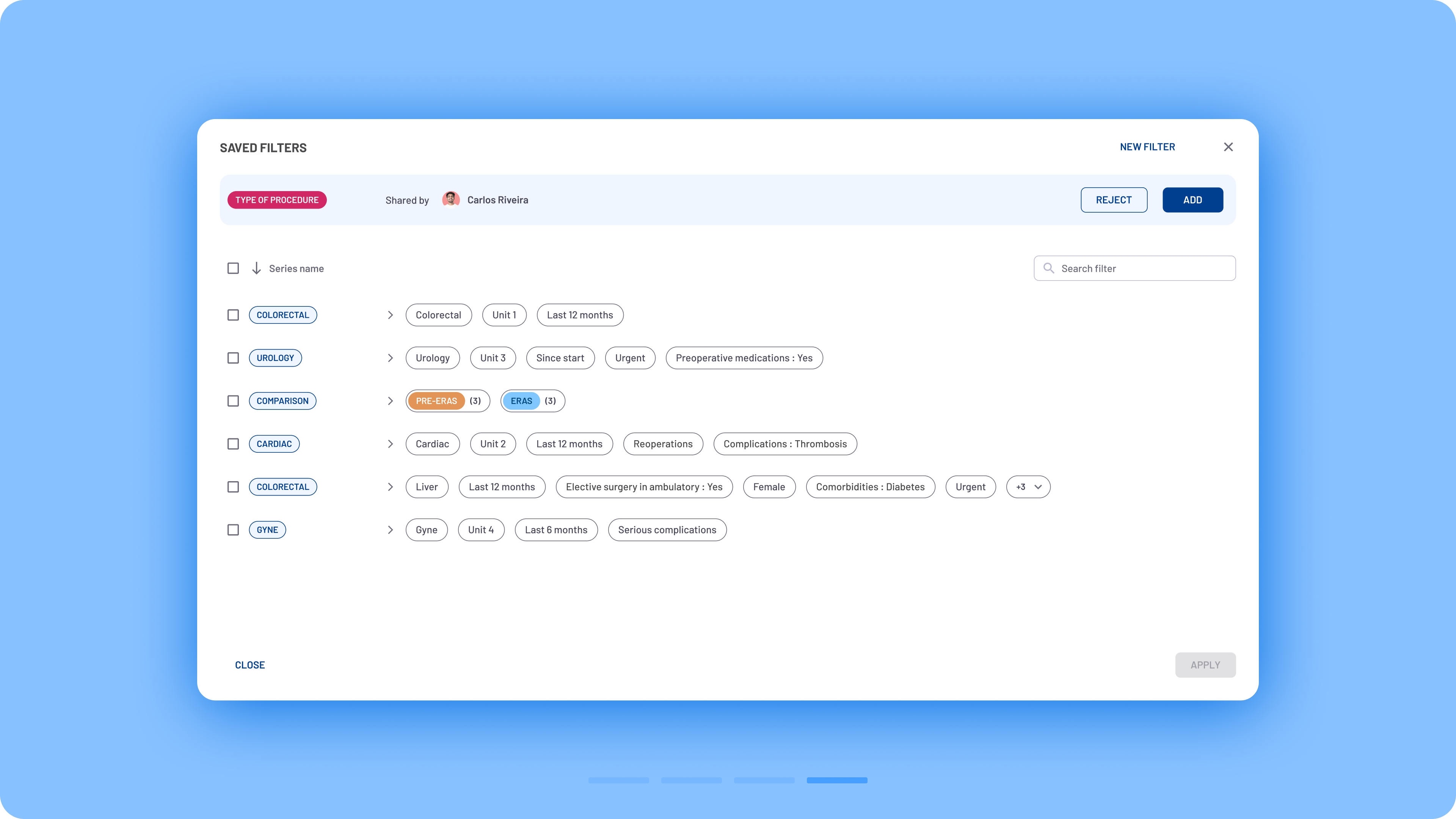
In the new design, quick filters, advanced filters, and series creation were merged into a single modal box that functions similarly to a web browser. Users can create multiple series, similar to browser tabs, and assign a unique set of filters to each one.
The redesigned filtering system introduced a more structured and scalable interaction model:
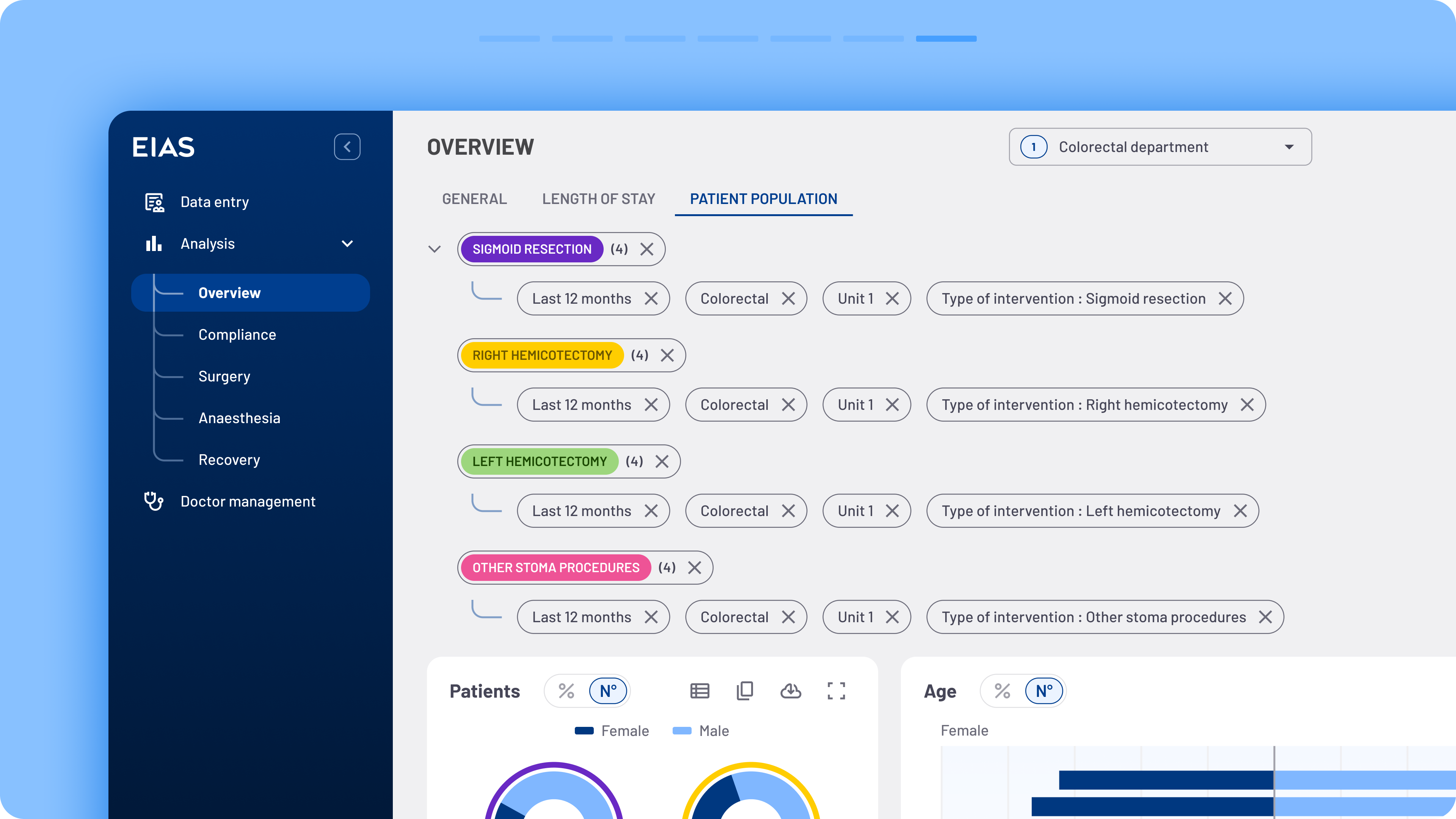
- Improved hierarchy: Filters were organised into logical categories, reducing visual complexity and making navigation easier.
- Better visibility: Applied filters became easier to identify, edit and remove, improving users’ awareness of the current analysis context.
- Consistent interactions: Reusable interaction patterns were introduced across the platform, reducing the learning curve and supporting future feature development.
- Scalable architecture: The new structure provides a flexible foundation for adding future filters without compromising usability.
Outcome:
The redesigned filtering experience made complex data exploration easier while providing a scalable framework for future analytical capabilities.
The solution enables users to:
- Build complex queries more efficiently
- Maintain awareness of active filters
- Navigate large datasets with greater confidence
- Explore analytical insights with fewer interaction steps
Reflection:
One of the biggest lessons from this project was that filtering is not simply a UI component, it’s part of the user’s mental model for understanding data. Designing an effective filtering experience required balancing flexibility with simplicity, ensuring advanced functionality remained accessible without overwhelming users. By focusing on information architecture and interaction consistency rather than adding more controls, we created a solution that can continue evolving alongside the product.
Filter sharing flow

Advanced AND logic flow


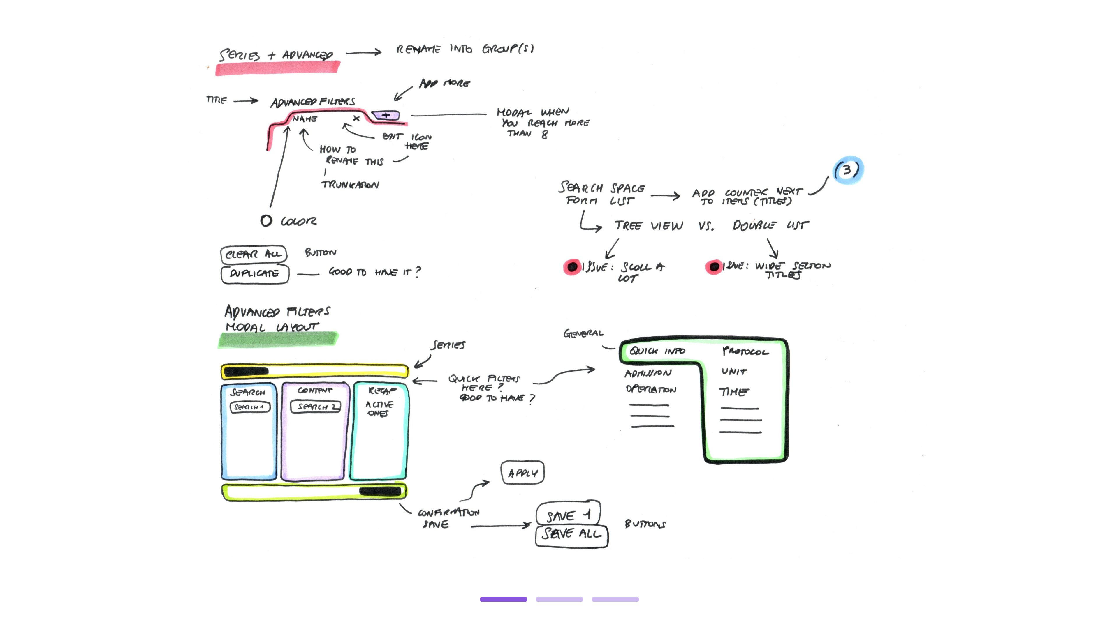
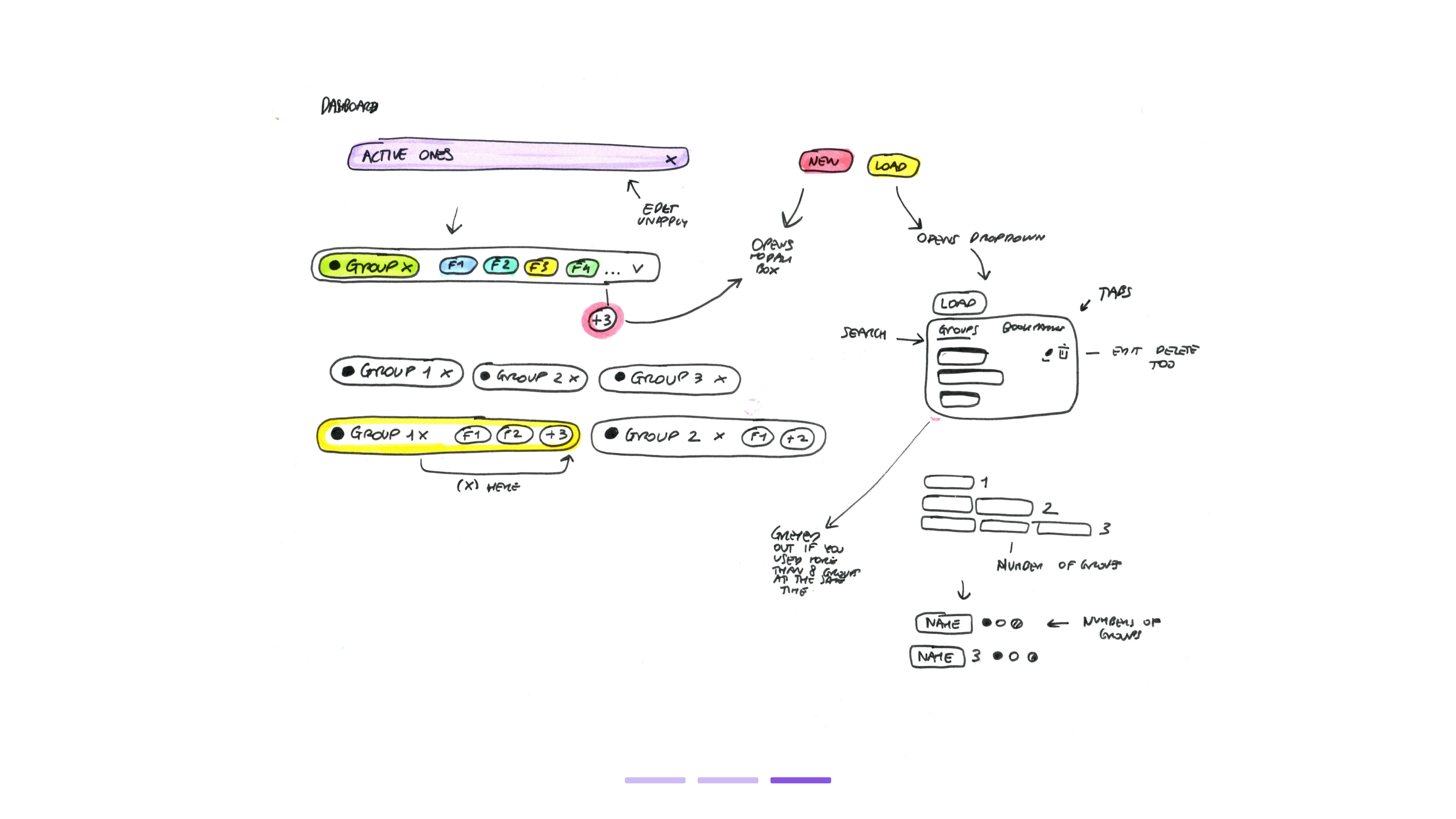
Development sketches

Samples of the previous filtering ecosystem