Dashboard
The project focused on redesigning the dashboard layout and expanding its capabilities. Investigations into the three main user profiles were conducted to establish more precise user goals and offer a more engaging experience with tailored dashboard content and graphs based on these profiles.
Research & analysis / UX / UI / Prototype
2023
Simployer is a Norwegian company specialising in human resource (HR) management solutions and services. It provides a comprehensive suite of tools that support organisations throughout the entire employment cycle, from onboarding to off-boarding.
&frankly is a Stockholm-based company owned by Simployer that developed an employee engagement tool. The platform enables organisations to capture real-time feedback through pulse surveys, helping managers and teams understand and improve engagement levels.
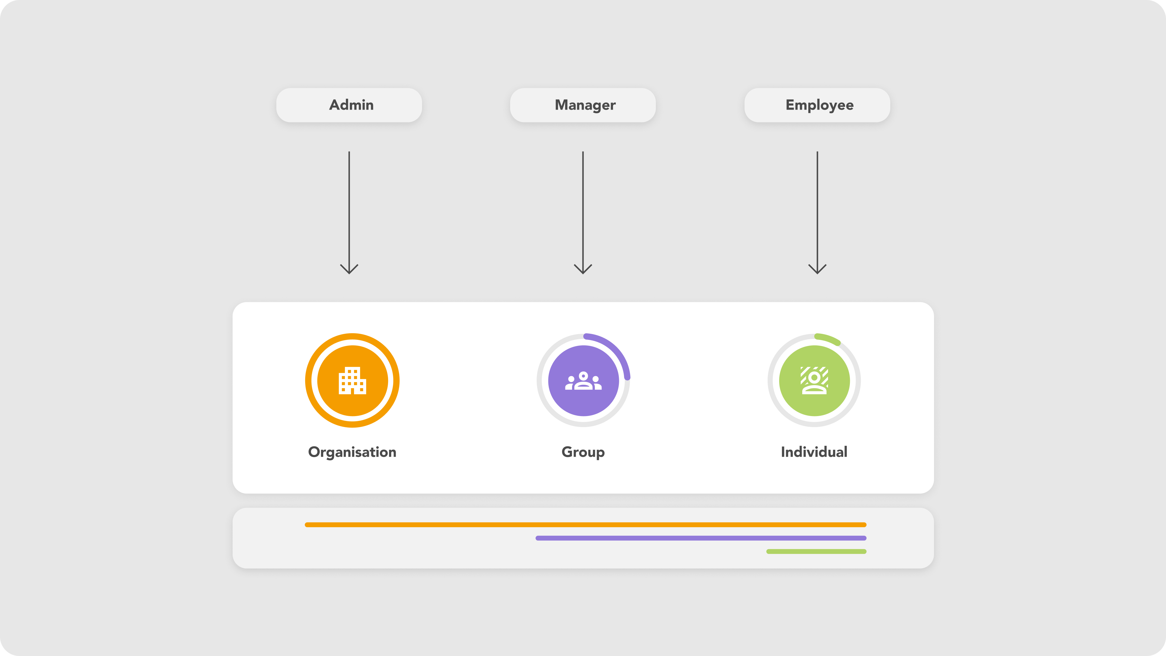
Users and company hierarchy
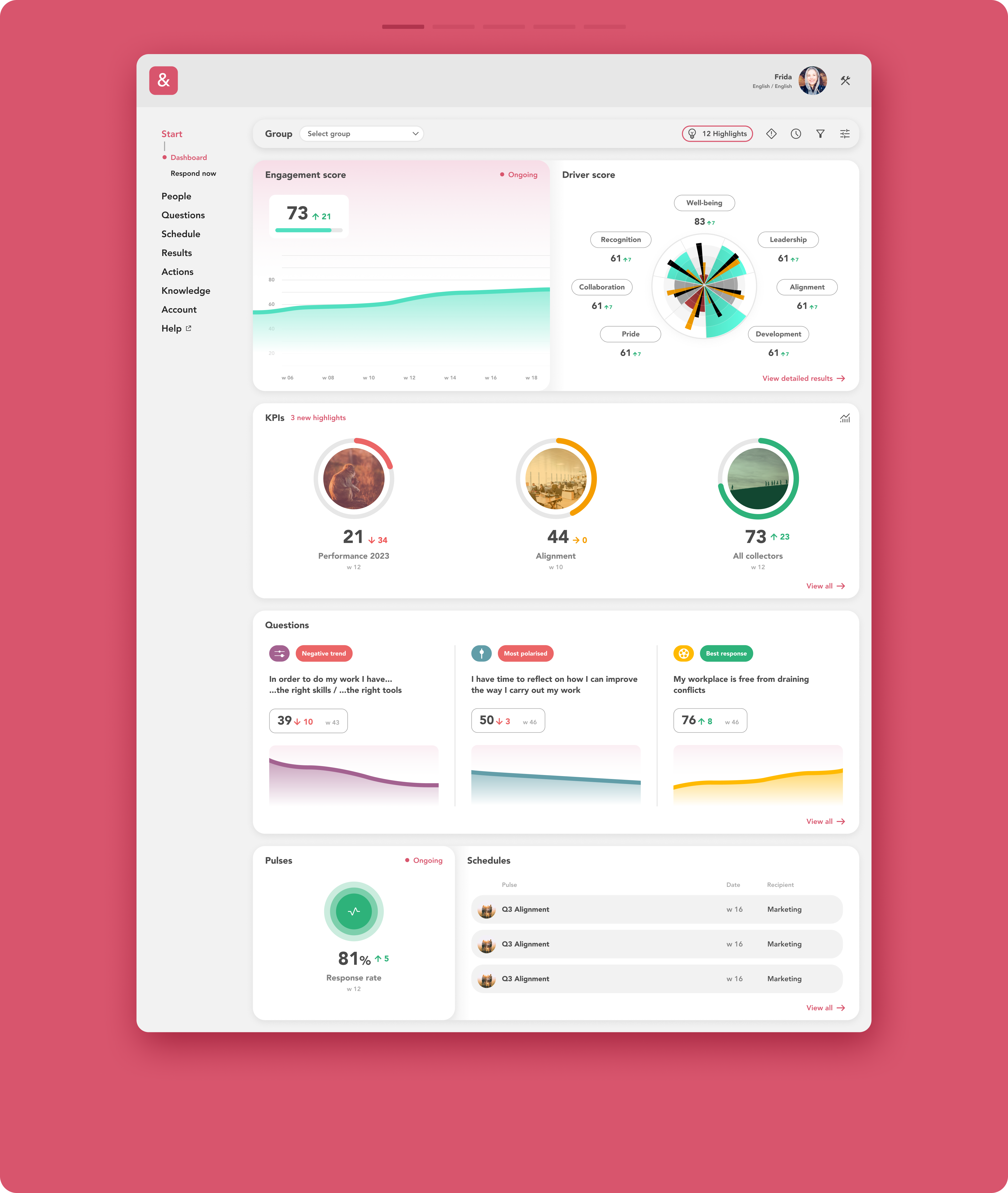
Browse the gallery to explore the new dashboard layouts, highlights, customization, and filtering functionalities
The problem :
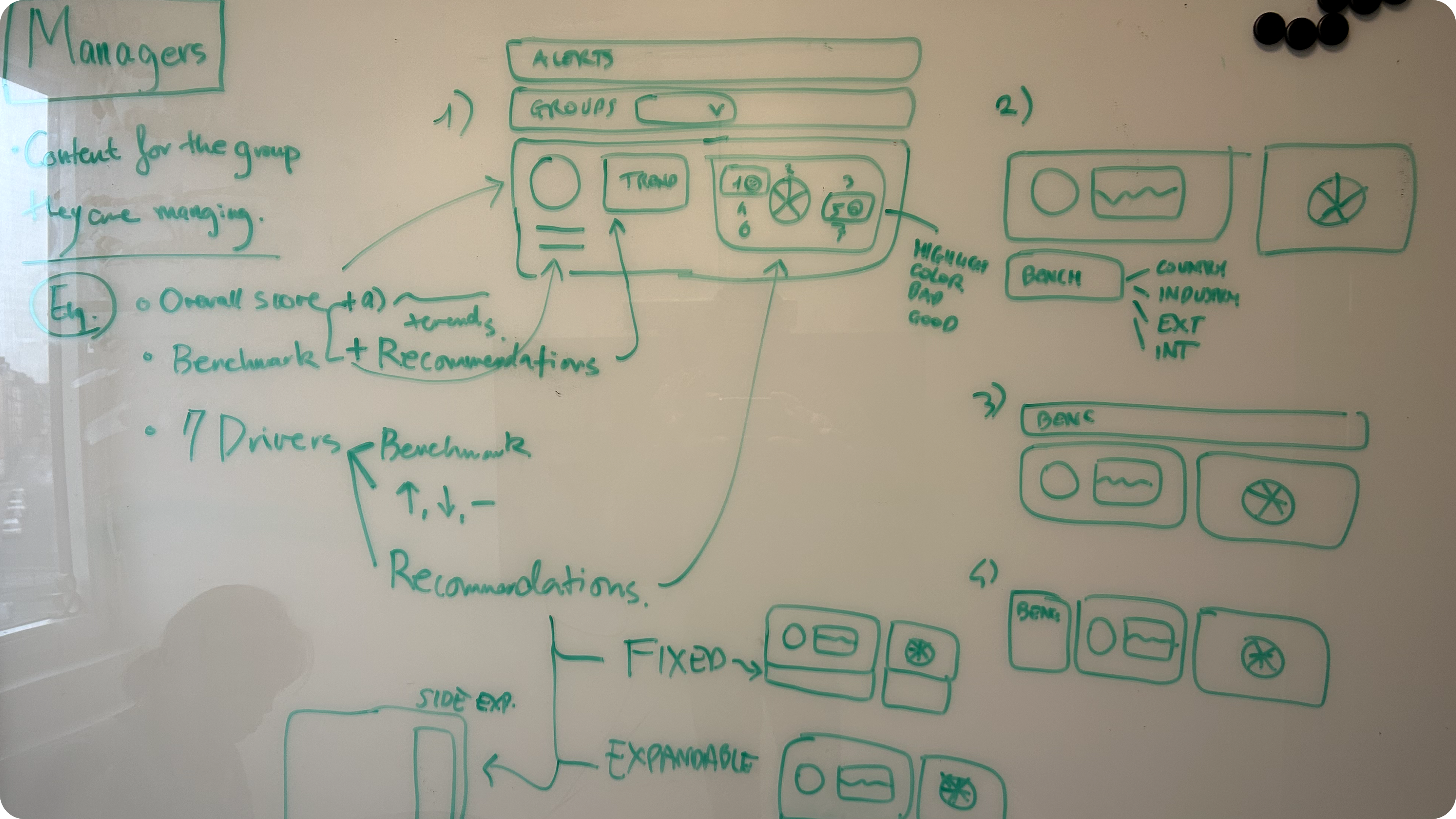
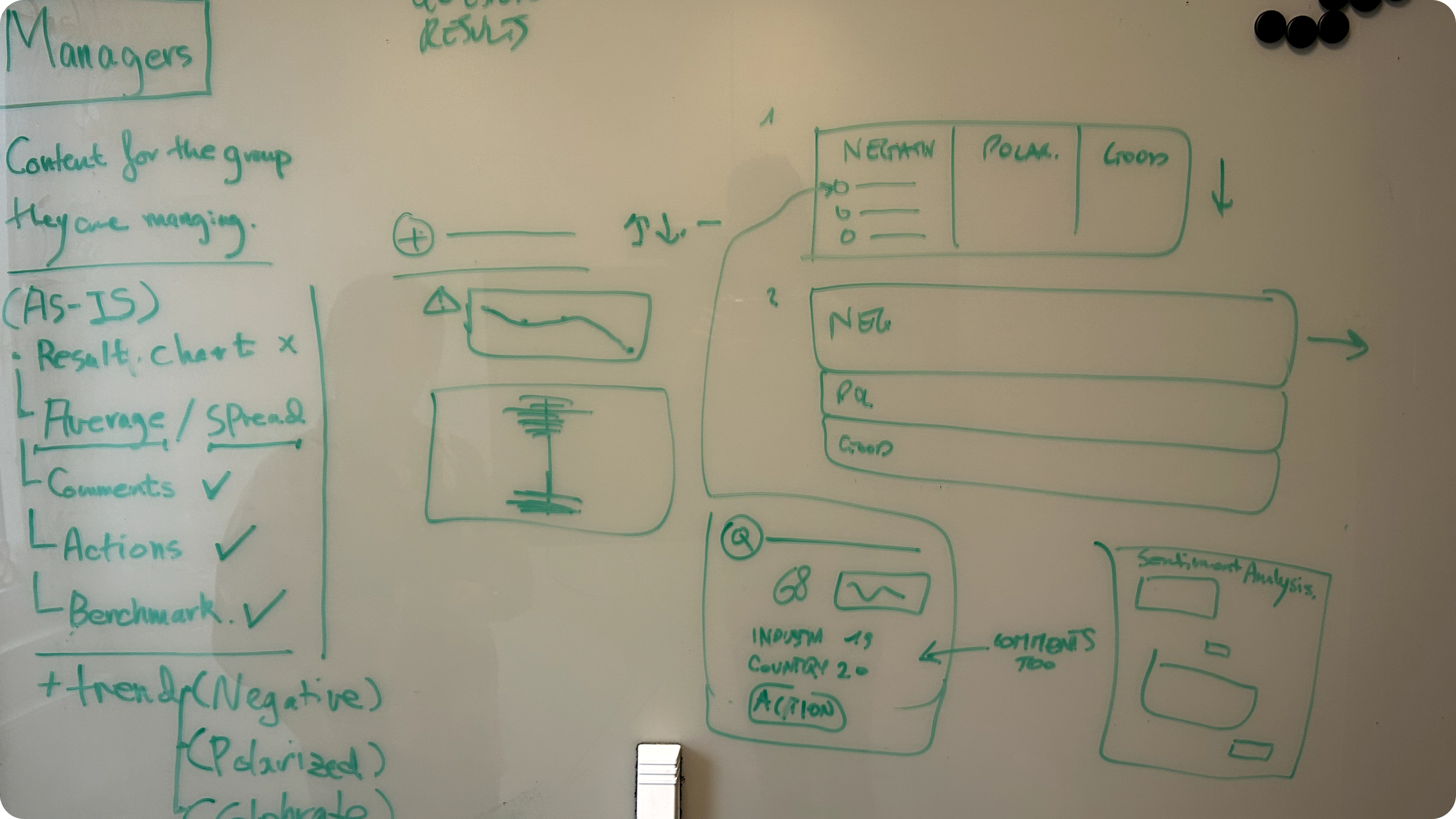
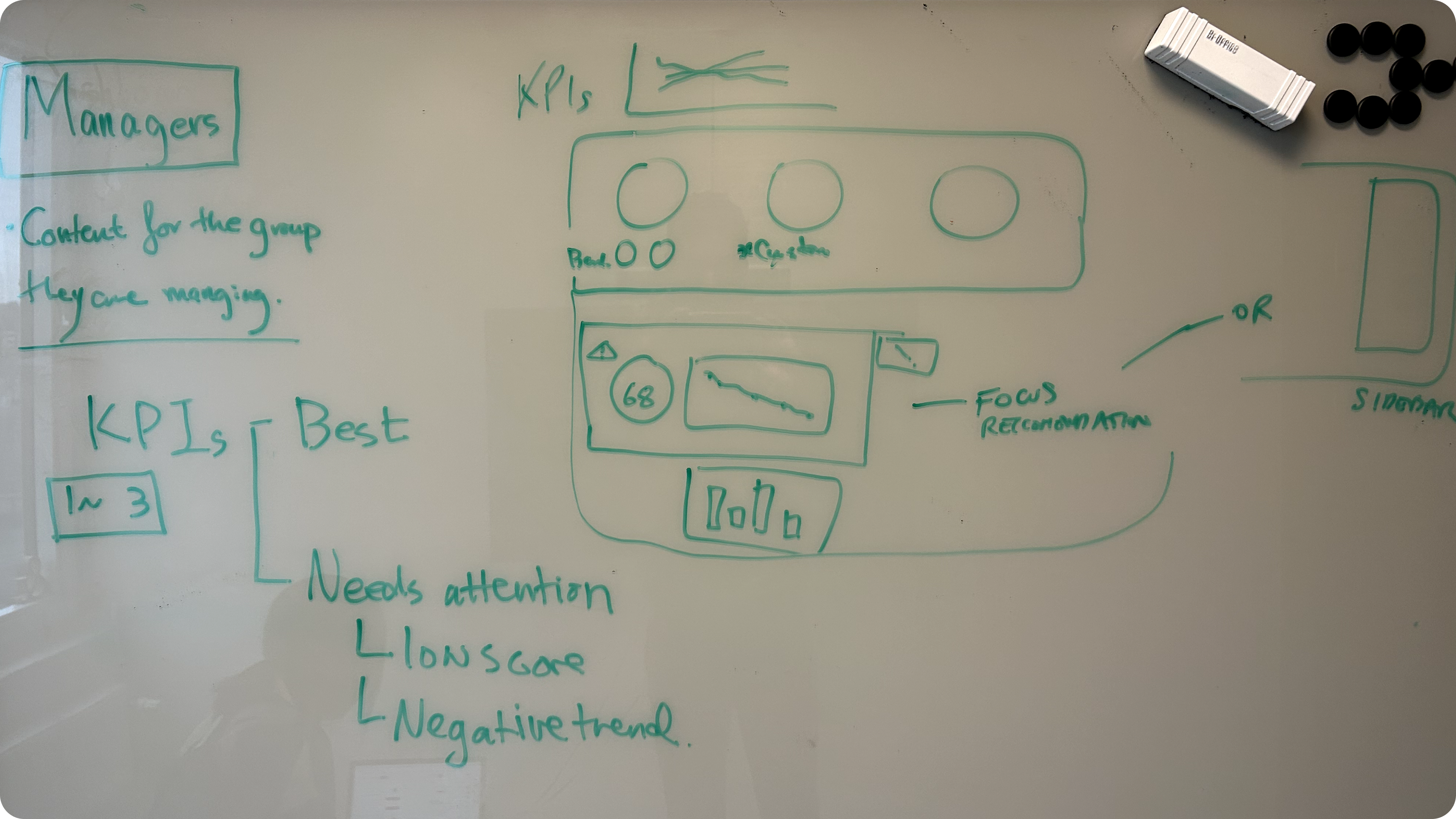
Based on pre-existing research, the previous interface offered limited capabilities. A workshop was conducted to identify and prioritise user goals, with the aim of reorganising existing elements and developing additional critical features.
The workshop results highlighted new potential alternatives, particularly the need for admins and managers to have a better overview of different teams, more flexibility in setting KPIs, and the ability to customise the layout of various widgets to align with internal goals.
One of the primary goals was the ability to quickly assess both positive and negative trends as a general summary, as well as the ability to drill down into specific pages. Another request was the inclusion of wider benchmark comparisons, such as countries and company sectors, which were missing in the current interface.
Additionally, there was a need for insights to help users better understand the data, along with action suggestions for specific cases, especially for new users.
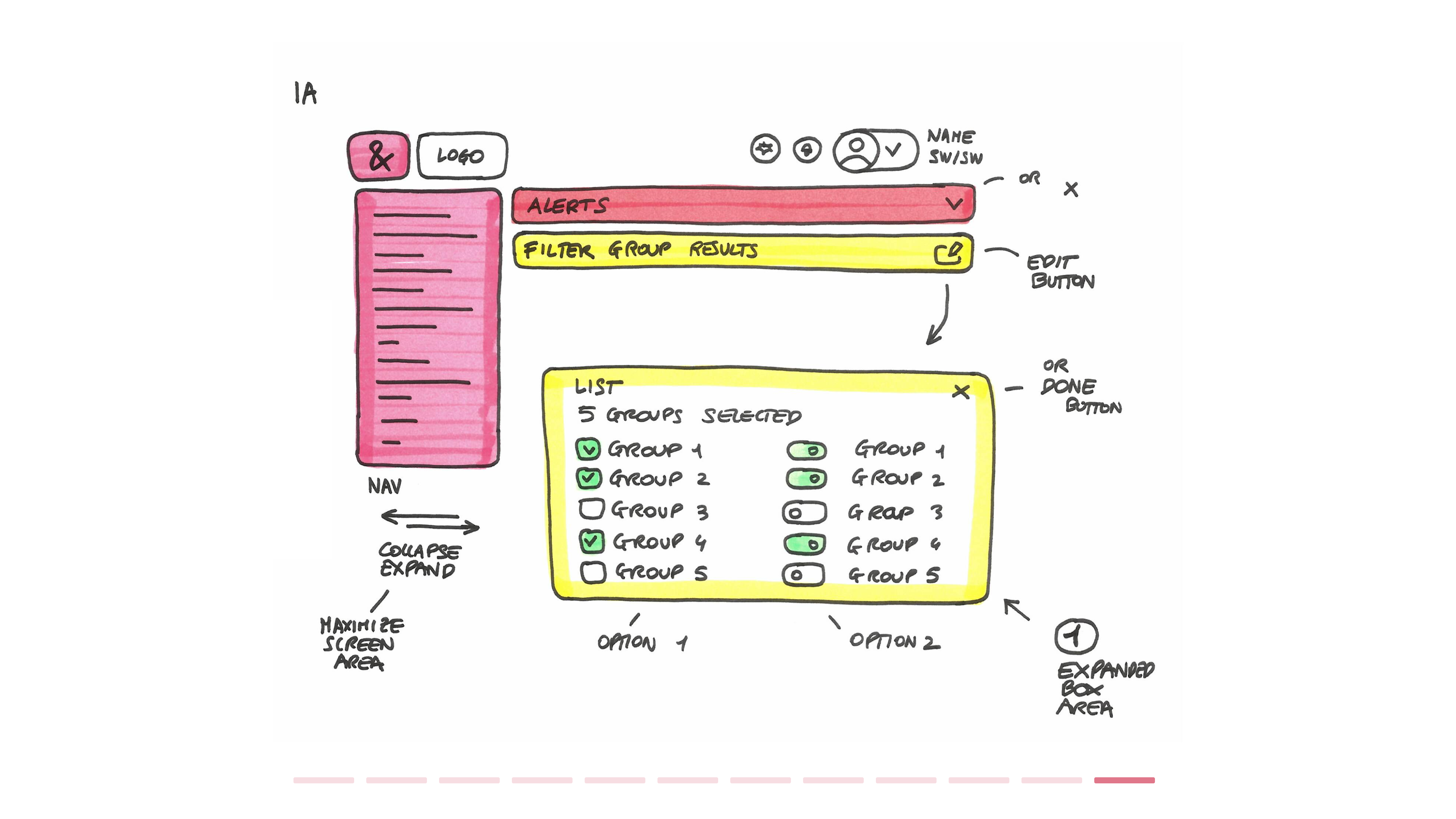
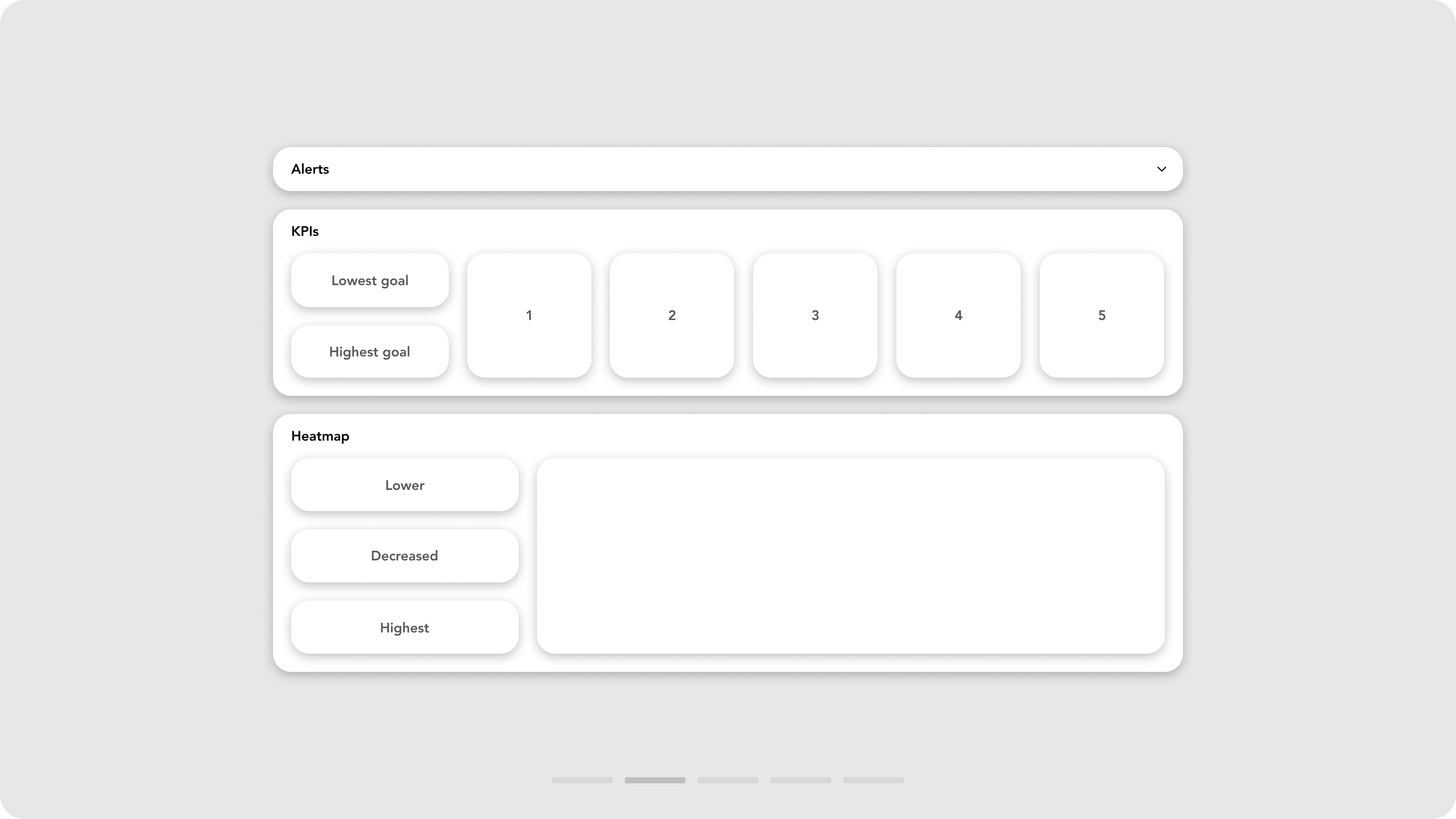
Workshop activity and layout configurations

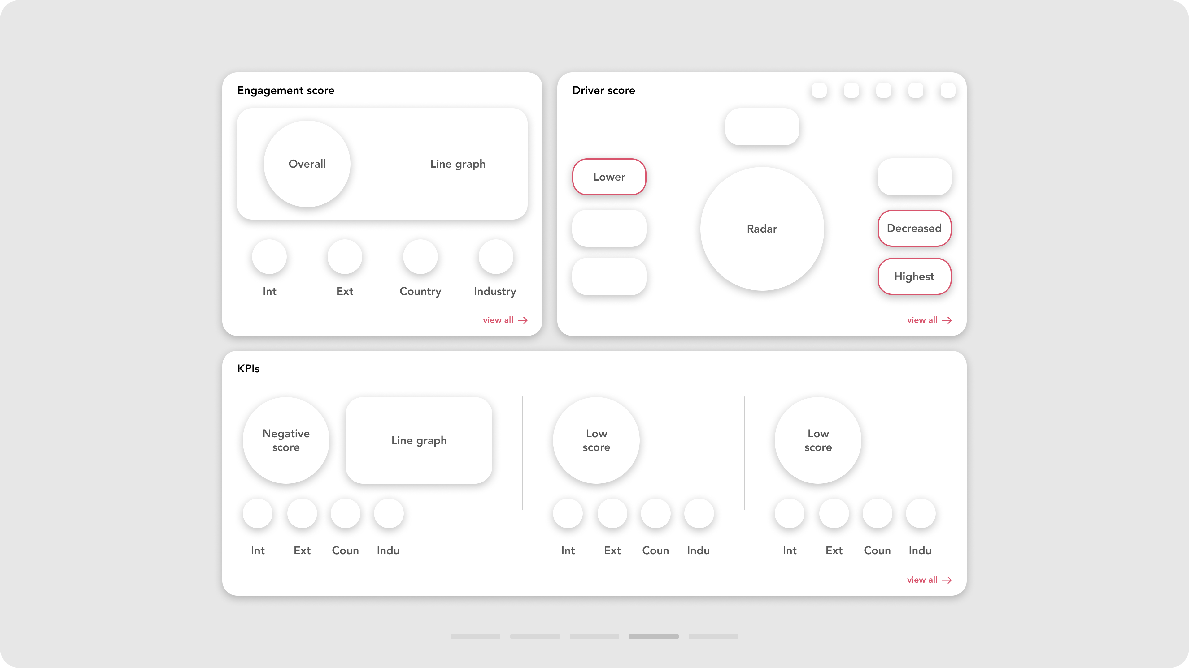

Examples of the redesigned widgets
The solution :
In the new design, many improvements were introduced, including:
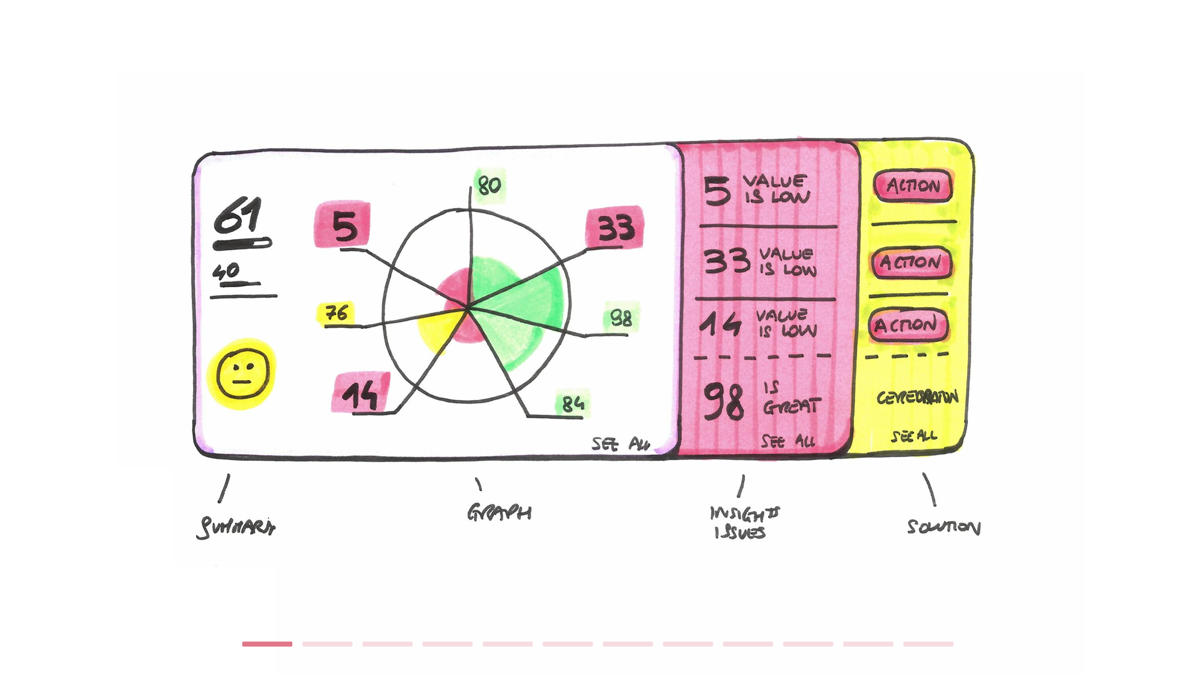
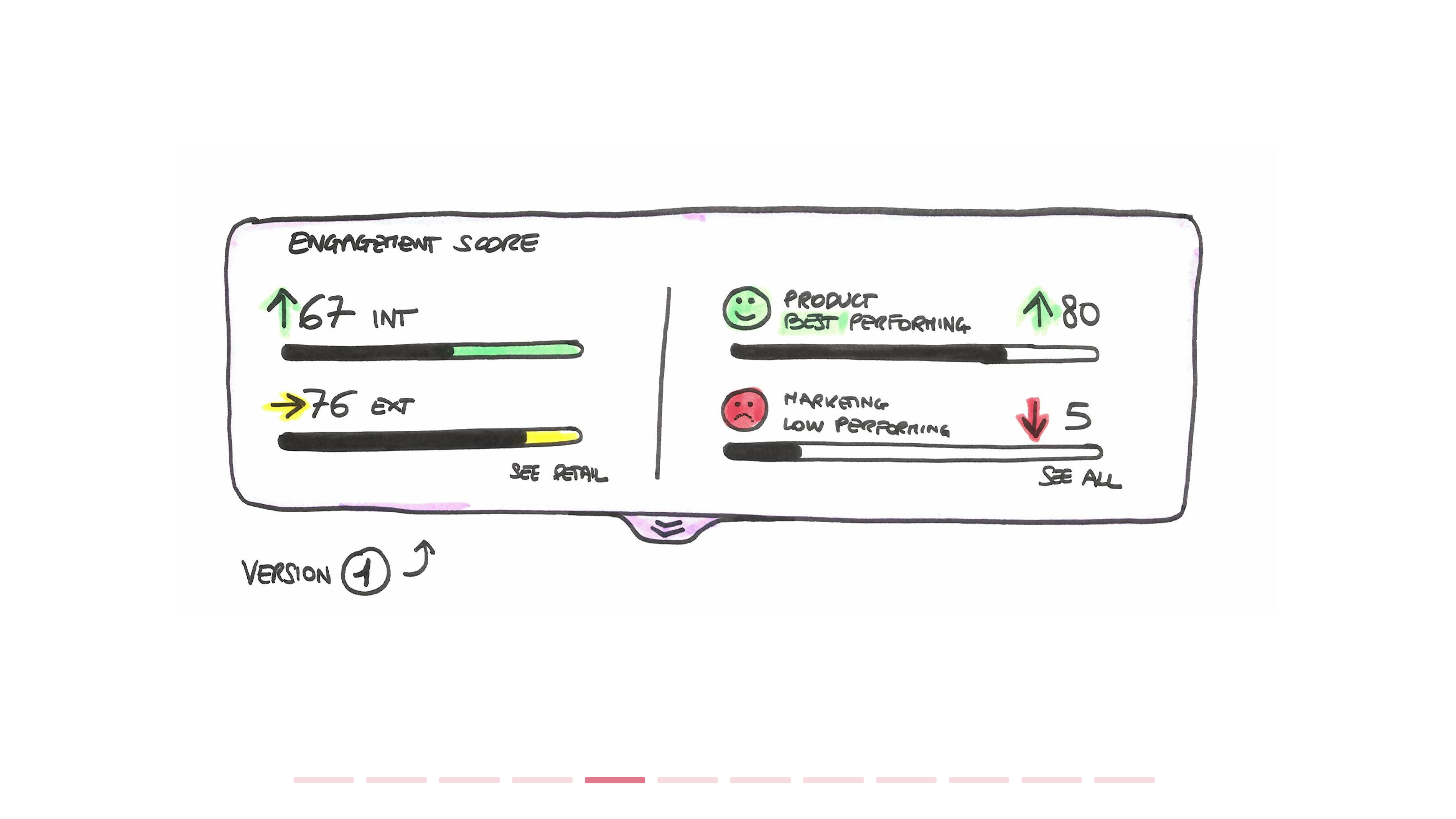
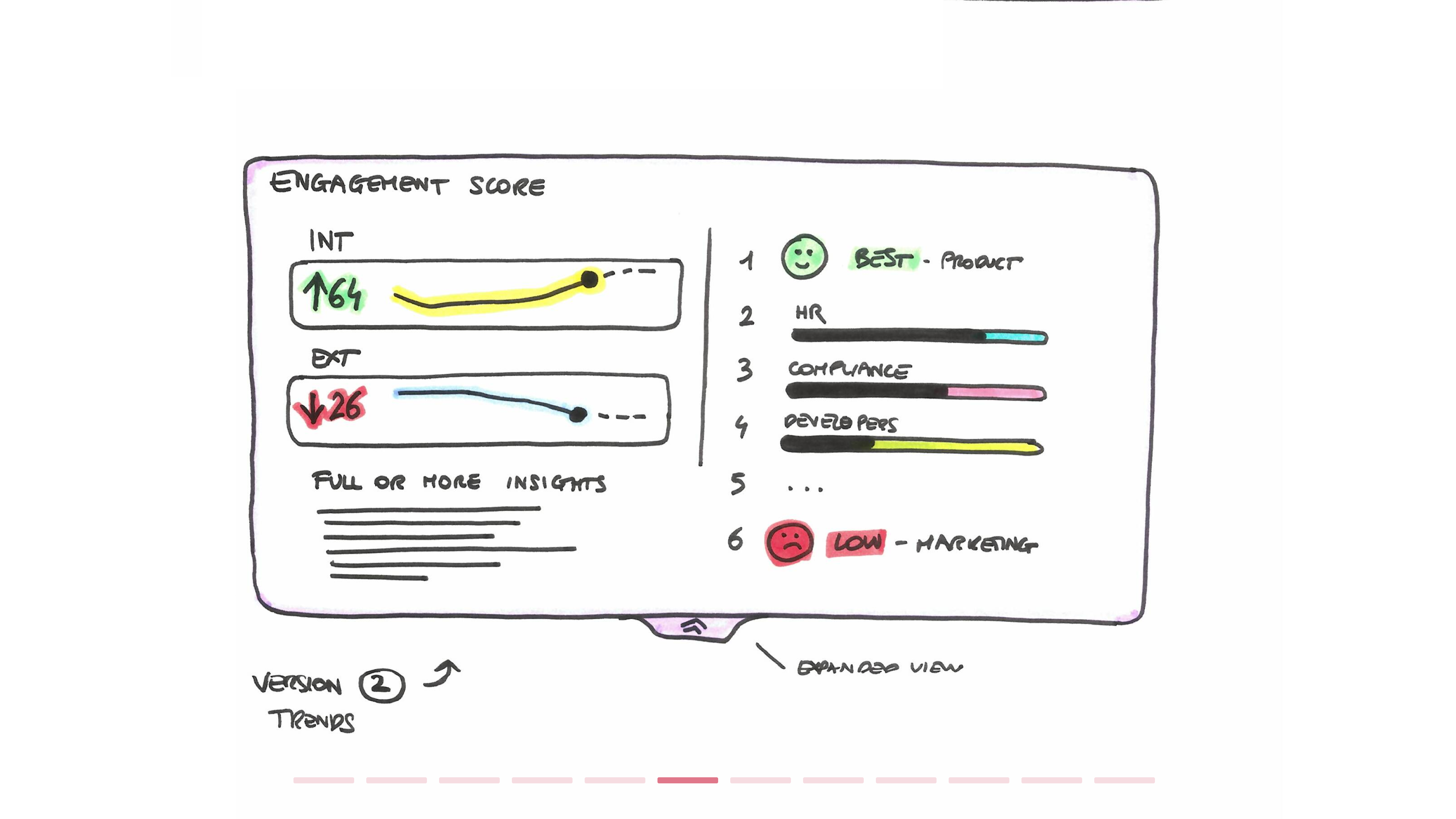
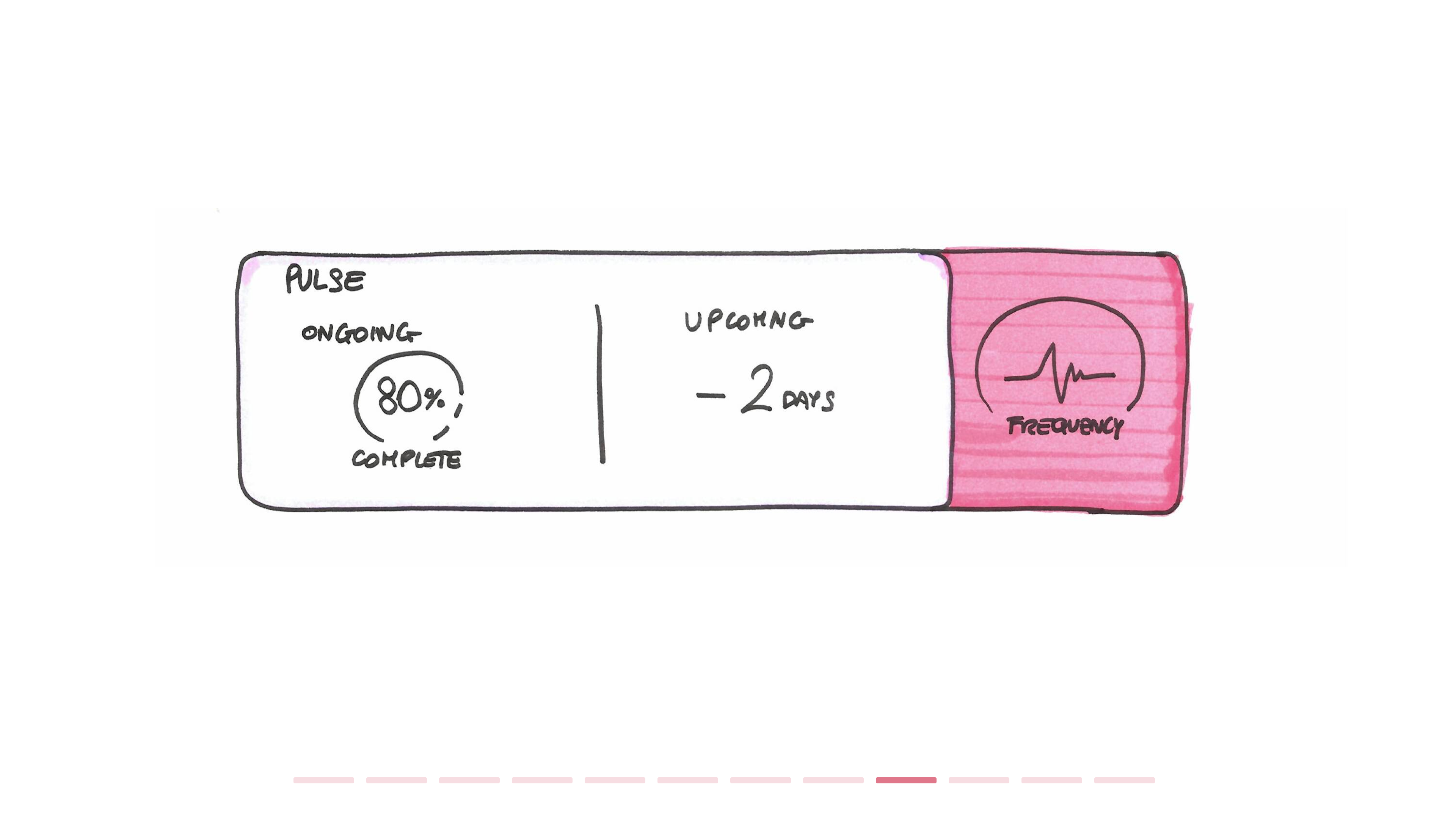
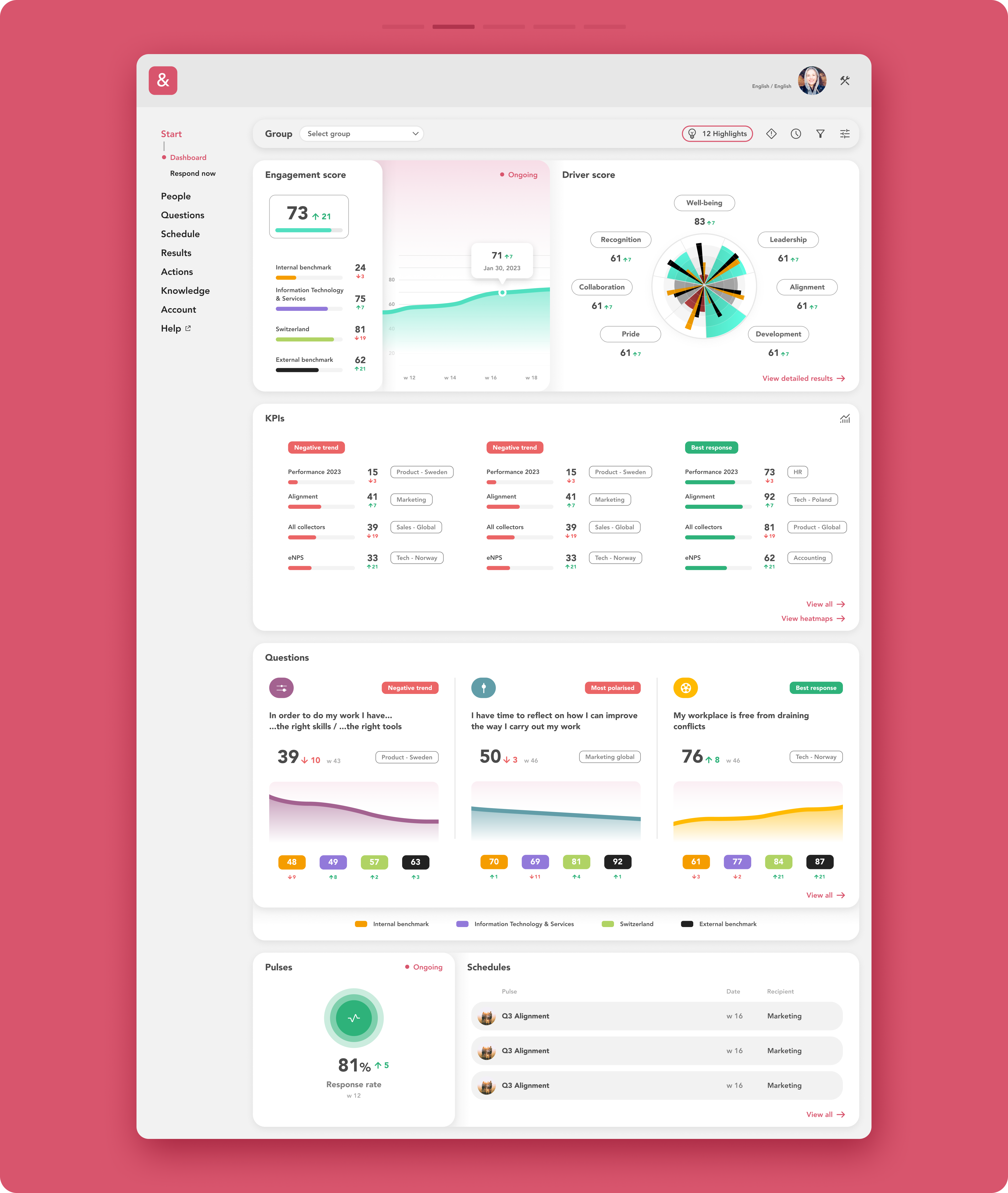
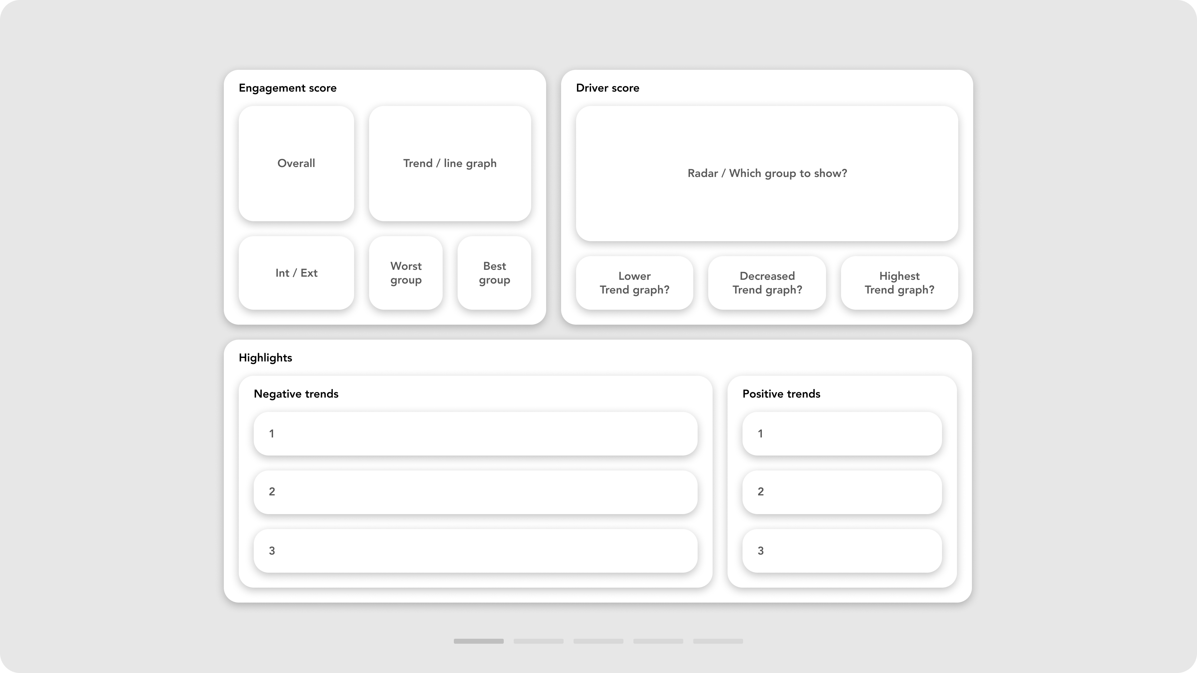
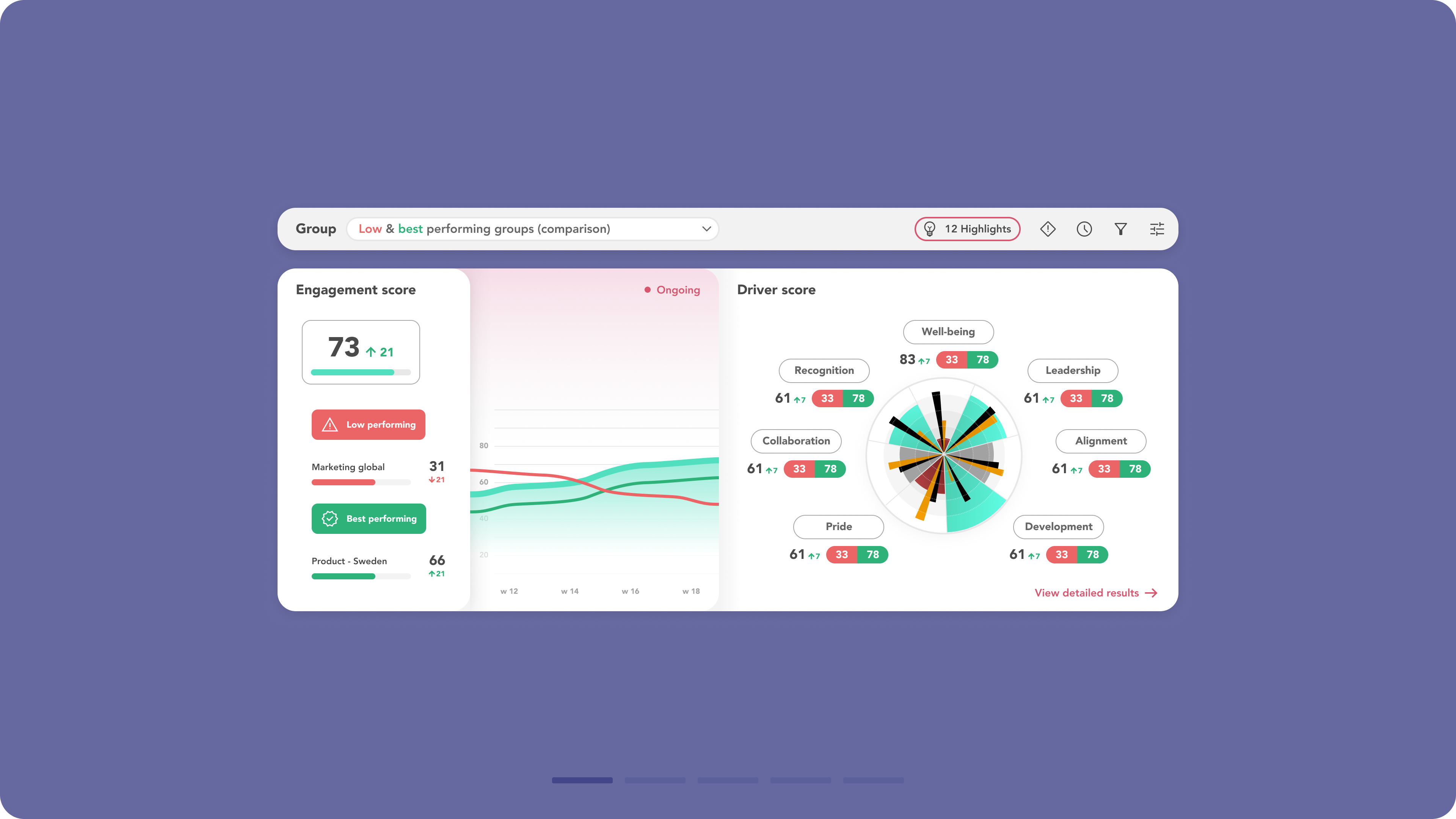
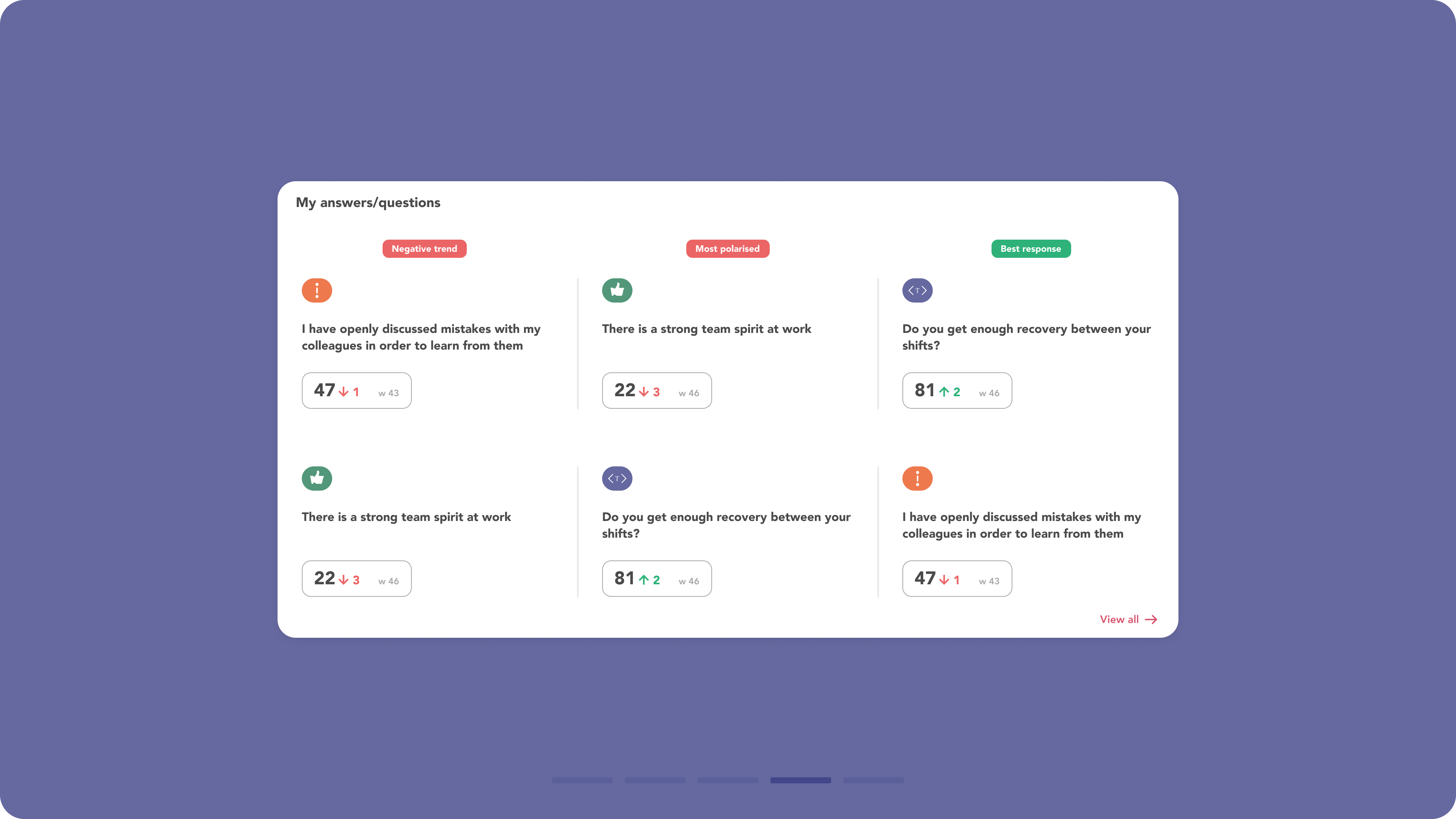
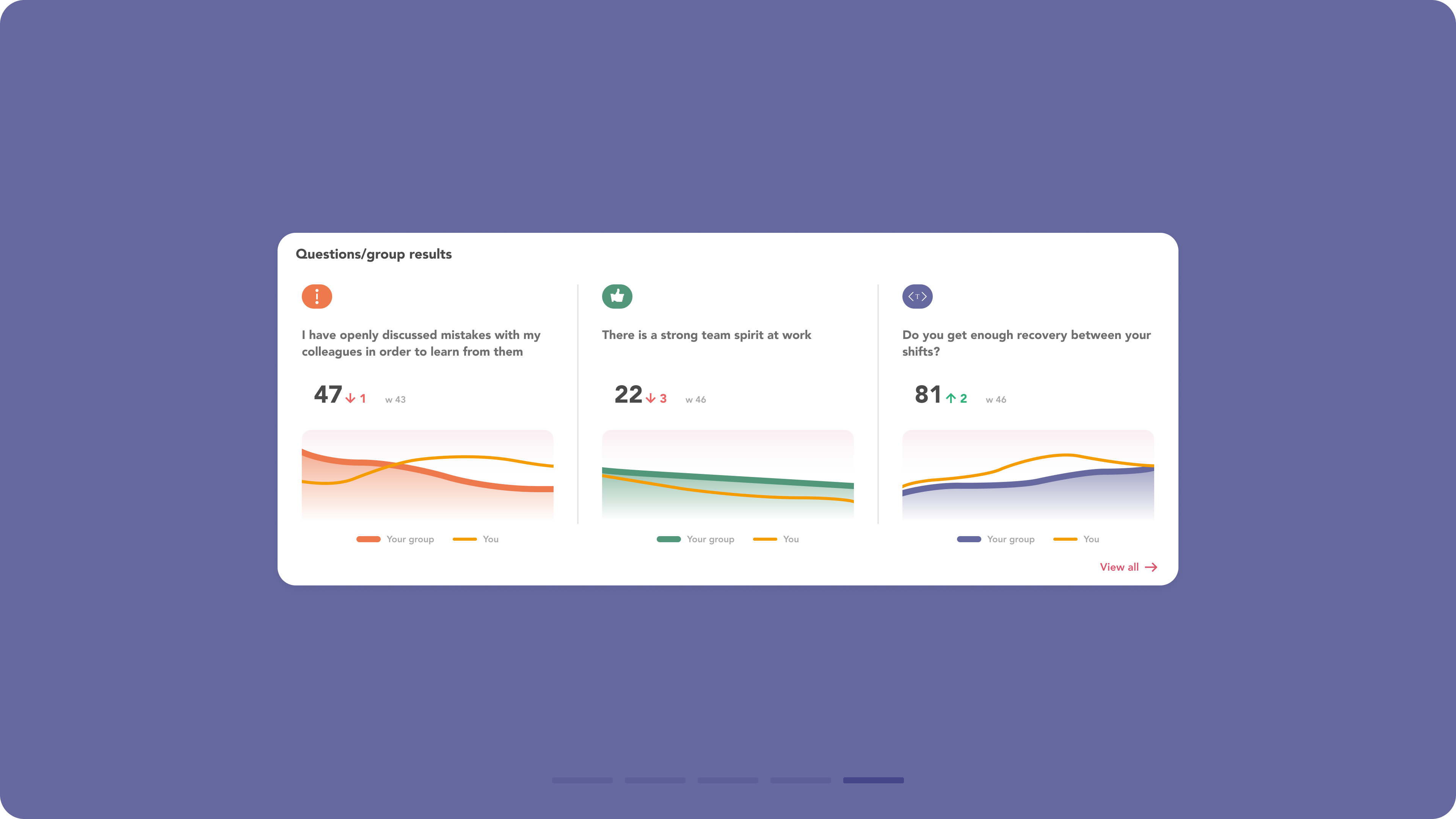
- Additional trend visualisations, including trend arrows, were added to many elements, such as the engagement score datapoint.
-
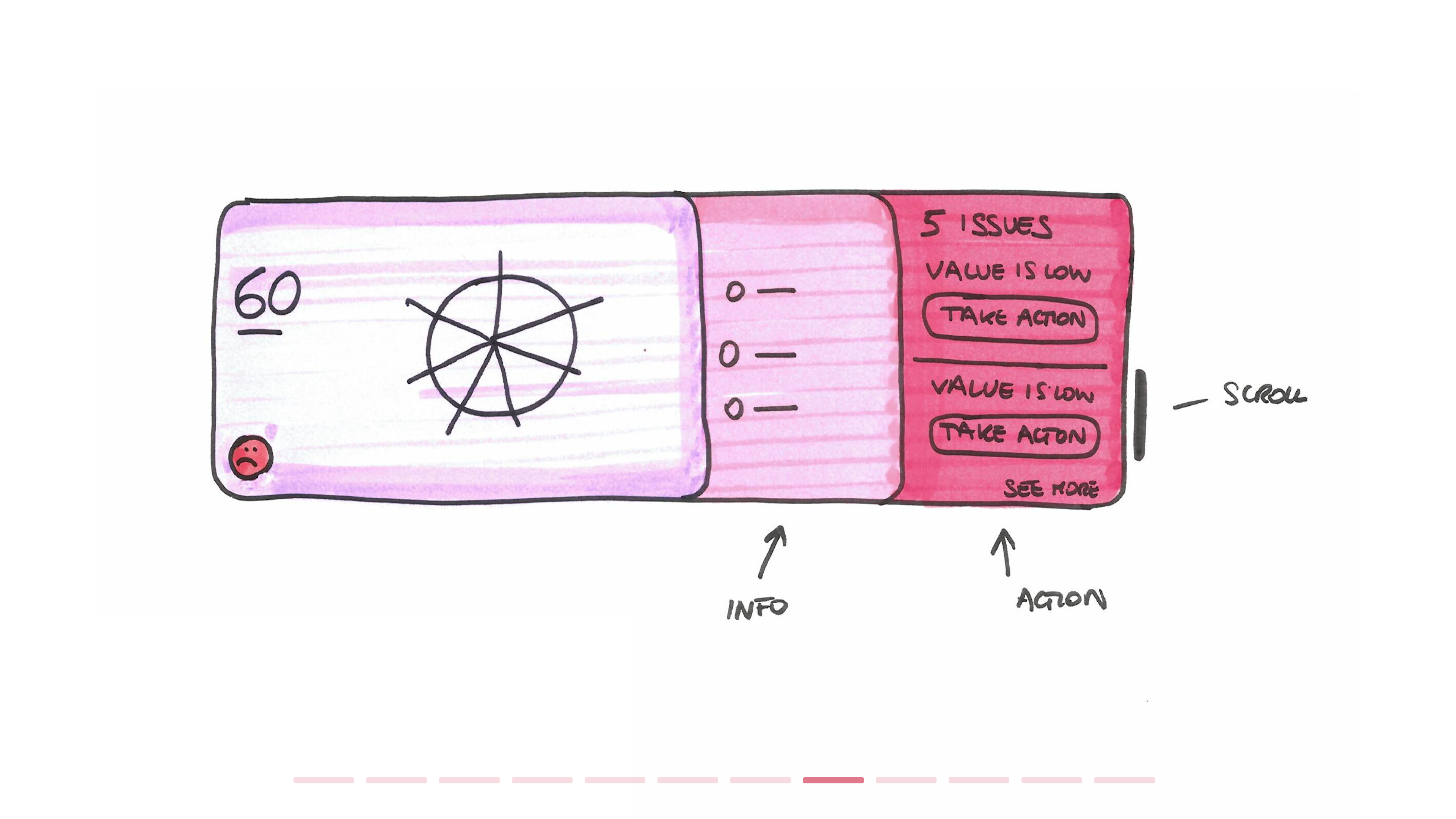
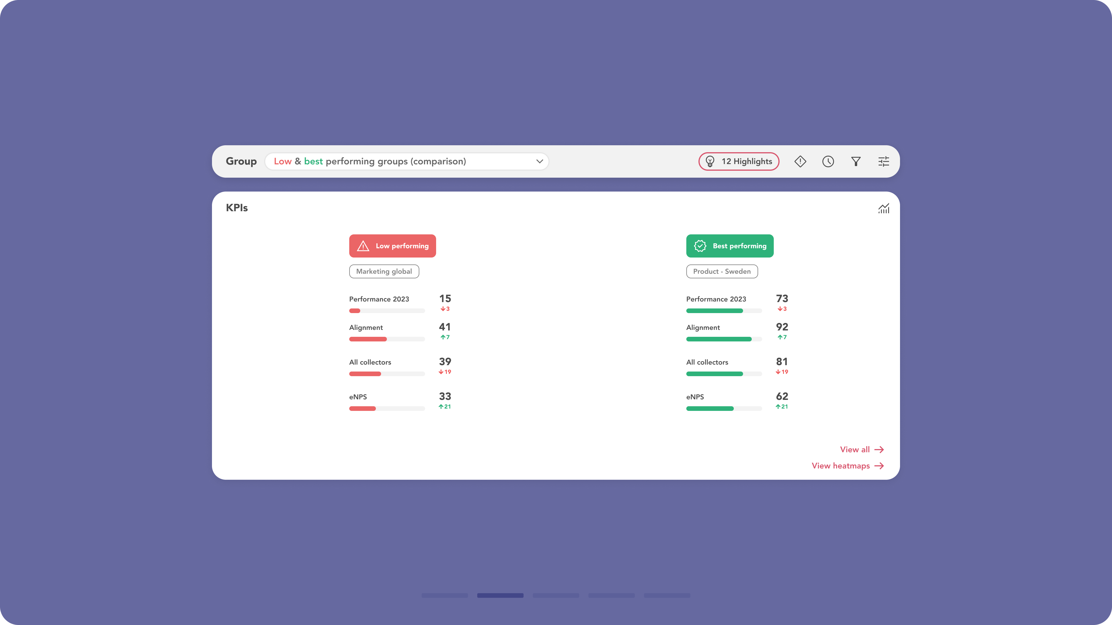
Aggregated data results were presented in new summary visualisations, highlighting both the best and worst performances. Links to related pages for further analysis of the results were provided in every widget.
-
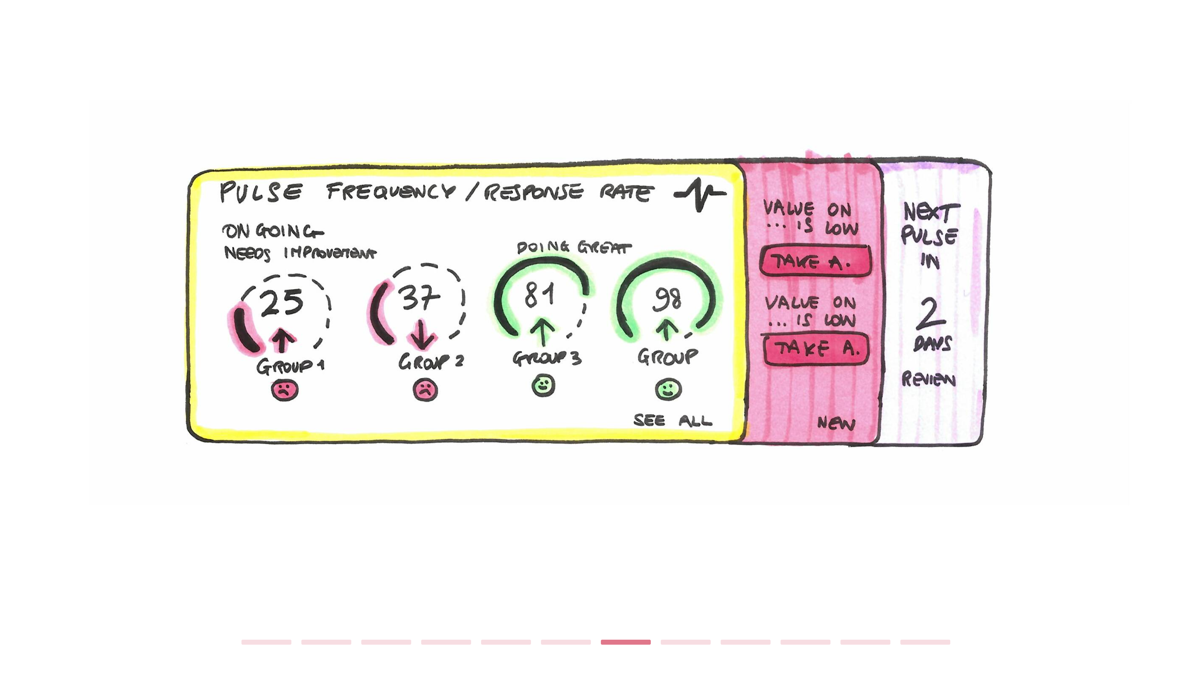
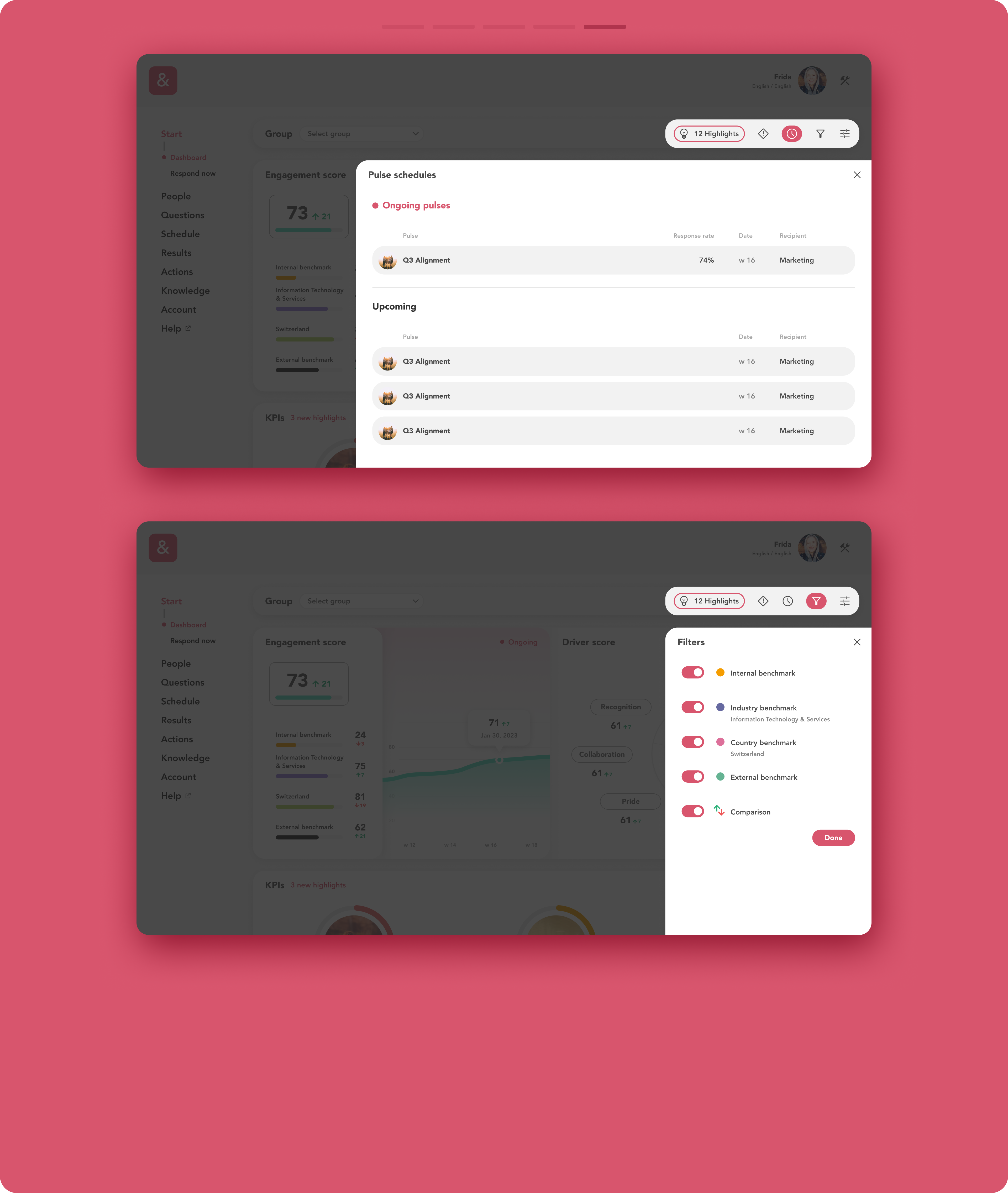
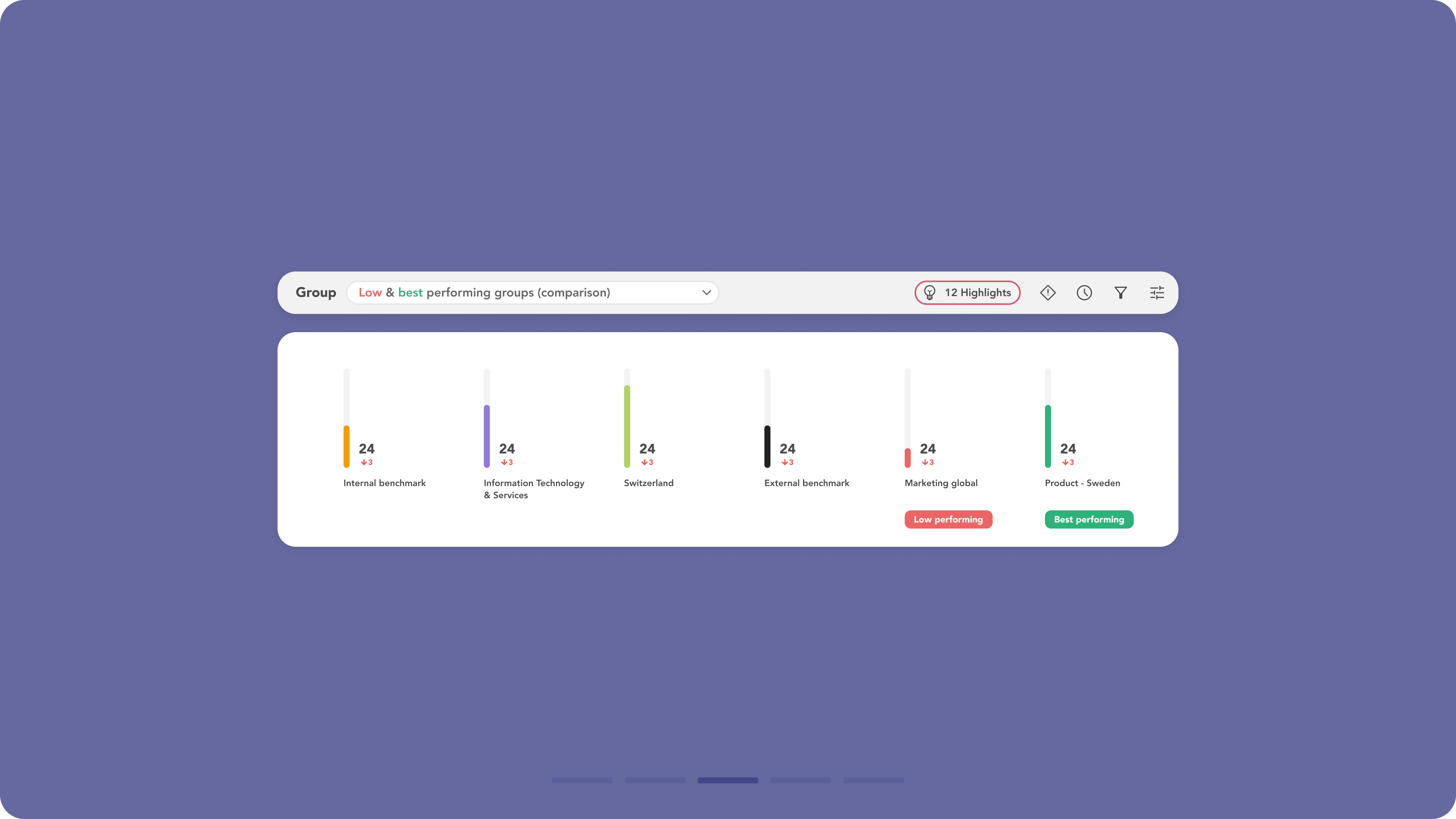
The benchmark functionality was expanded to include additional comparison data for company sectors and countries, along with corresponding visualisations throughout the platform. The benchmark is now also applied to questions. Users can use the toolbar in the top-right corner to open the sidebar and select specific filters for the benchmark comparison.
-
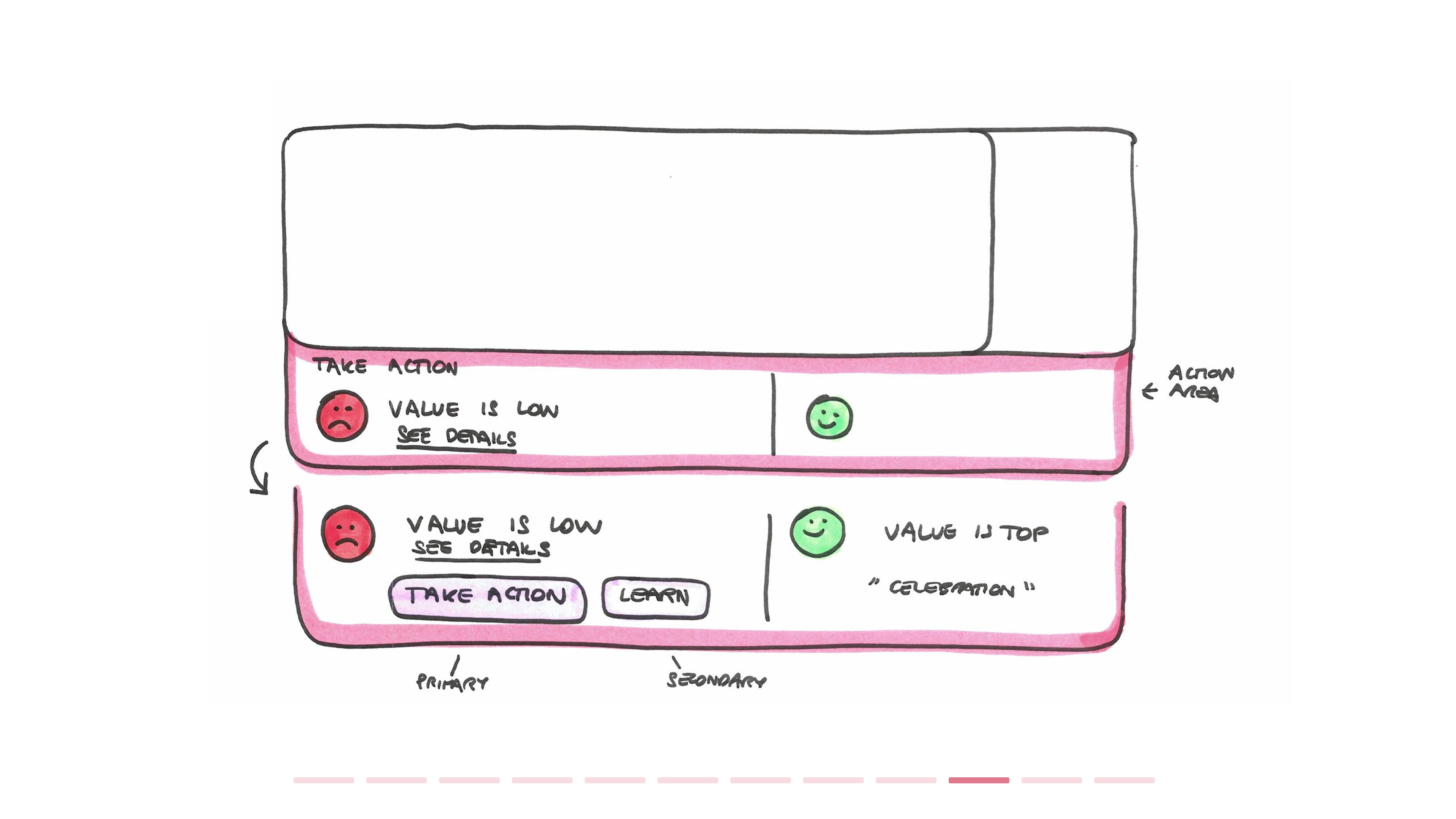
Additional emotional evaluation tags, with colour coding, were introduced for questions, helping to understand trends (negative, positive, stable) and how they compare across different teams. This makes it easier to identify what’s going well, what needs attention, and where to focus further investigations and actions.
-
The layout of the KPIs widget for admins and managers was reorganised to accommodate more datapoints, split into three columns to emphasise the most critical KPIs. It now includes a new layout with negative and positive trend indicators, making it easier to assess the situation.
-
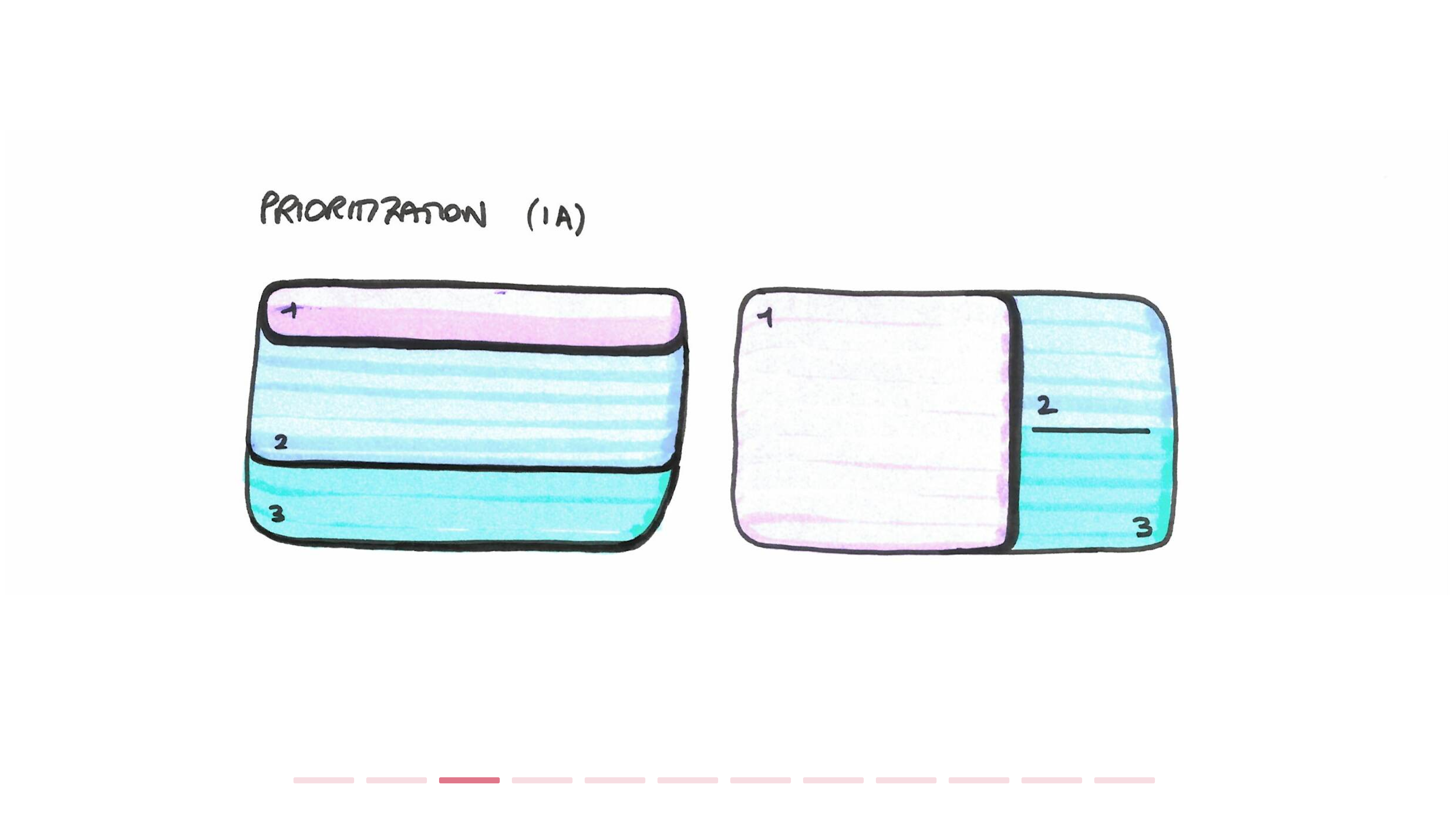
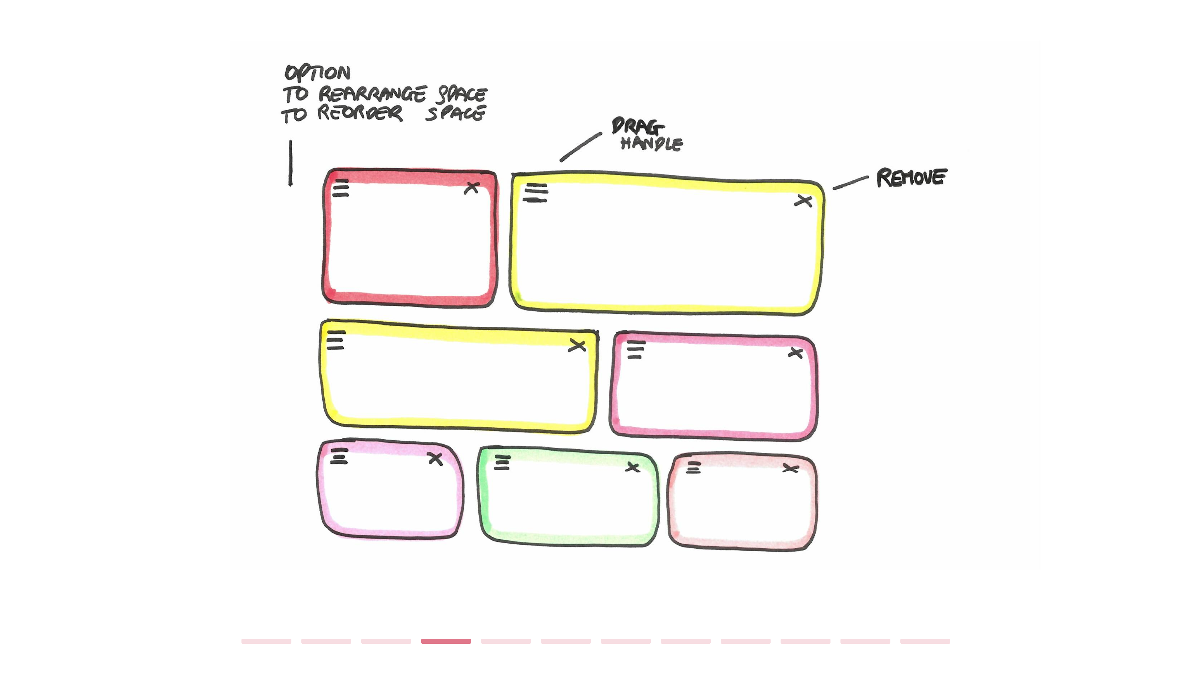
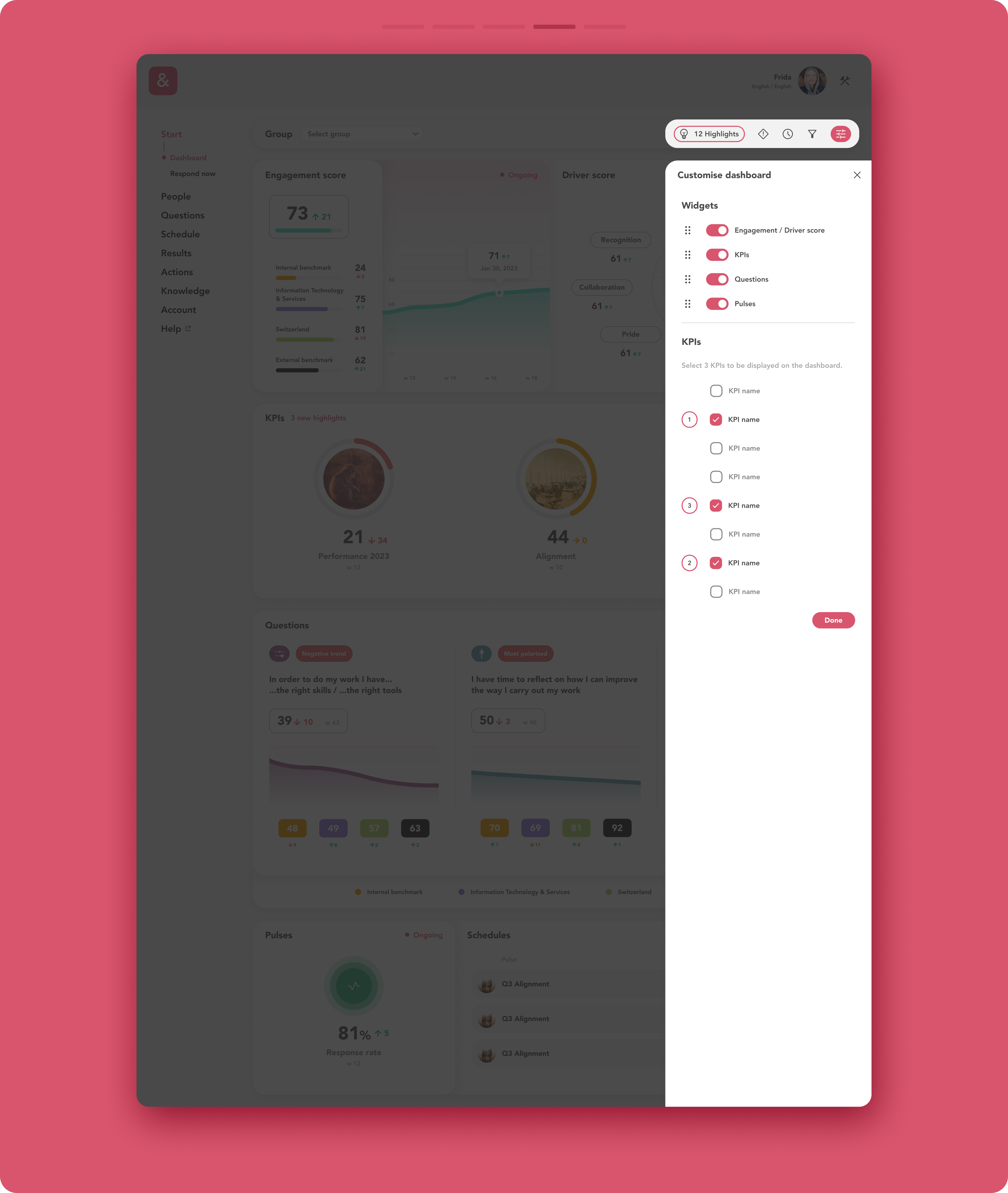
A new customisation feature in the top-right toolbar allows users to reorder widgets on the dashboard, prioritising the most important ones by dragging them up and down within the sidebar. For the simplified KPIs layout, users can select up to three KPIs to display on the dashboard widget.
-
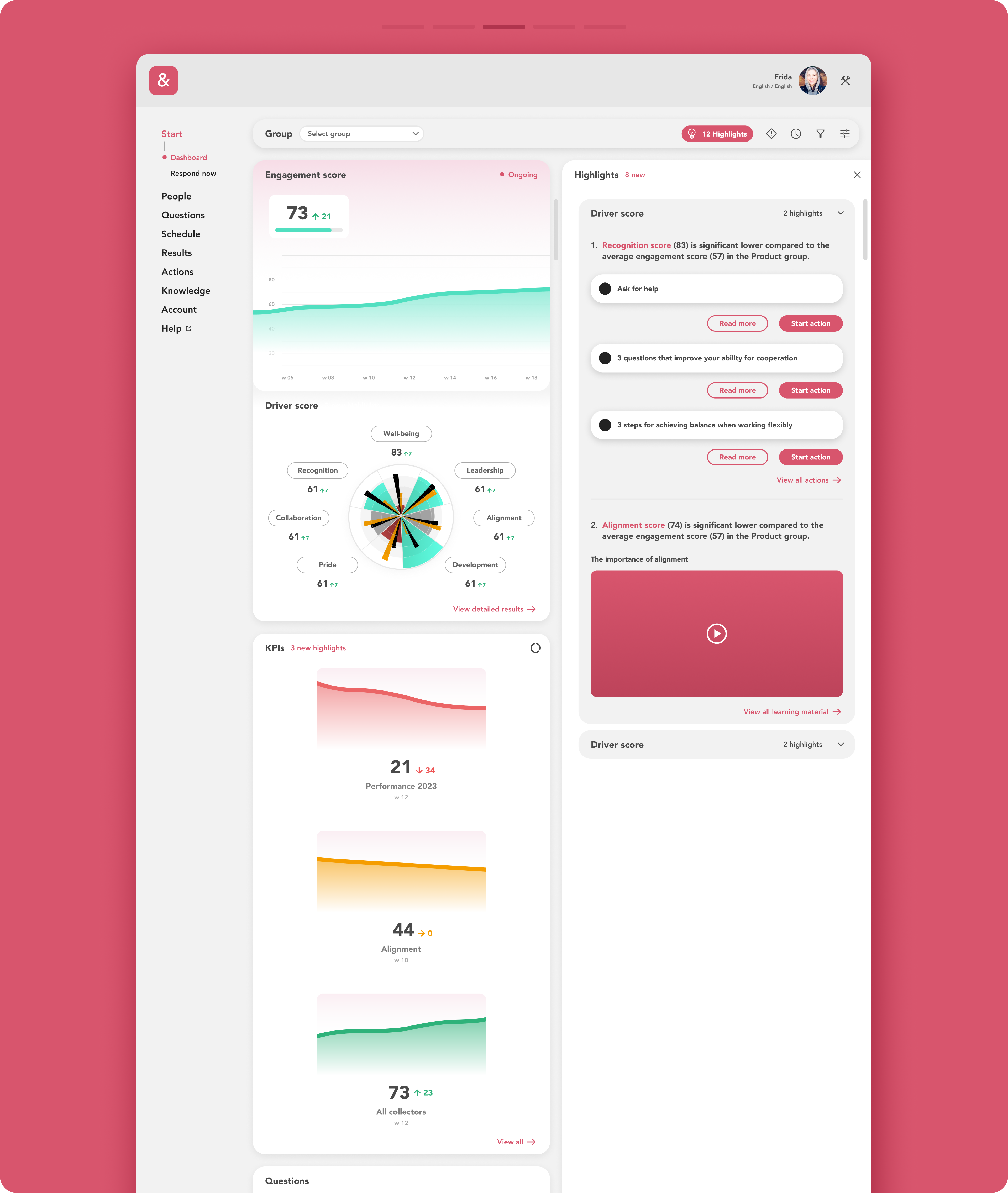
A left-side insights panel was added to highlight areas for improvement and suggest actions or additional guidance, including tailored interactive material for users.
-
Additionally, the design was modernised by removing unnecessary visual elements, resulting in a cleaner, more streamlined look.
Previous interface

Development sketches