Analysis
The project focuses on redesigning the information architecture and design system of EIAS, enhancing data visualisation efficacy, and introducing advanced analysis capabilities and customisation features. These improvements aim to better align with users’ goals and expectations.
Research & analysis / UX / UI / Prototype
2024 / 2025 (ongoing)
Encare is a HealthTech company based in Stockholm, specializing in the development of cloud-based solutions to enhance surgical care.
EIAS, ERAS® Interactive Audit System, is a comprehensive software solution developed by Encare to support the implementation of ERAS protocols in hospitals. It offers functionalities such as data entry, analysis, and reporting.
Enhanced Recovery After Surgery (ERAS) protocols aim to improve patient outcomes by reducing complications and shortening hospital stays.
Browse the galleries to view the new design


The problem :
In the previous interface, the information architecture was not intuitively structured, and the prioritisation of elements was ineffective. The left navigation menu displayed only icons by default, which failed to convey the content of each section, causing confusion among users.
The secondary navigation used a nested tab system with two layers of dropdowns, making it difficult for users to navigate across sections and remember their locations. This increased the number of clicks needed to get a full overview of the data.
Additionally, a secondary right navigation menu contained important actions, but its hidden placement and poor prioritisation made them harder to access. The icons in this menu also lacked clarity, further hindering usability.
Overall, the steep learning curve caused significant friction for users.
Browse the gallery to view screens of the previous interface
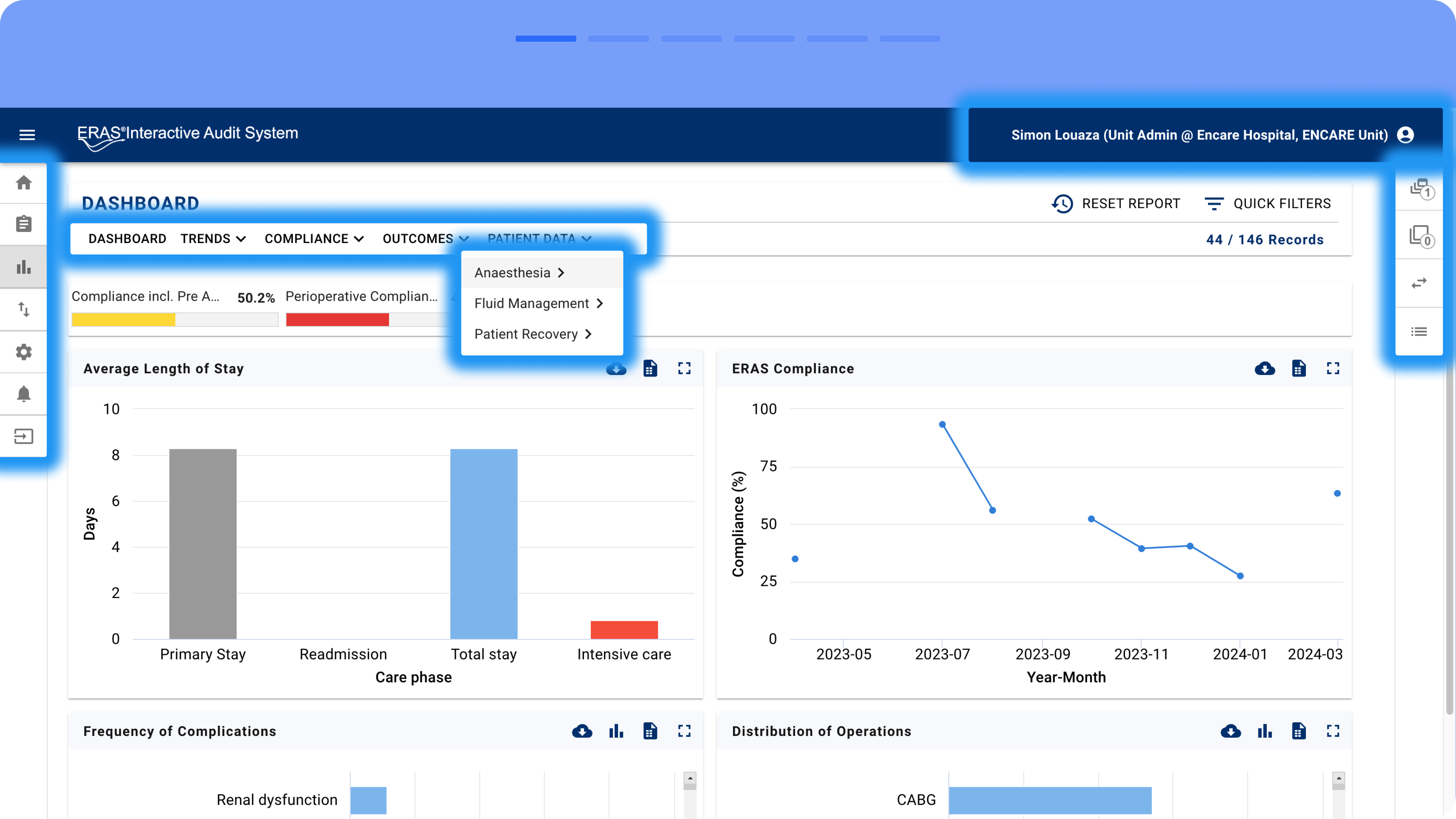


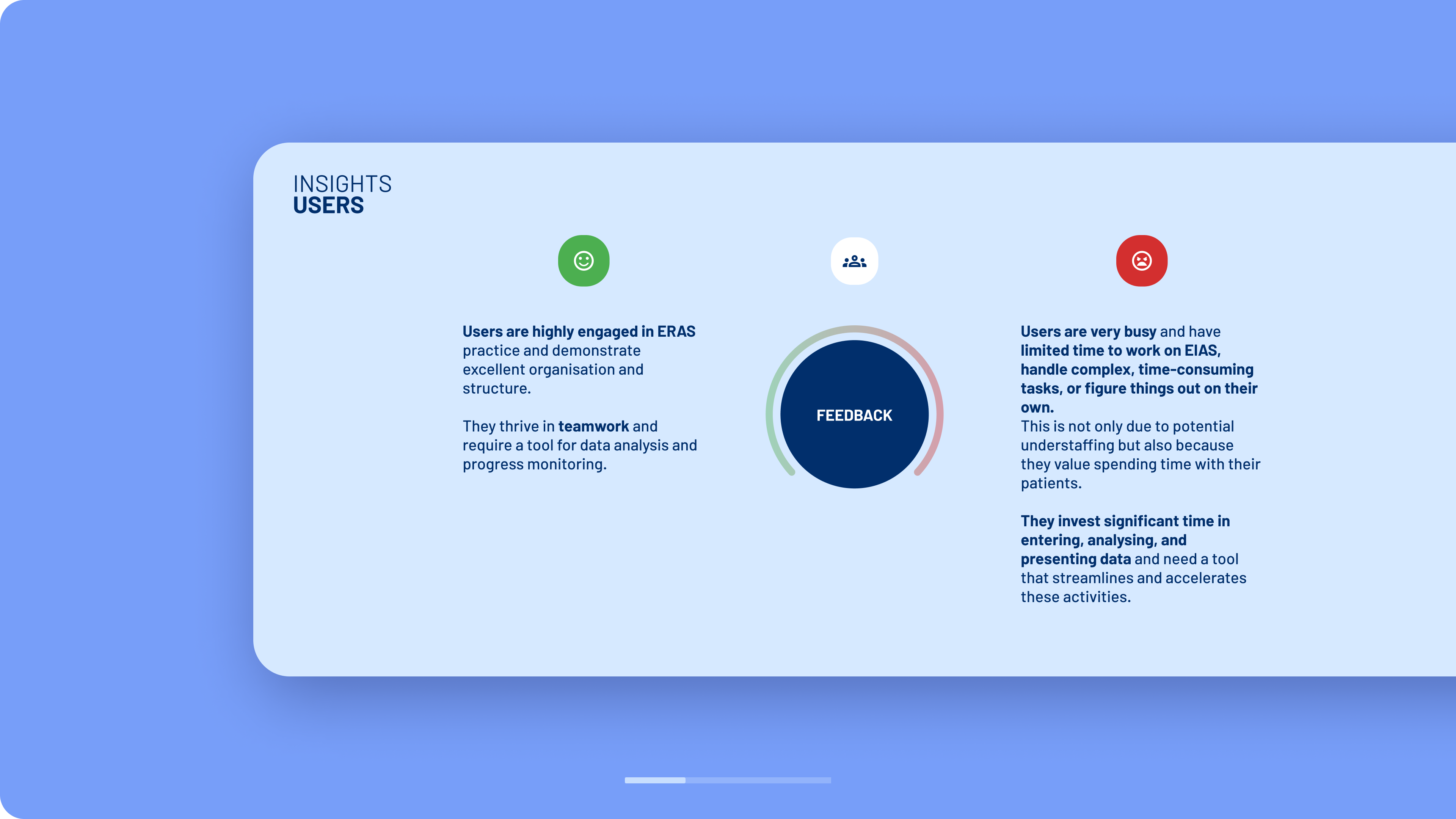
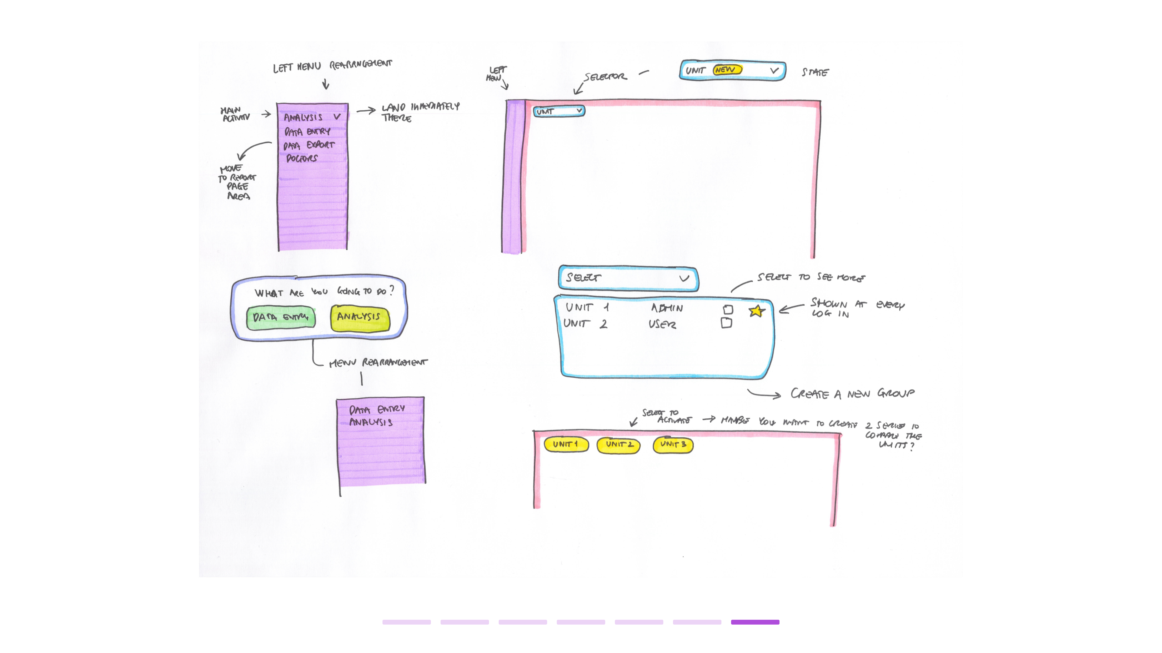
Additional steps between login and landing on the main page increased user frustration. Since their primary goal was to perform data entry tasks or conduct data analysis, these extra steps created unnecessary friction.
Upon every login, users were required to select a specific data unit before proceeding. However, they were not given the option to set a favourite unit, remember their last selection, or skip this step if they had access to only one unit. This resulted in additional clicks and an inefficient workflow.
Upon every login, users were required to select a specific data unit before proceeding. However, they were not given the option to set a favourite unit, remember their last selection, or skip this step if they had access to only one unit. This resulted in additional clicks and an inefficient workflow.
Browse the gallery to explore the workshop map and the bubble chart

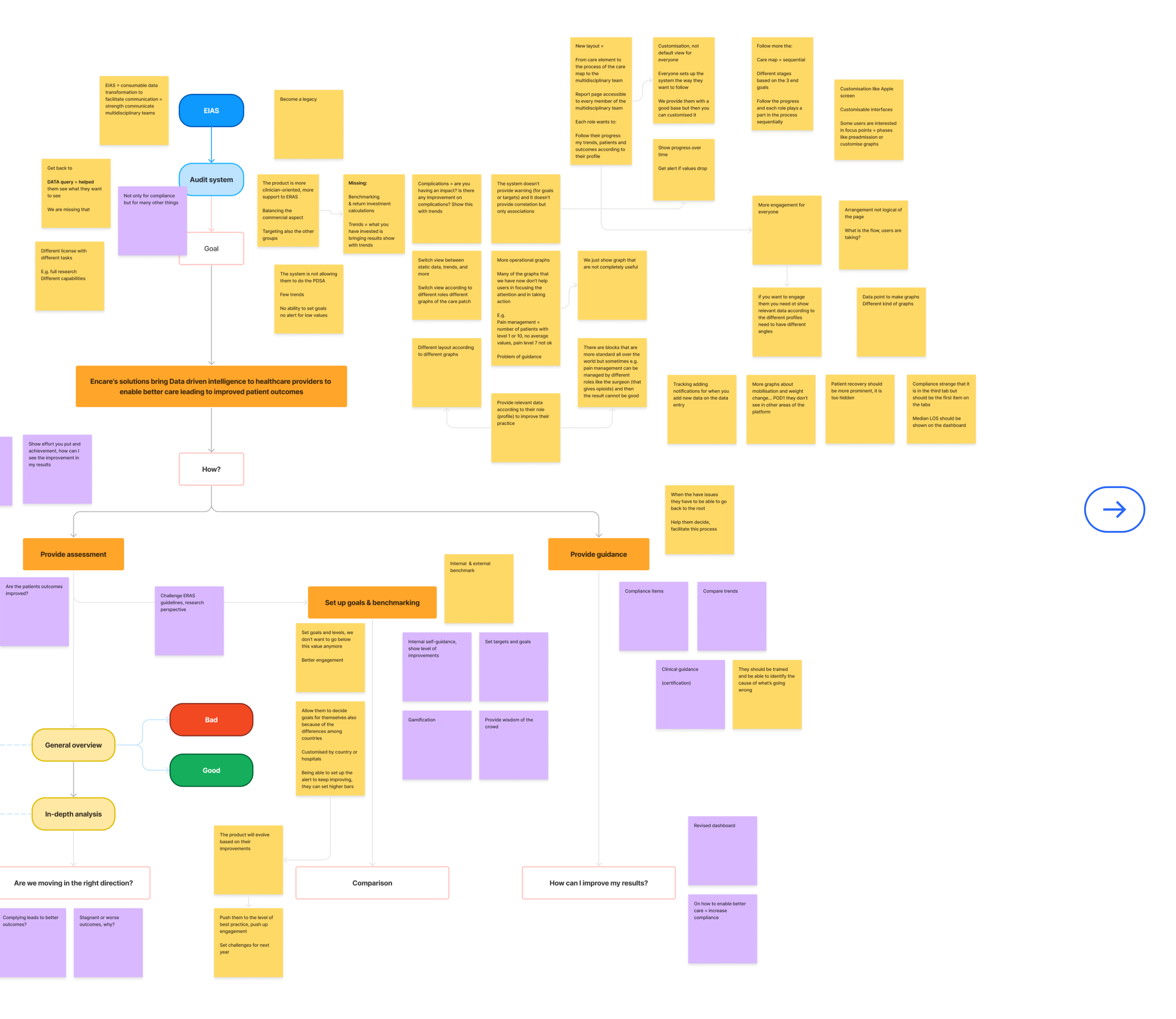
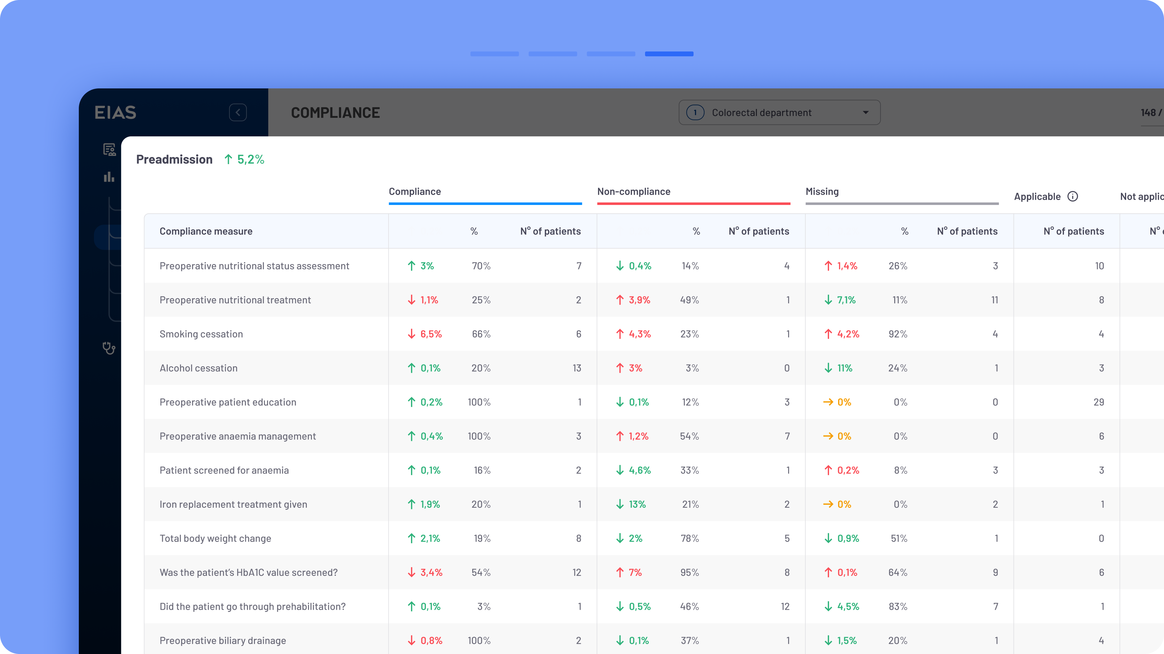
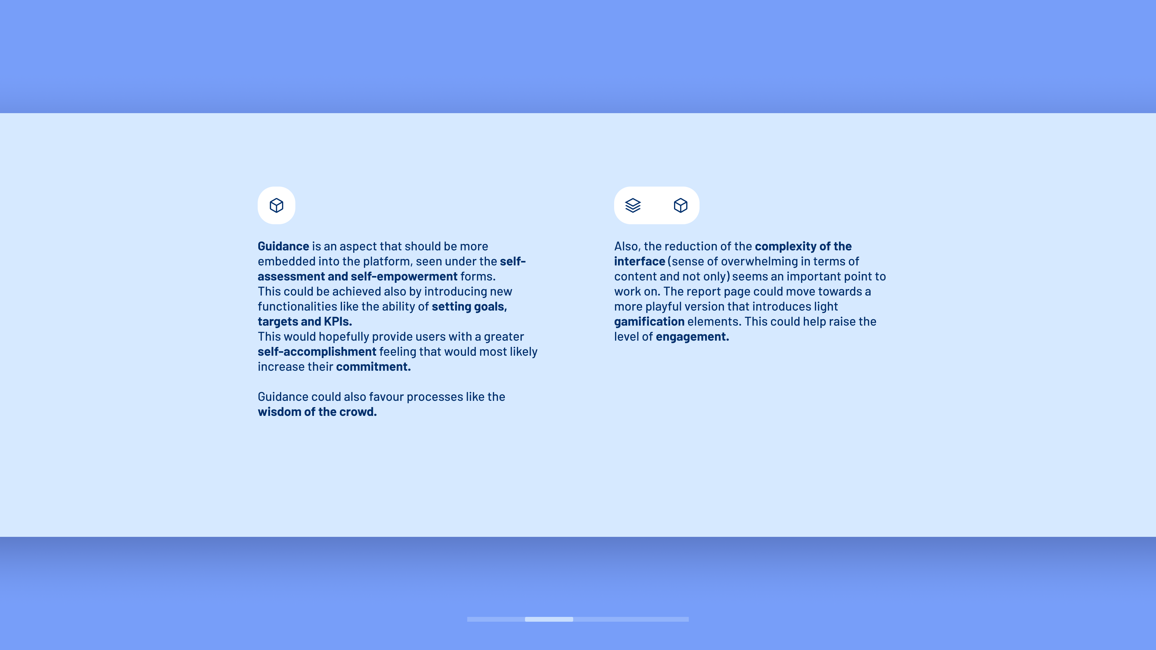
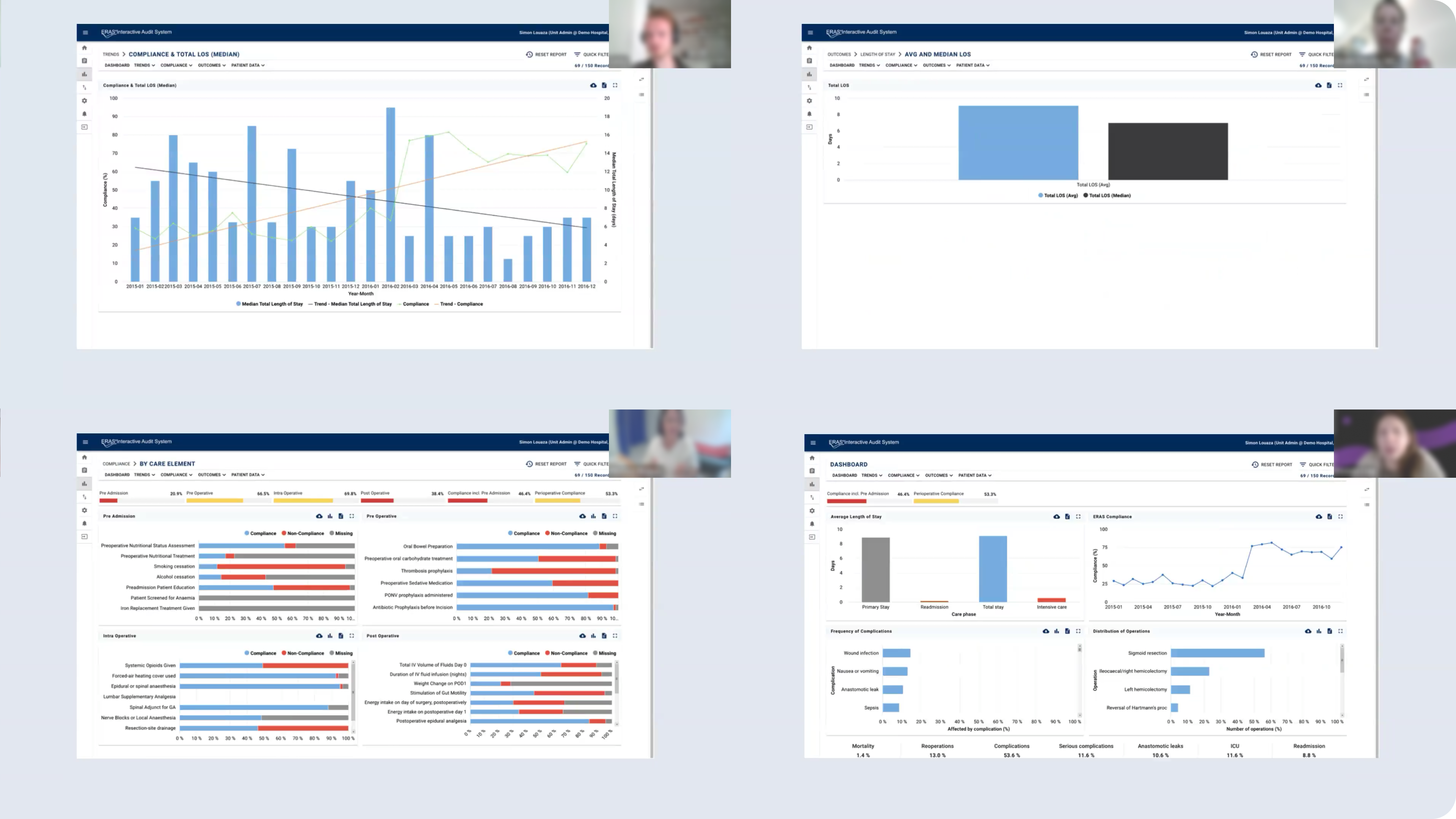
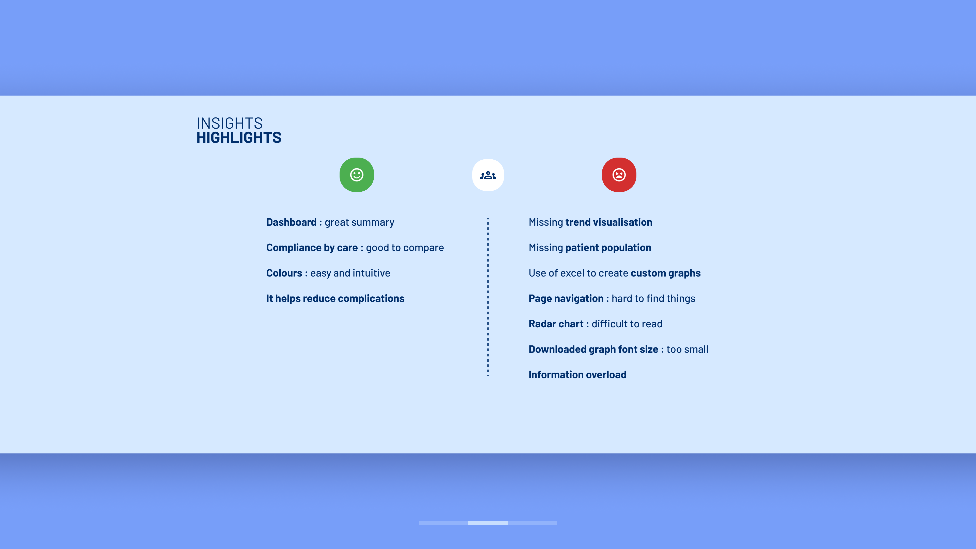
Users often felt overwhelmed by the complexity of the many sections and graphs, highlighting a general lack of guidance and intuitiveness in facilitating data interpretation. At the same time, they found that many graphs lacked key features or data, limiting flexibility in analysis. They needed more tools to explore data from different perspectives and dive deeper into insights.
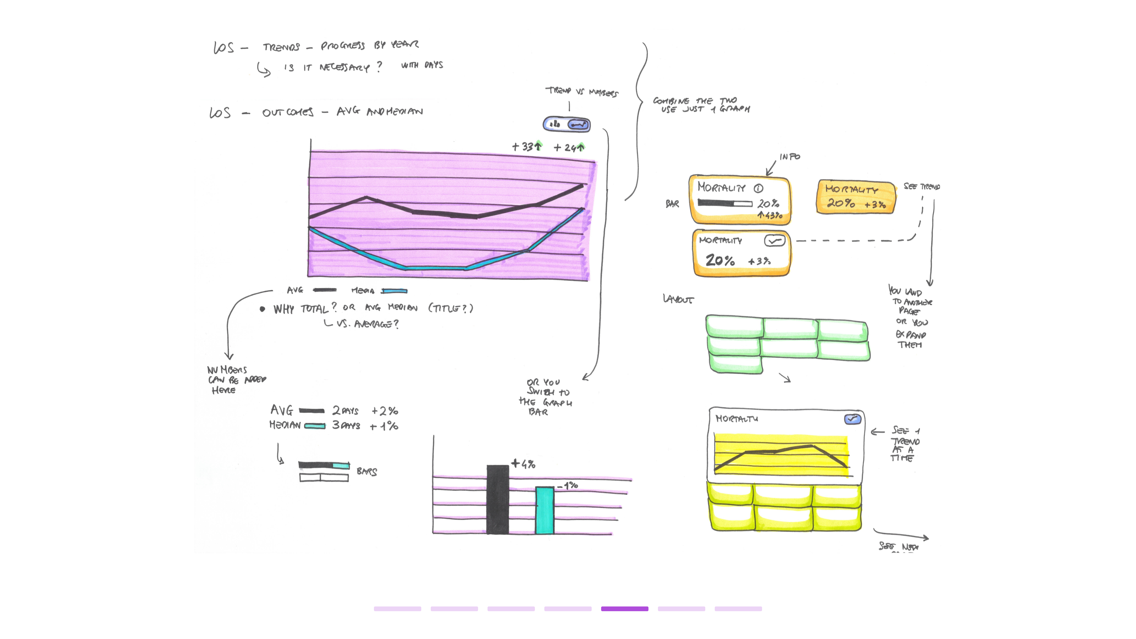
Examples of missing functionalities included the absence of trend visualisation (such as trend graphs and arrows) to indicate status and direction, limited graph customisation (e.g., switching between bar and line charts), and missing comparison parameters like average and median values.
Additionally, several high-priority graphs were buried within the interface, requiring excessive scrolling, which led to users overlooking them. Some graphs lacked proper colour coding or additional visual elements to support interpretation.
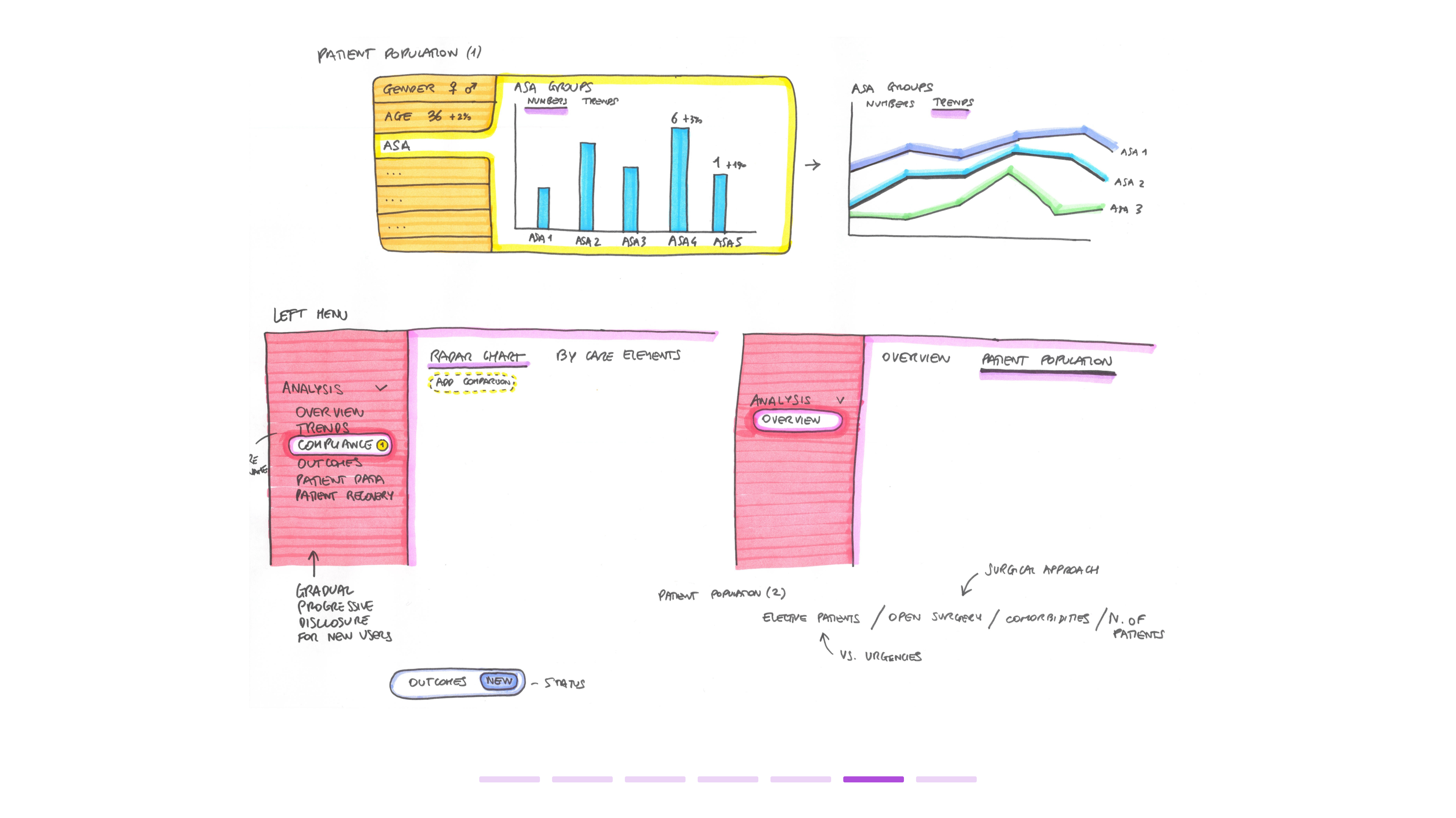
Despite the abundance of graphs, users still felt that essential data points were missing, particularly those related to patient population, comorbidities, and surgical areas.
Examples of missing functionalities included the absence of trend visualisation (such as trend graphs and arrows) to indicate status and direction, limited graph customisation (e.g., switching between bar and line charts), and missing comparison parameters like average and median values.
Additionally, several high-priority graphs were buried within the interface, requiring excessive scrolling, which led to users overlooking them. Some graphs lacked proper colour coding or additional visual elements to support interpretation.
Despite the abundance of graphs, users still felt that essential data points were missing, particularly those related to patient population, comorbidities, and surgical areas.
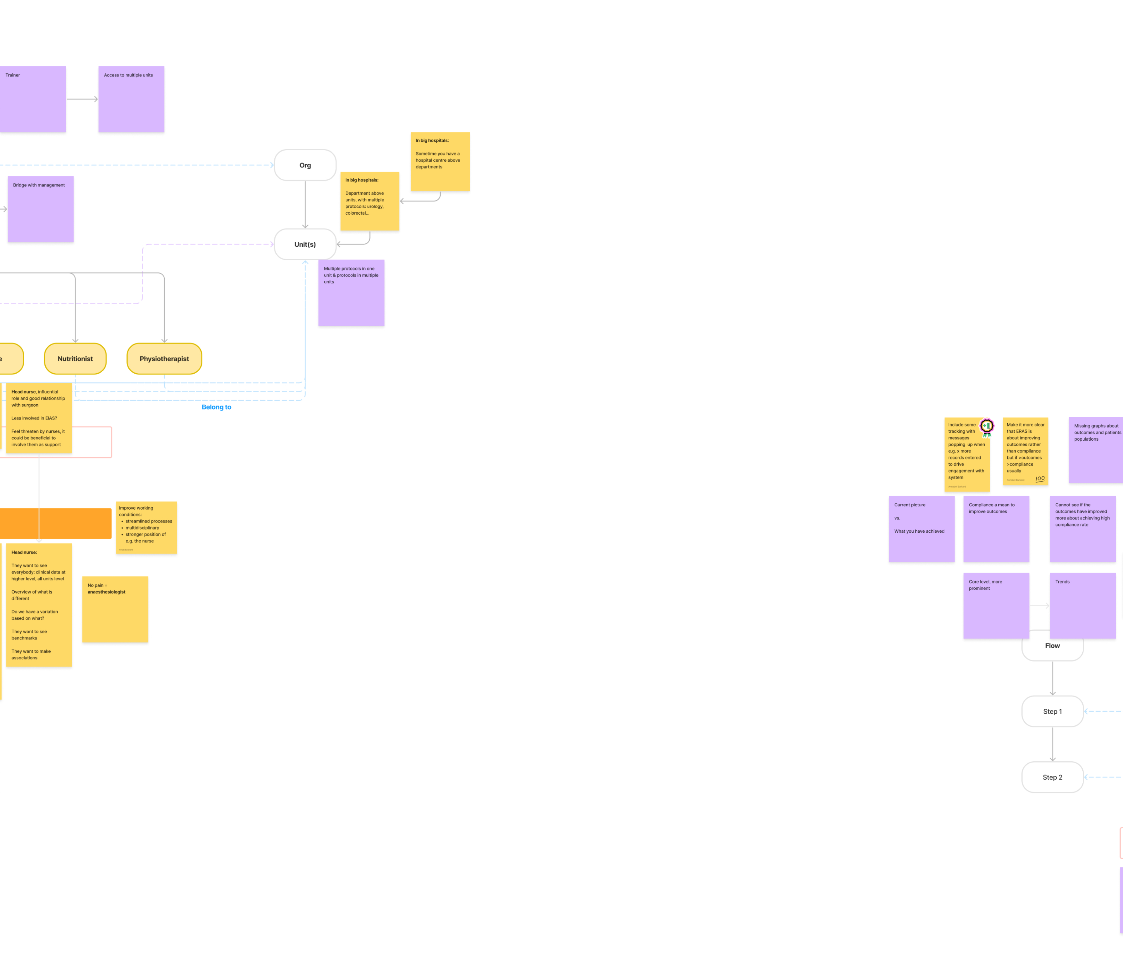
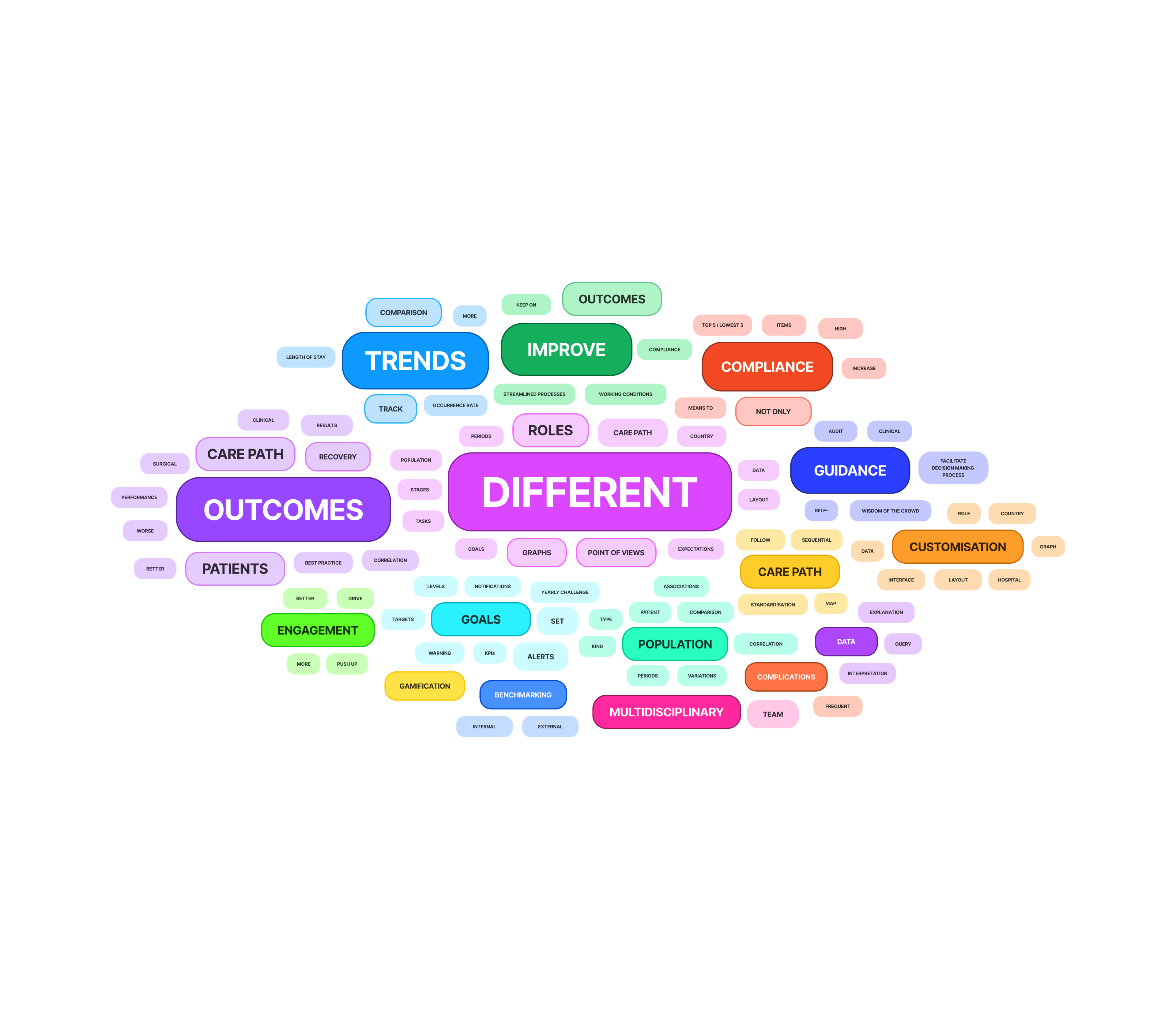
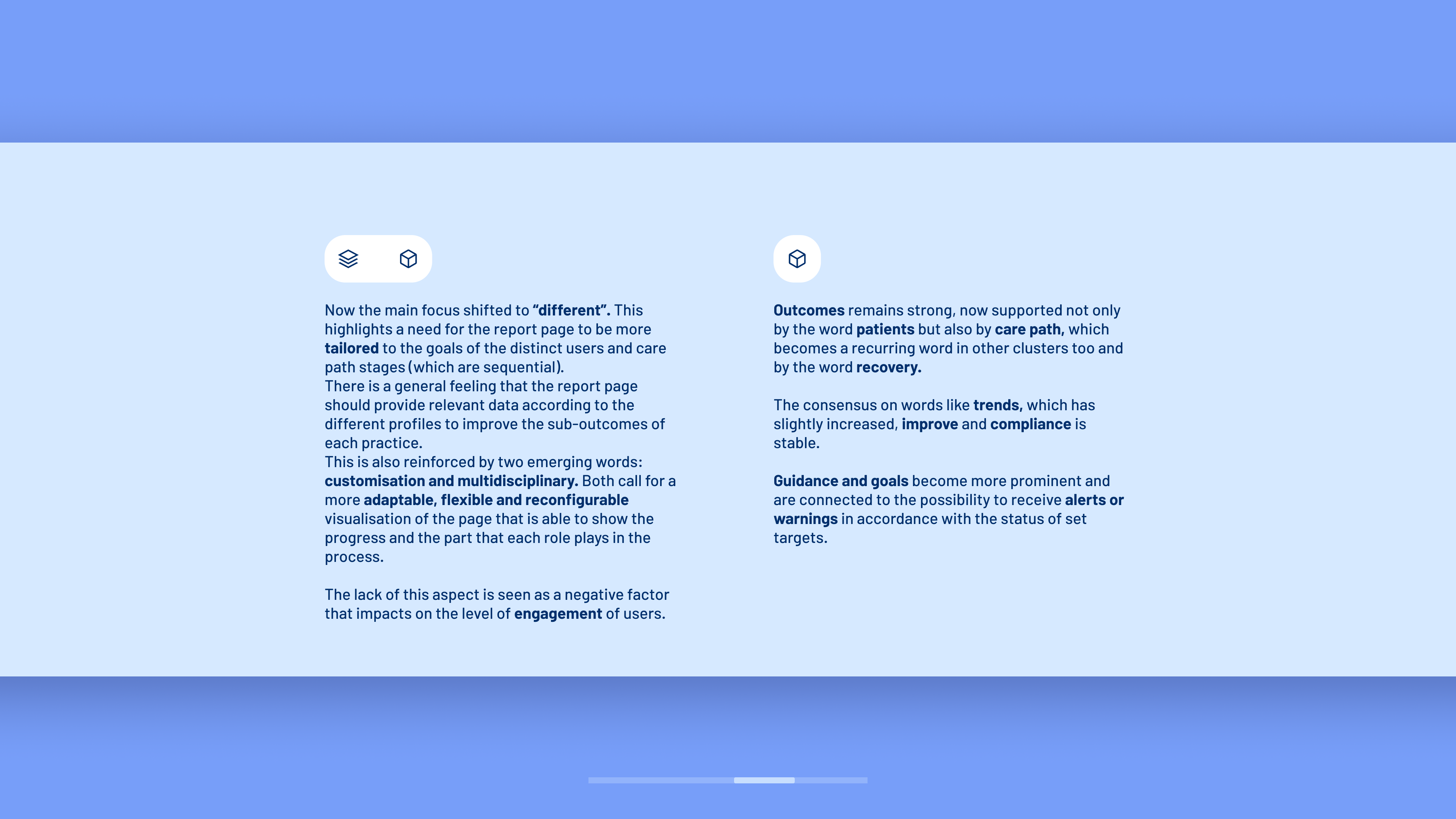
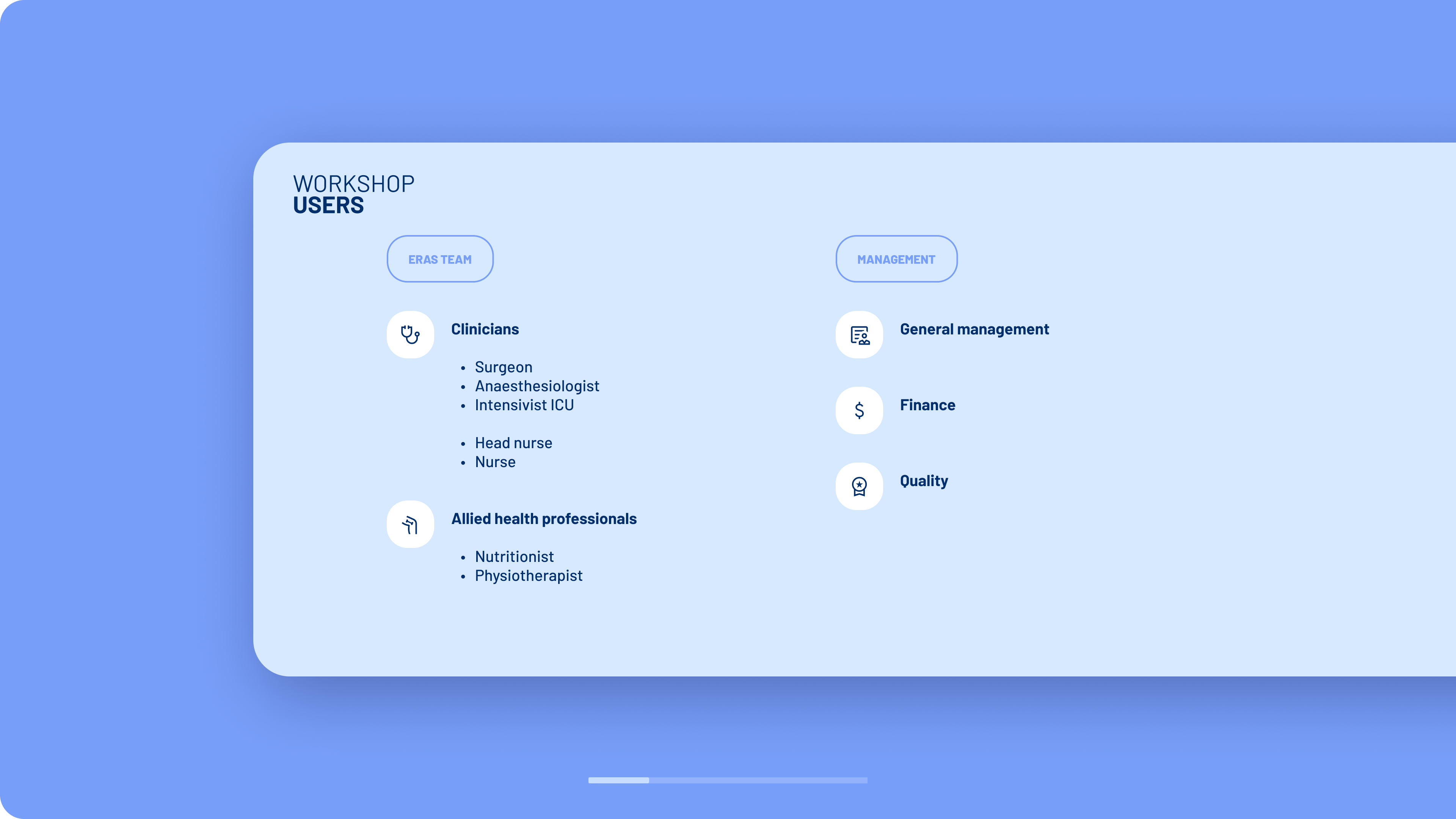
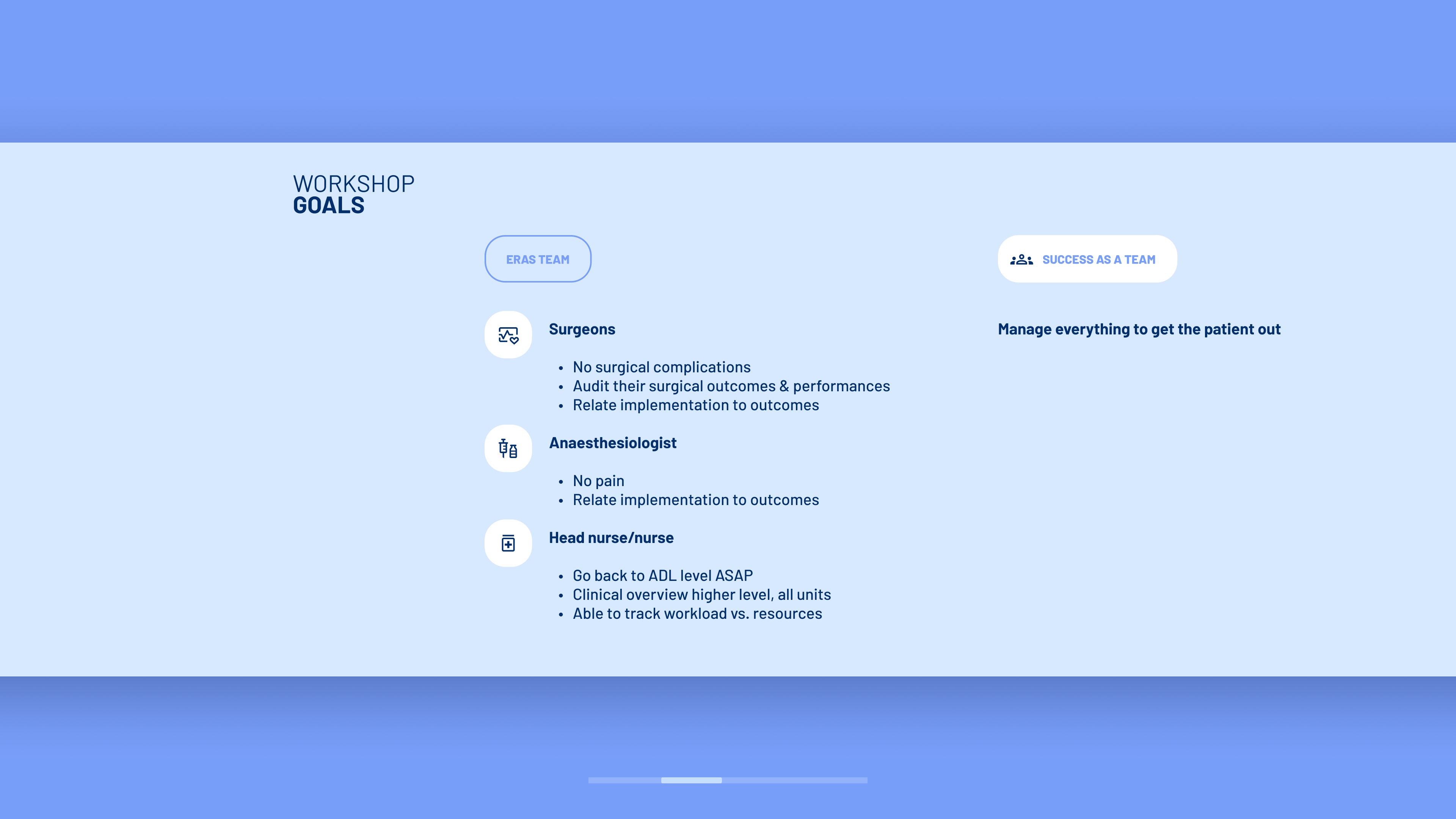
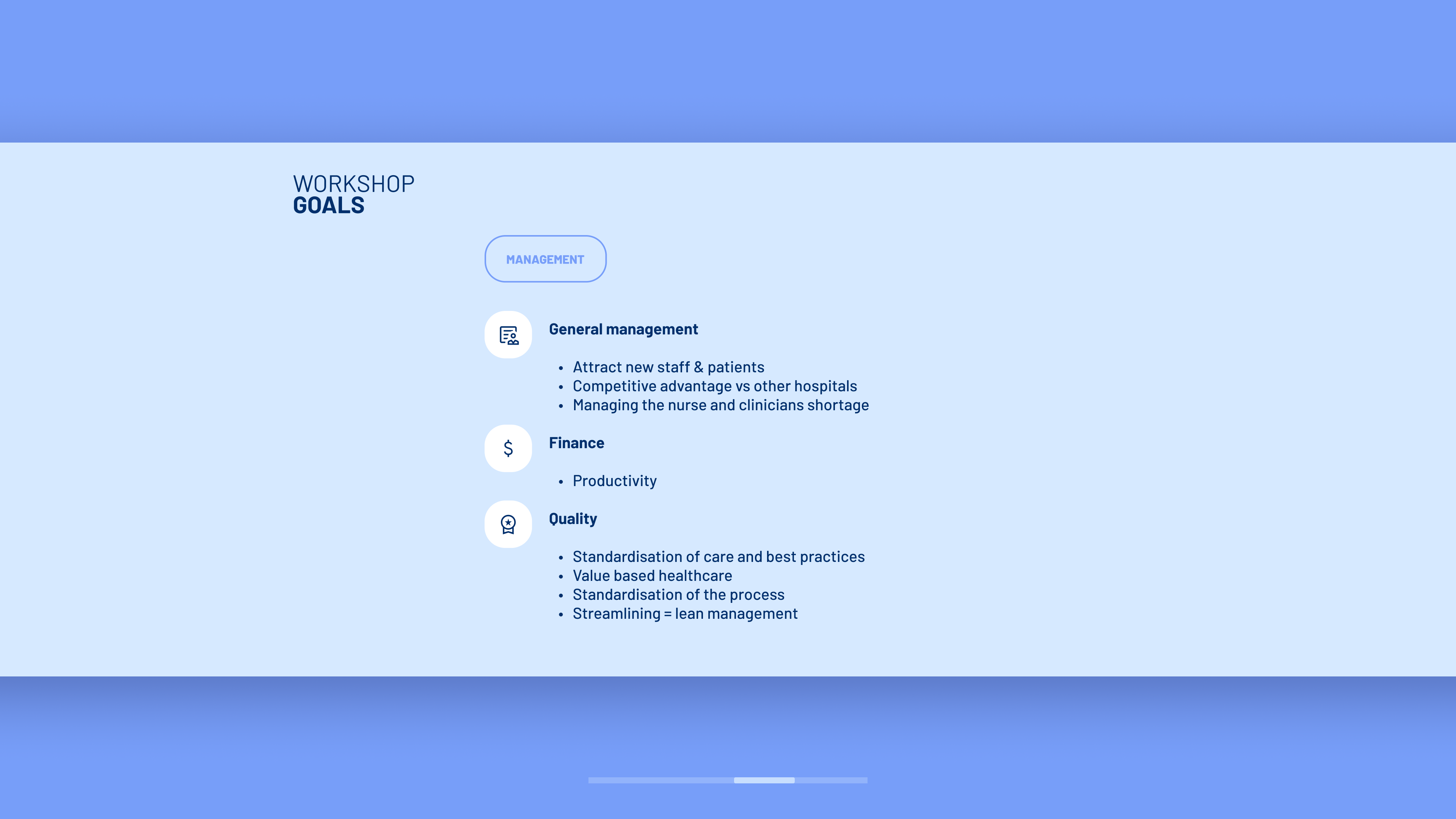
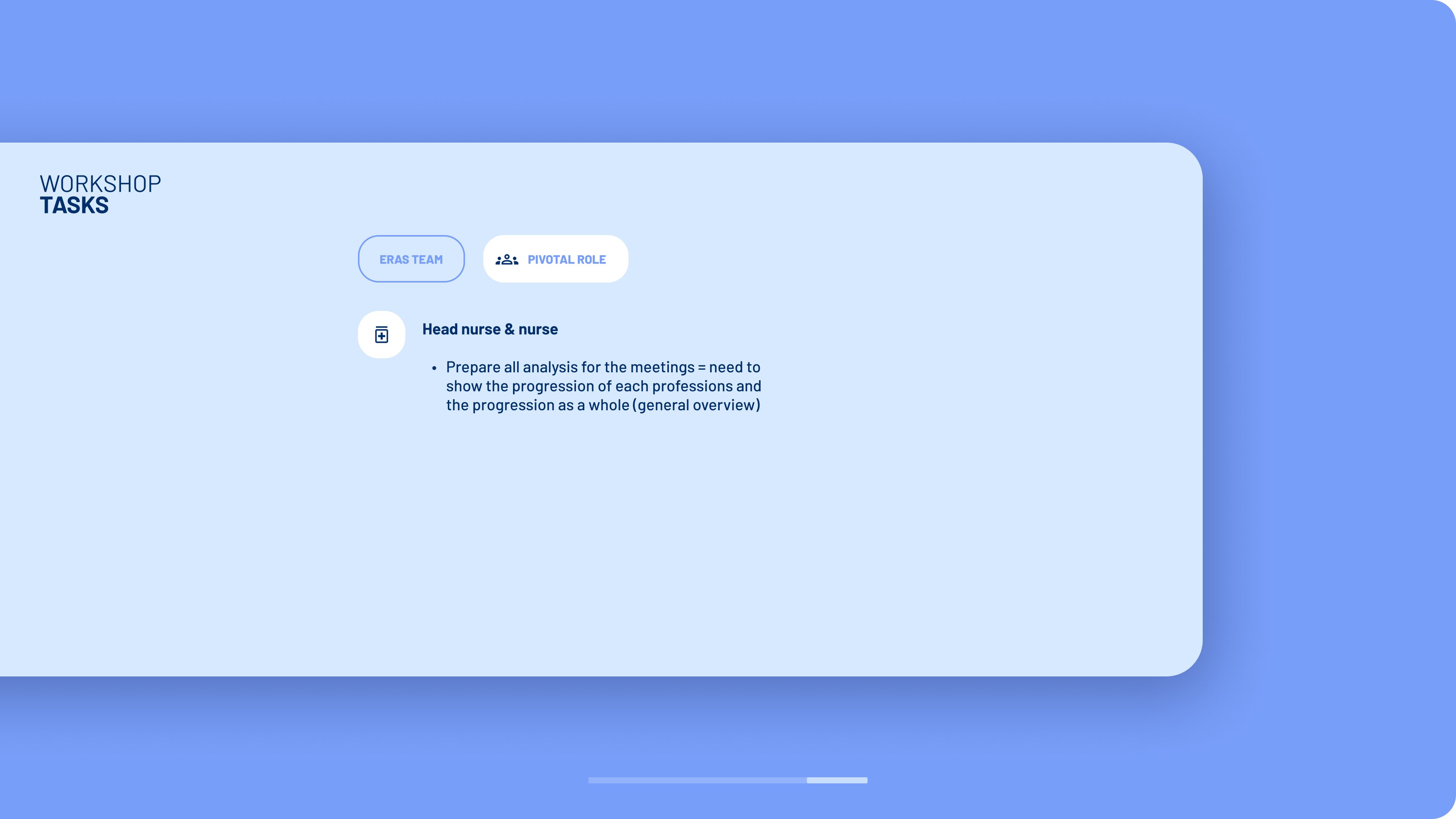
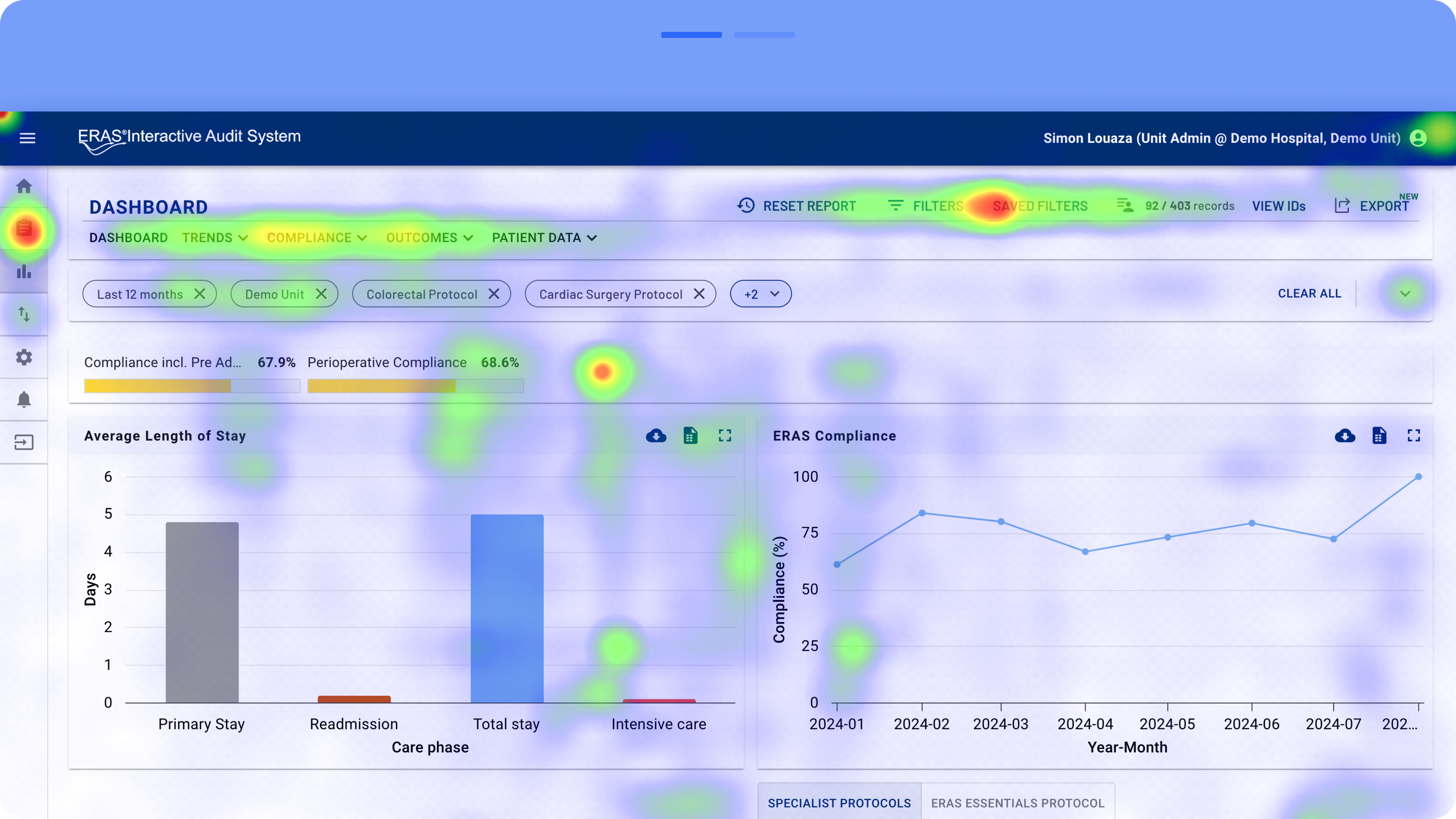
Workshop results and usability tests


The overall appearance and design system were outdated and lacked consistency. The interface contained unnecessary and visually cluttered elements, while key areas were not visually separated effectively. This increased eye strain and made it harder for users to scan the page for functionalities and data. Additionally, many colours did not provide optimal colour coding and were not fully accessible.
Browse the galleries to explore the findings from usability tests


The solution :
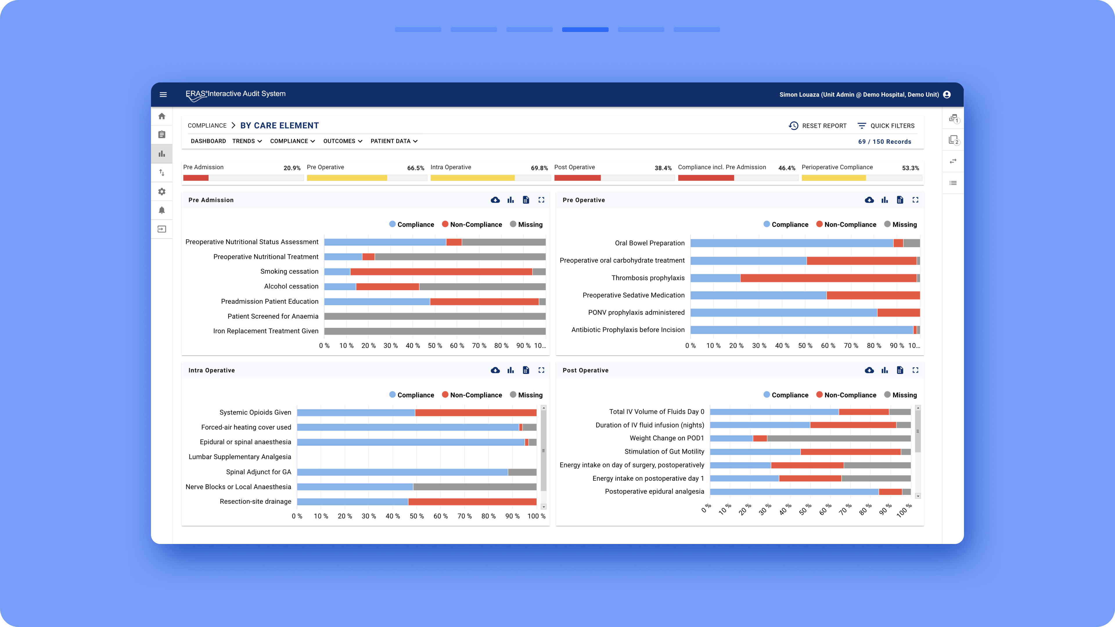
With the new design, the information architecture was completely rearranged. The primary left navigation icons were replaced with clear items that include both icons and text, with the left navigation panel always open by default. All pages were grouped into five categories to reduce the number of main items, supporting the different user profiles and highlighting relevant content for each, aligned with their goals:
For the secondary level of navigation, standard tabs were introduced, and their number was reduced compared to before by grouping similar graphs together in the same area.
A new dropdown feature was added to select and switch between units, along with the ability to pin favourite units.
Important functionalities, such as filters, were removed from the right bar and repositioned in a more prominent location on the interface. As a result, the right bar was completely removed, freeing up space for better graph visualisation. These graphs were also rearranged to be more accessible across the platform.
- Overview
-
Compliance
-
Surgery
-
Anaesthesia
- Recovery
For the secondary level of navigation, standard tabs were introduced, and their number was reduced compared to before by grouping similar graphs together in the same area.
A new dropdown feature was added to select and switch between units, along with the ability to pin favourite units.
Important functionalities, such as filters, were removed from the right bar and repositioned in a more prominent location on the interface. As a result, the right bar was completely removed, freeing up space for better graph visualisation. These graphs were also rearranged to be more accessible across the platform.
New graph toggle switches
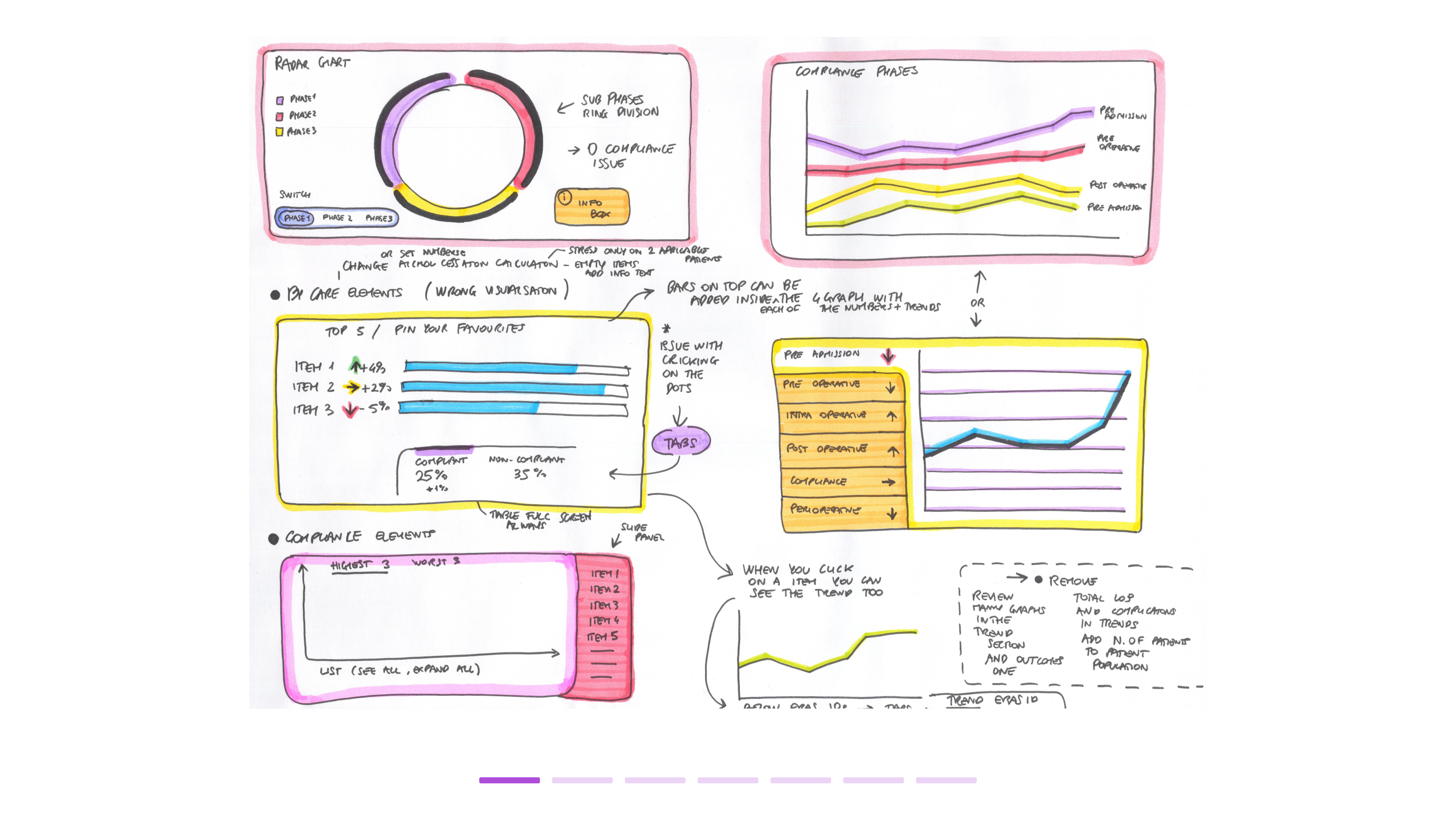
New visual elements were introduced to improve data interpretation, such as additional coloured rings around the radar chart to highlight the different phases in the care pathway.
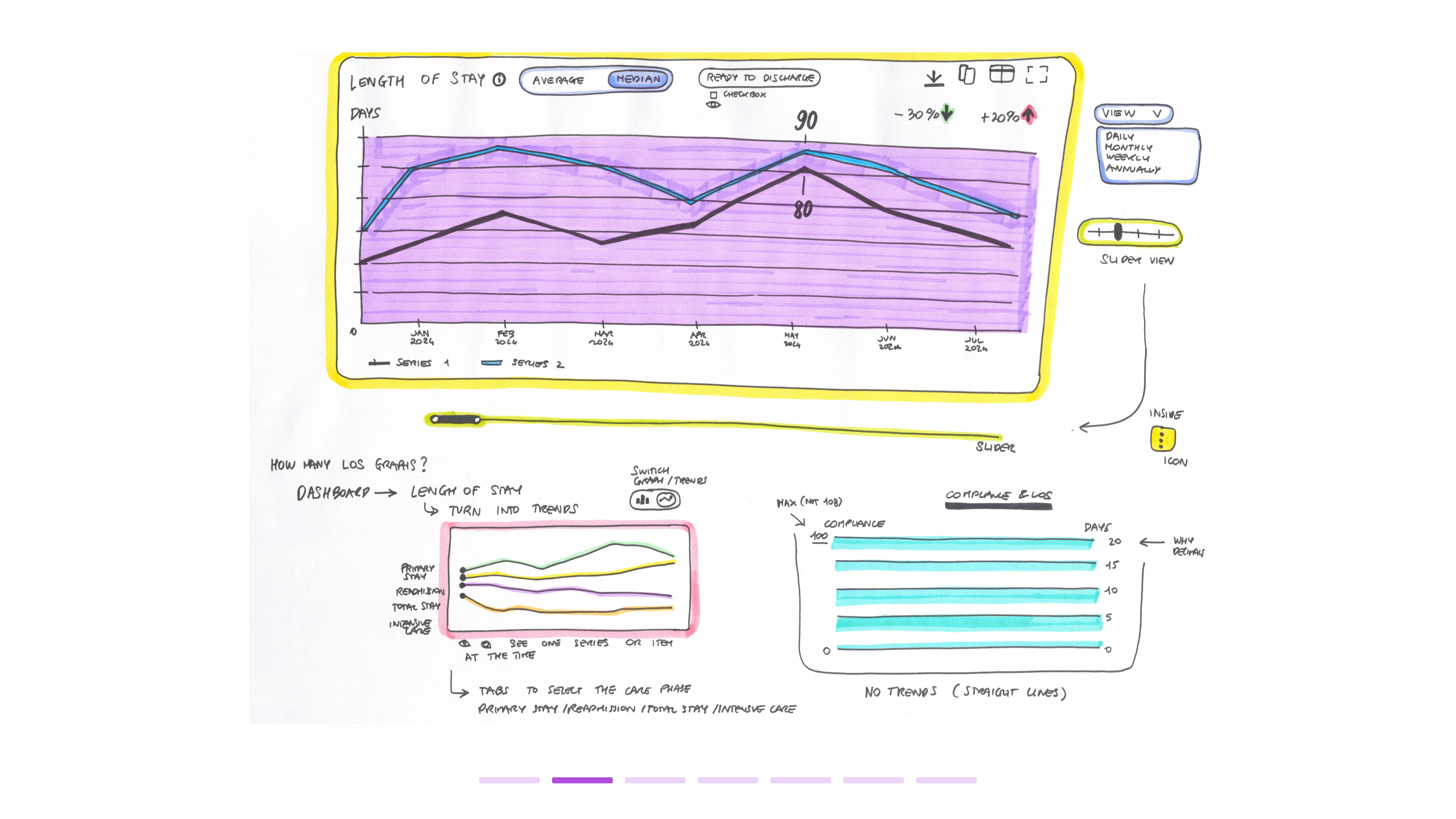
New capabilities were also added to graphs, including a series of toggle switches to change graph visualisation, which helped reduce the number of graphs needed while enhancing data analysis and comparison.
New capabilities were also added to graphs, including a series of toggle switches to change graph visualisation, which helped reduce the number of graphs needed while enhancing data analysis and comparison.
Trend visualisation button
More trend visualisation options, including line graphs, trend arrows, and a special trend button, were added to the platform. These features help users easily assess the progression of the overall situation and critical medical parameters, making it easier to pinpoint both positive and negative trends and focus attention where needed.
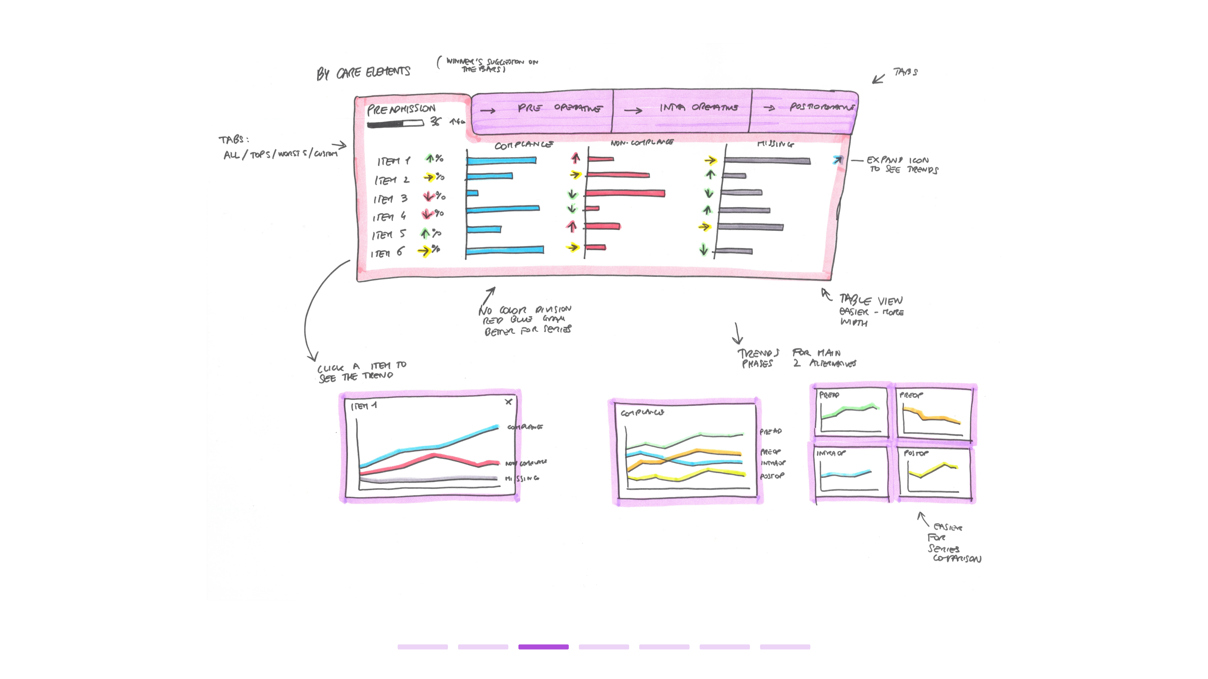
Checkboxes and radio buttons were introduced to allow users to hide or show specific graph elements, preventing overwhelming amounts of data and helping users focus on selected items.
Checkboxes and radio buttons were introduced to allow users to hide or show specific graph elements, preventing overwhelming amounts of data and helping users focus on selected items.
Graph checkboxes
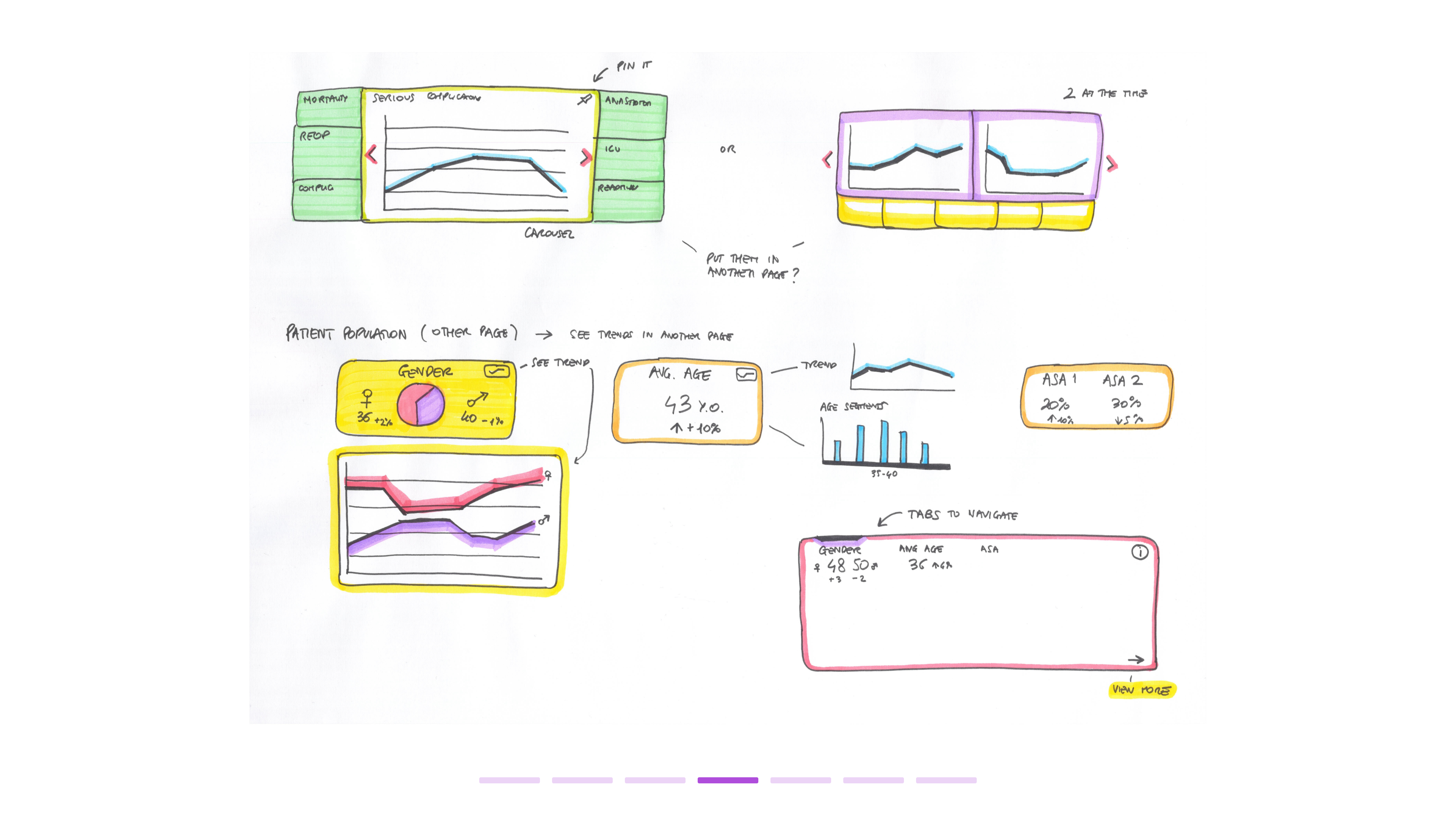
The internal organisation of graphs on each page was reviewed, with the prioritisation of certain graphs adjusted. For example, the occurrence rate graph was moved to the top of the overall page for better visibility.
A new section dedicated to patient population data was introduced, featuring graphs that provide insights into gender, age, and comorbidities. Additionally, a new set of graphs focused on surgery data is currently in development.
A new section dedicated to patient population data was introduced, featuring graphs that provide insights into gender, age, and comorbidities. Additionally, a new set of graphs focused on surgery data is currently in development.
Heatmaps

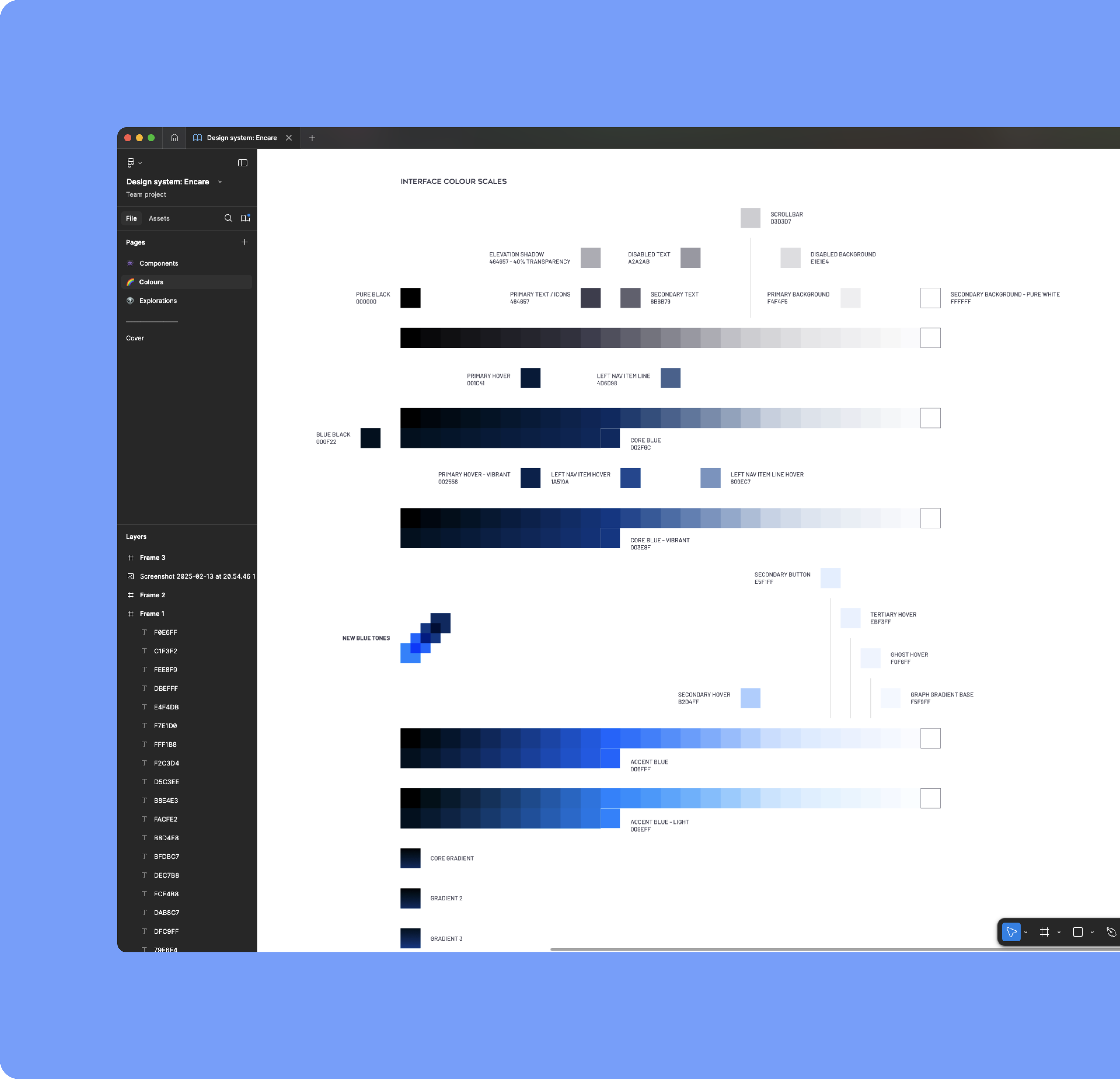
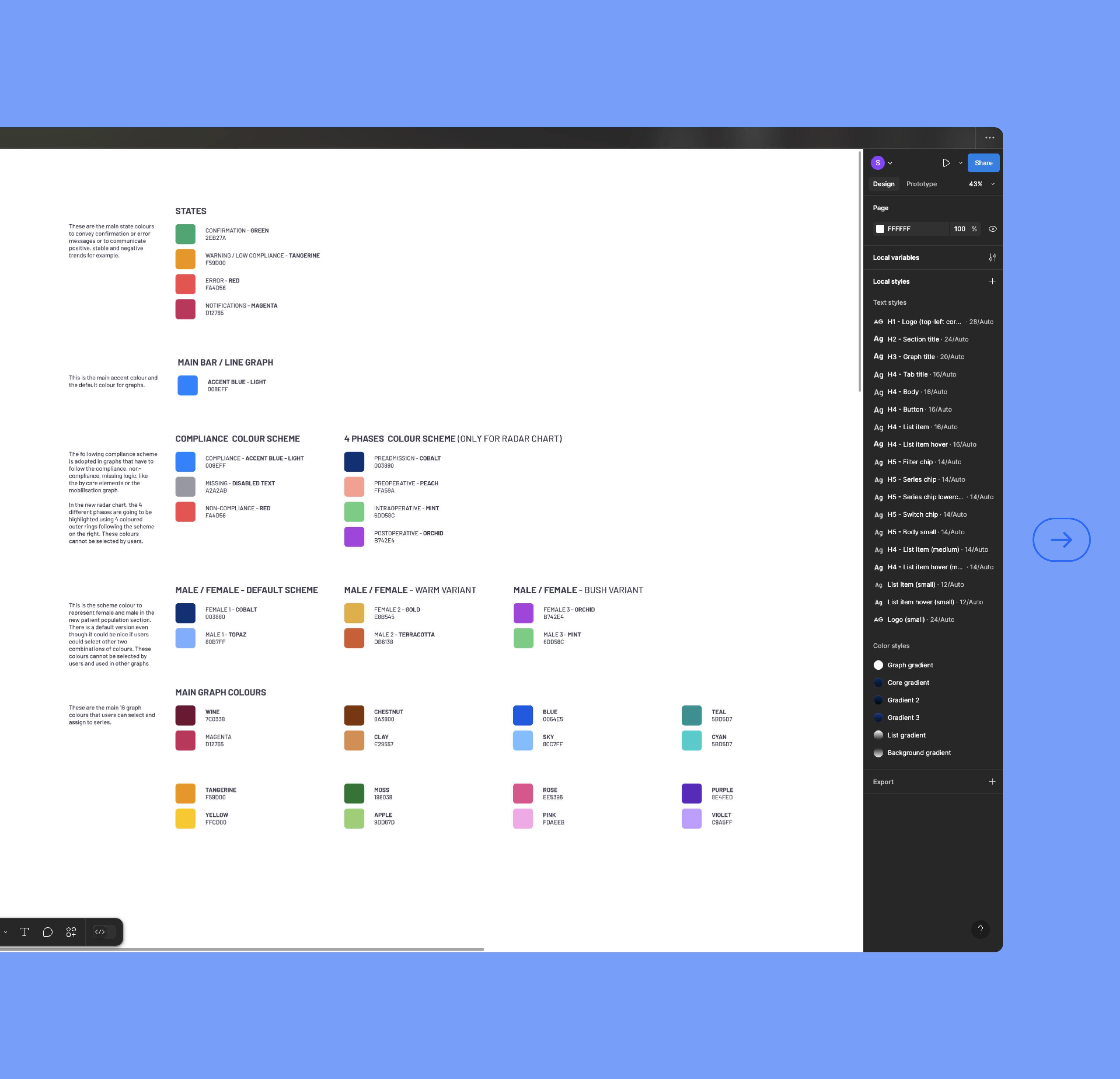
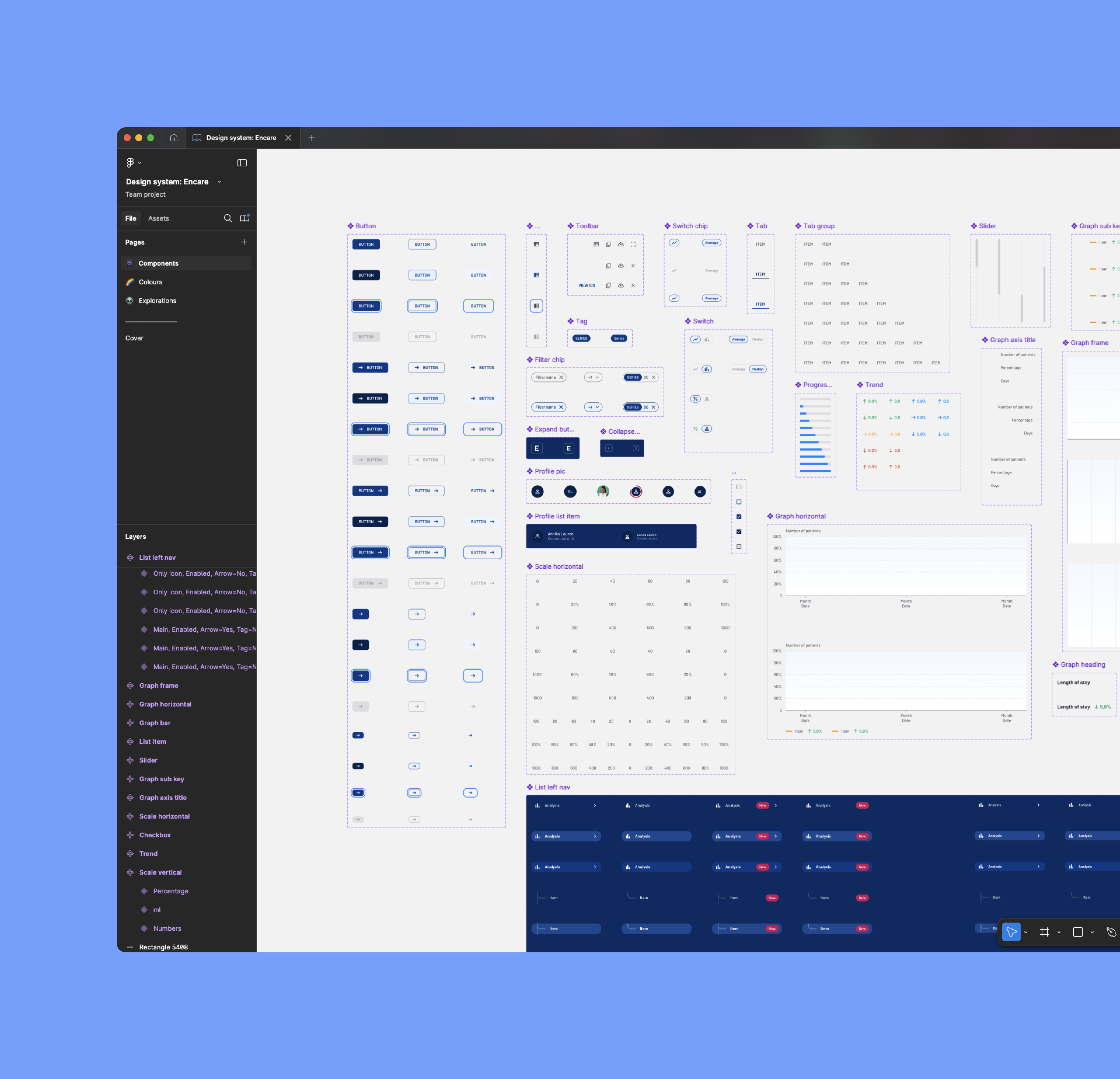
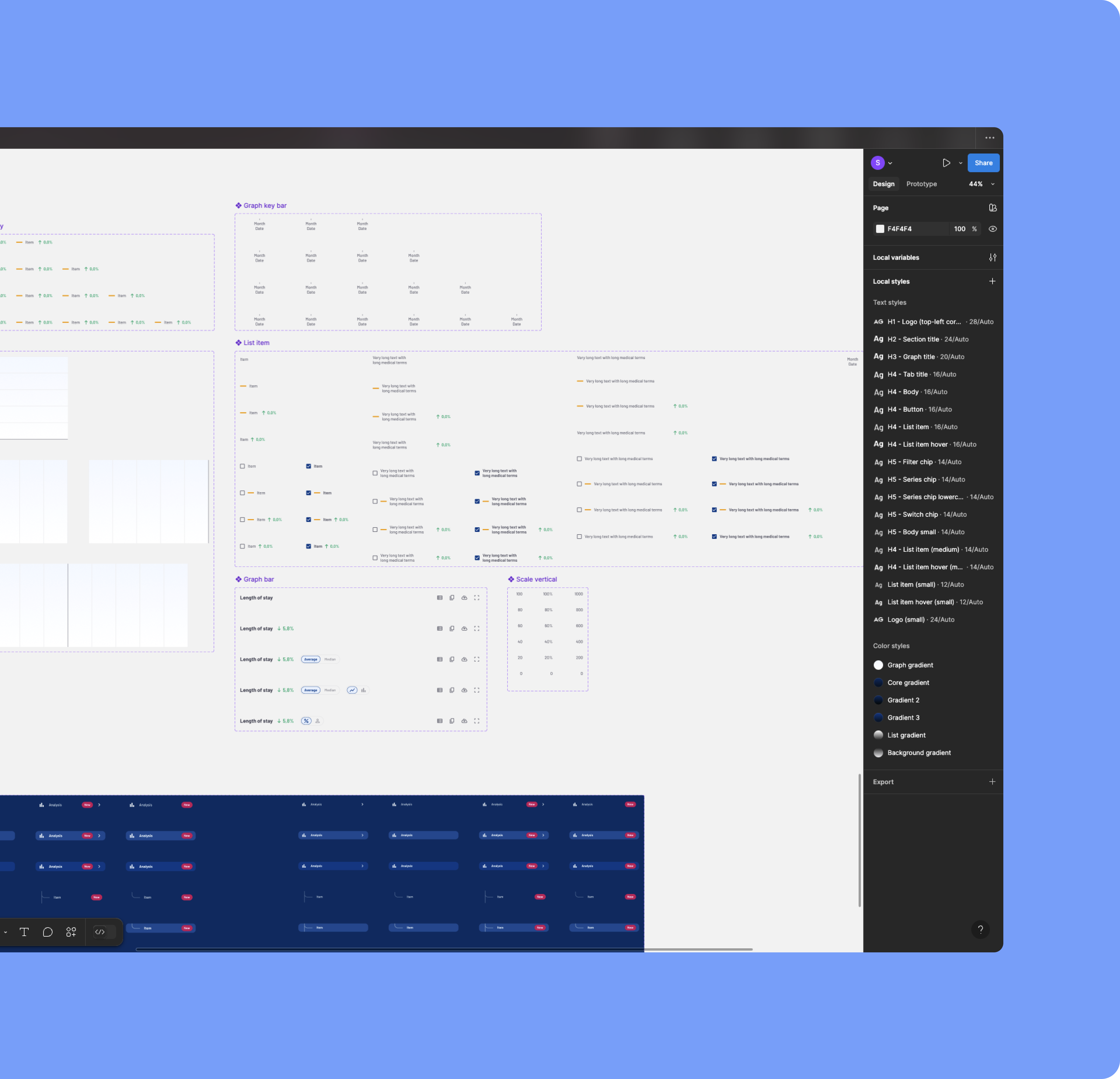
A new design system was developed to modernise the interface, adopting a more minimal, flatter, and bolder style in line with current UI trends. The goal was to create a cleaner, more engaging experience while boosting consistency and accessibility across the platform. This allows users to focus on tasks rather than relearning the UI every time they switch contexts. For example, many graphical elements like frames and dividers were removed, and more whitespace and improved colour coding were introduced to facilitate easier scanning of the interface.
Development sketches
Browse the gallery to vexplore the new design system